Printing on uncoated paper offers a rich, tactile experience, but its porous nature often leads to “dry-back”—a process where the paper fibers absorb the ink, causing deep shadows to lose detail and colors to look flat or muted. Introducing a touch plate (a fifth or additional printing plate beyond standard CMYK) completely transforms the final piece by targeting specific areas with supplemental ink. By laying down a bump plate of spot color—such as an extra hit of process magenta to warm up skin tones, a custom Pantone to match a brand hue, or a rich varnish/duotone black to lift the shadows—you can inject pure color saturation right where the artwork needs it most. This extra bump compensates for ink absorption, restoring punchy contrast, striking depth, and vivid vibrance to photos while preserving the soft, organic feel of the uncoated stock. Here’s an overview of the steps I used:
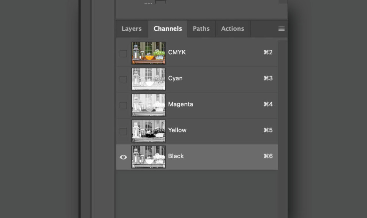
1The four default channels/plates in Adobe Photoshop: Cyan, Magenta, Yellow and Black (CMYK).
2 To get started, select the black channel in Photoshop.
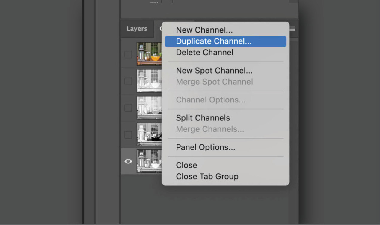
3From the pull down menu in the upper right, select Duplicate Channel.
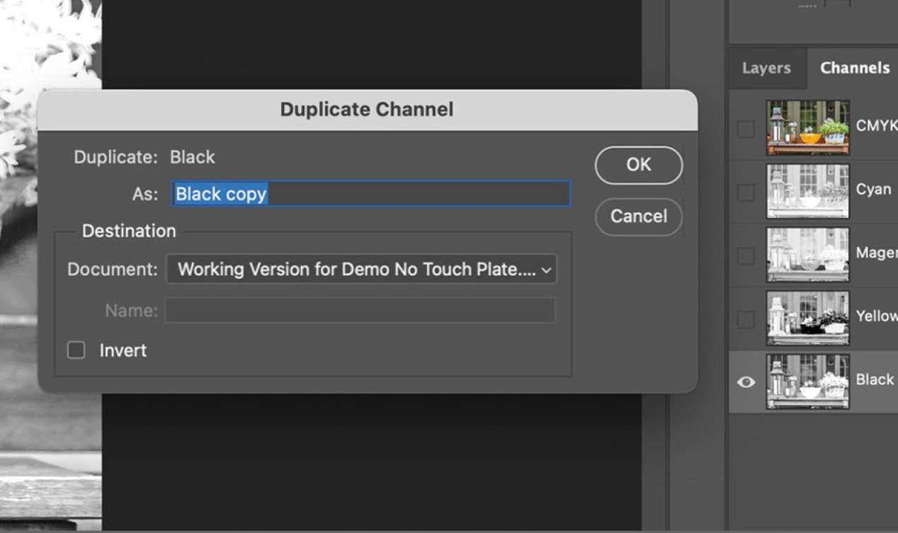
4When duplicating a channel, the default is “Black copy.” Change the name to “Touch Plate” and click OK. Note: You can rename “Black copy” to anything you’d like. Just be sure to rename it consistently on all images so that you’re only adding one new channel to your InDesign document.
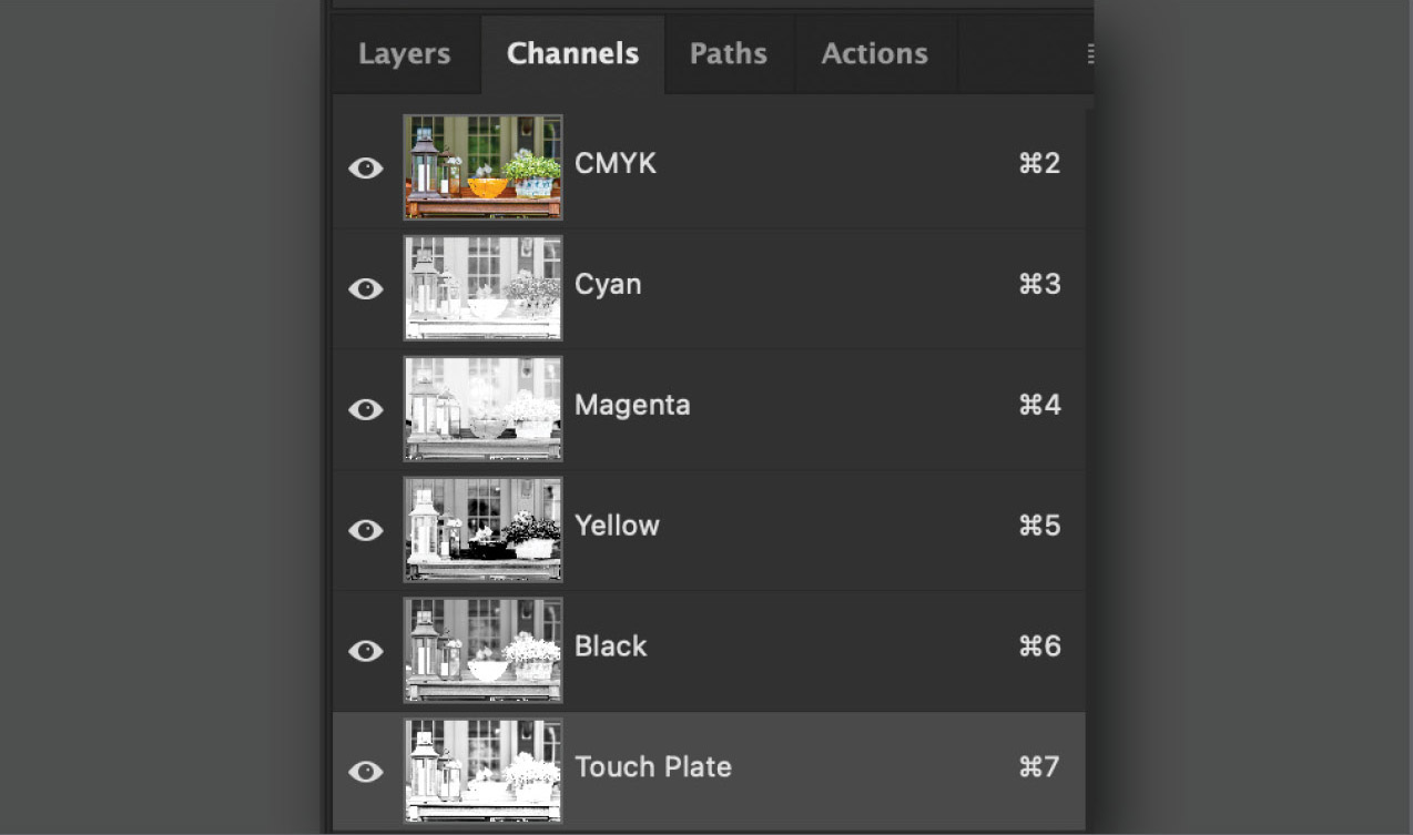
5The new “Touch Plate” channel now shows in the Channels panel.
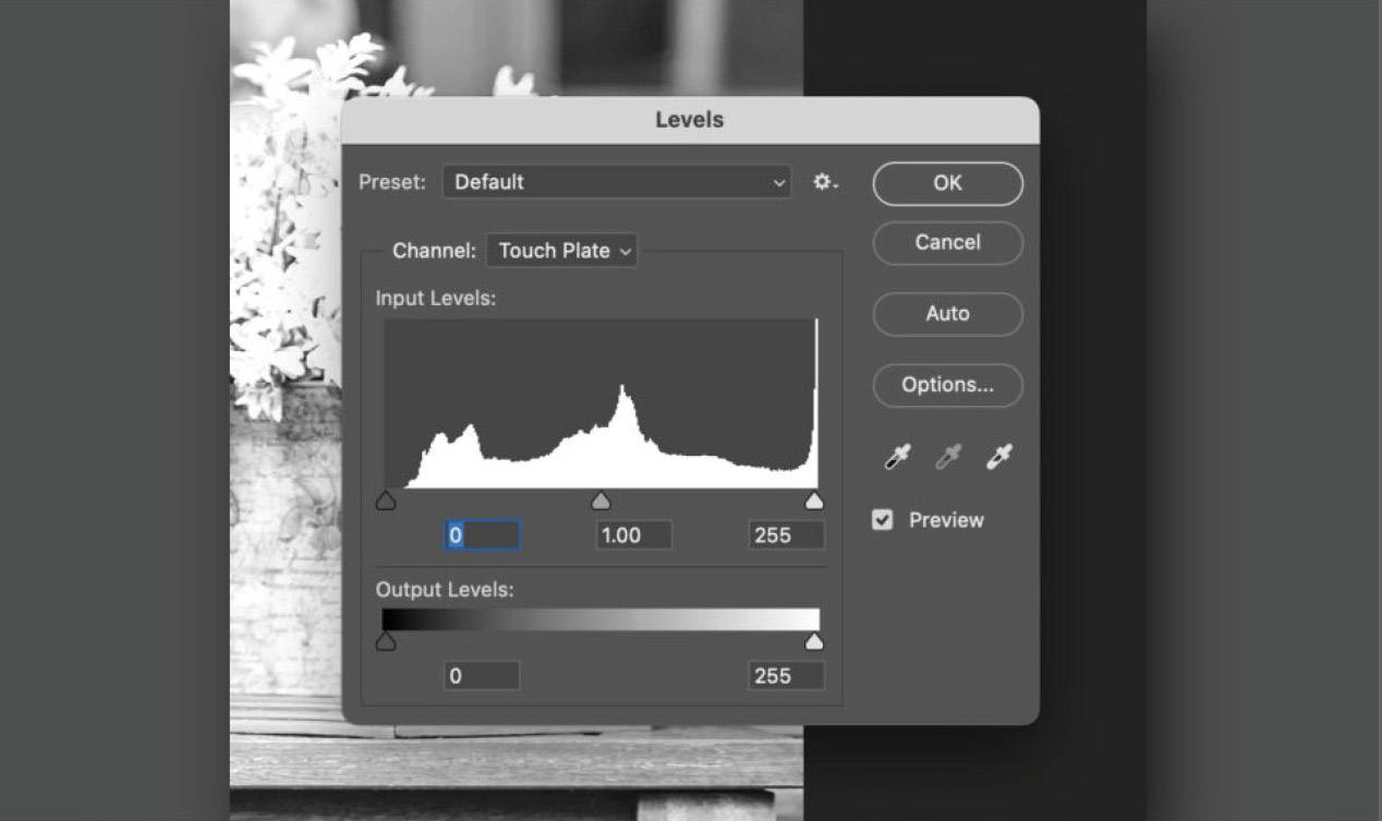
6Select the Levels dialog box. Go to Image > Adjustments > Levels. Here are the defaults. Note: if you’re used to working in Curves, you can accomplish roughly the same thing as when using Levels. (To access Curves, go to Image > Adjustments > Curves)..
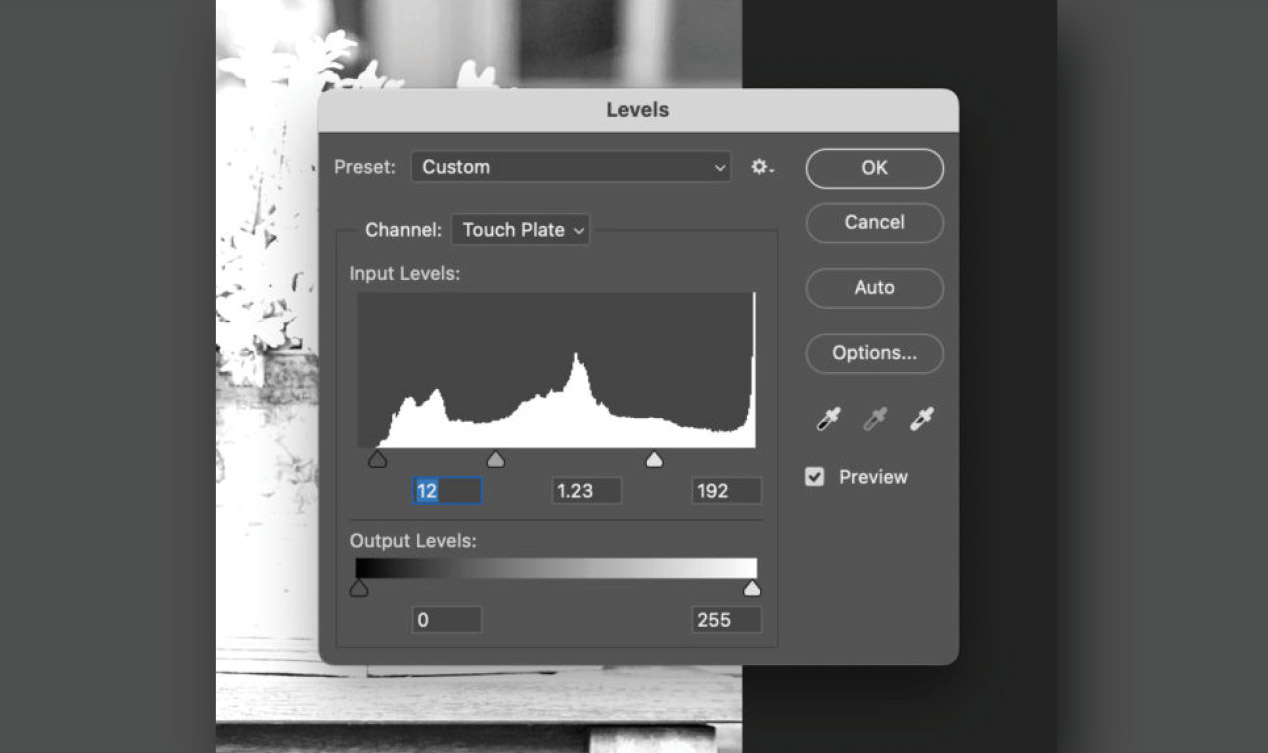
7Adjust the Levels. The defaults (see step 6 above) are 0 | 1.00 | 255. For this example, I’ve changed the values to 12 | 1.23 | 192. I usually start with the highlights (move the right arrow to the left to “open up” the highlights) and see what effect that has on the image. Then I adjust the shadows (move the left arrow to the right), and finally the mid-tones (move the center arrow to the left).
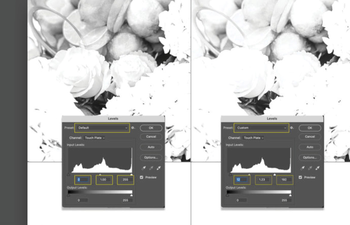
8This shows a before and after of the Hydrangeas image. On the left is the black “Touch Plate” before any adjustments (at this point, it’s still identical to the black plate which it’s a duplicate of). The image on the right shows the results after adjusting the highlights, shadows and mid-tones using the Levels dialog box.
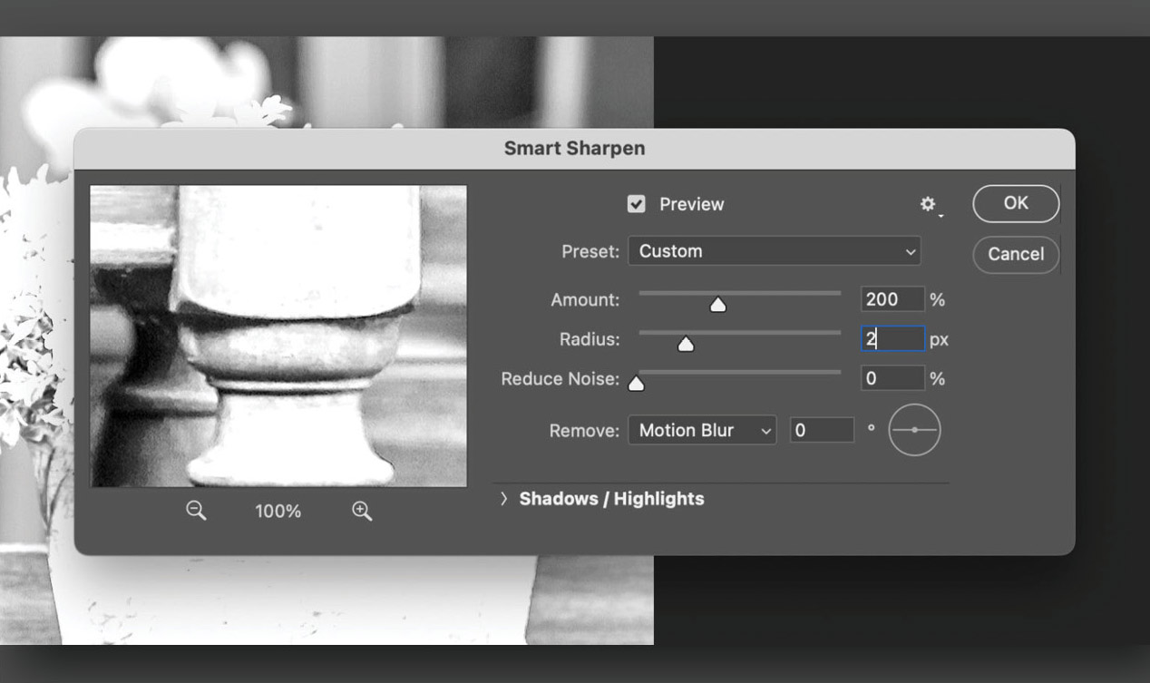
9Sharpening the black “Touch Plate”: Select Filter > Sharpen > Smart Sharpen*. When sharpening the “Touch Plate” I set the values higher than I would if sharpening a regular four-color/channel image. Since it’s going on an uncoated sheet, I think it helped to define the elements in each photo. (If you’re used to using other sharpening methods (unsharp mask, etc.) you can achieve approximately the same results).
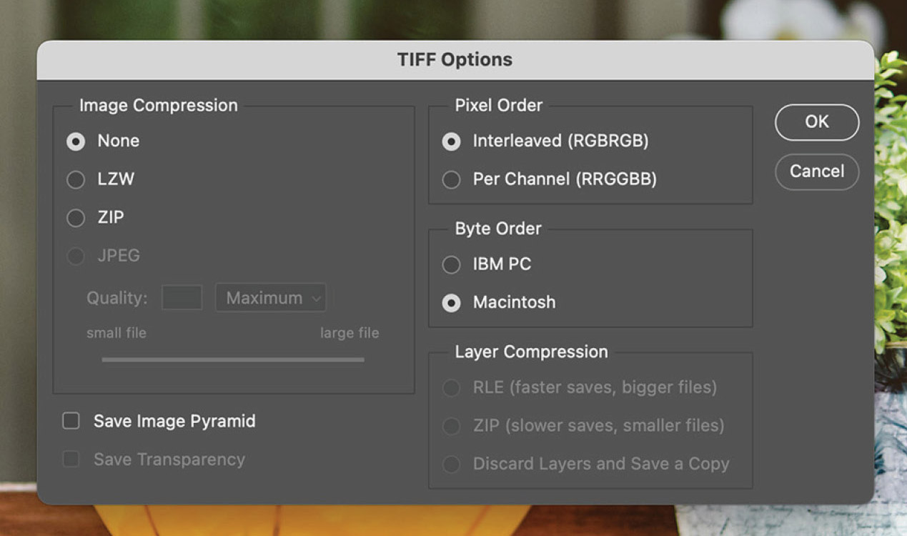
10Save and export. Once you’re satisfied with the results of the above adjustments, save the document as a TIFF* file (this assures the “Touch Plate” is included. The settings I use are shown here). “Tagged-Image File Format” (TIFF, TIF) is used to exchange files between applications and computer platforms. TIFF is a flexible bitmap image format supported by virtually all paint, image-editing, and page-layout applications.
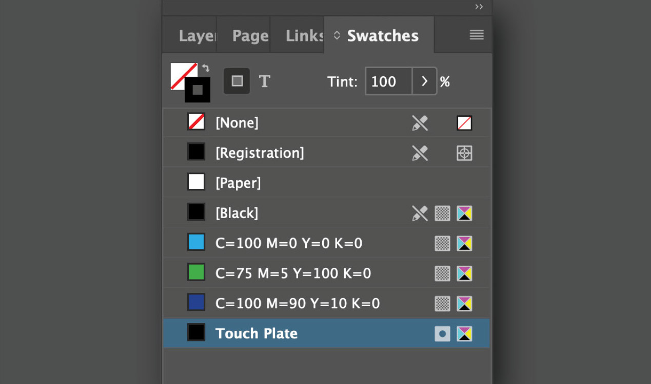
11Place the file in Adobe InDesign. When you do, you should see the black “Touch Plate” listed in the Swatches panel. If it’s not there, you may need to check your work on the Photoshop file using the steps above.
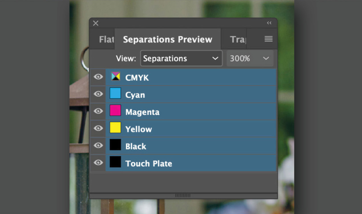
12You can confirm that InDesign will properly output the separations by using the Separations Preview panel. To access the panel, go to Window > Output > Separations Preview.
GBDWORKS START PAGE
This is a unique website which will require a more modern browser to work!