![]()
About the Sun, Moon and Star Logo
My graphic design business was originally called “Paul Kazmercyk Graphic Design” (clever, I know). When we moved from New Haven to Branford, I kept the name for awhile. Then at some point, I decided an overhaul was due, but I didn’t really know what to call myself. A neighbor suggested something with “Granite Bay” which is the section of Short Beach in Branford where we live. That seemed like a perfect name, and so “Granite Bay Design” was born. casedarno.tuscanycloud.it
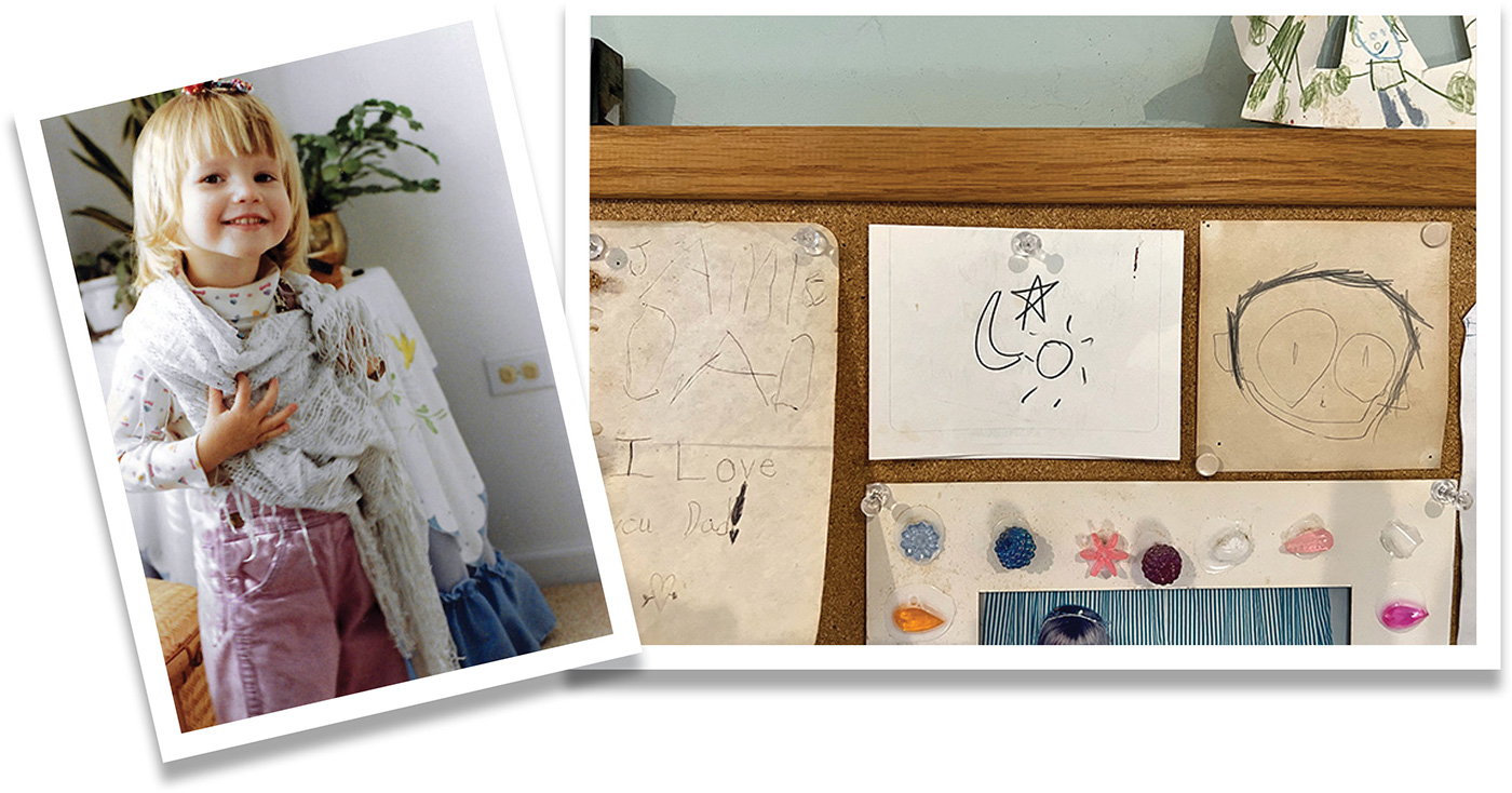
We had our first daughter, Melanie Rose in 1988. When Melanie was learning words, I remember sitting with her on my lap at my office desk and making a sketch of the sun, moon and stars, and getting her to pronounce each word. I don’t remember when I decided to use that sketch as my logo. Originally each element was a primary color and a printer I knew, made an embossing die in those shapes and I had my first set of business cards with the new name and logo.
I probably used that logo for a good twenty years before switching to icons—this time of a star, sun and waves. The sun doubled nicely as a gear and I used that for a couple of sections of my website where I have tutorials and step-by-step instructions. barbarossaleatheroverstock.com
The original sketch survives to this day and is pinned to the bulletin board in my office.