“Color always vexed me because I would fight with the media I was using. I love coloring in Photoshop, and it’s freed me to pursue ideas and techniques I wouldn’t have otherwise attempted. Since I get to take an assignment from concept to final execution, I have more freedom in my idea-making processes.” Adam Hughes
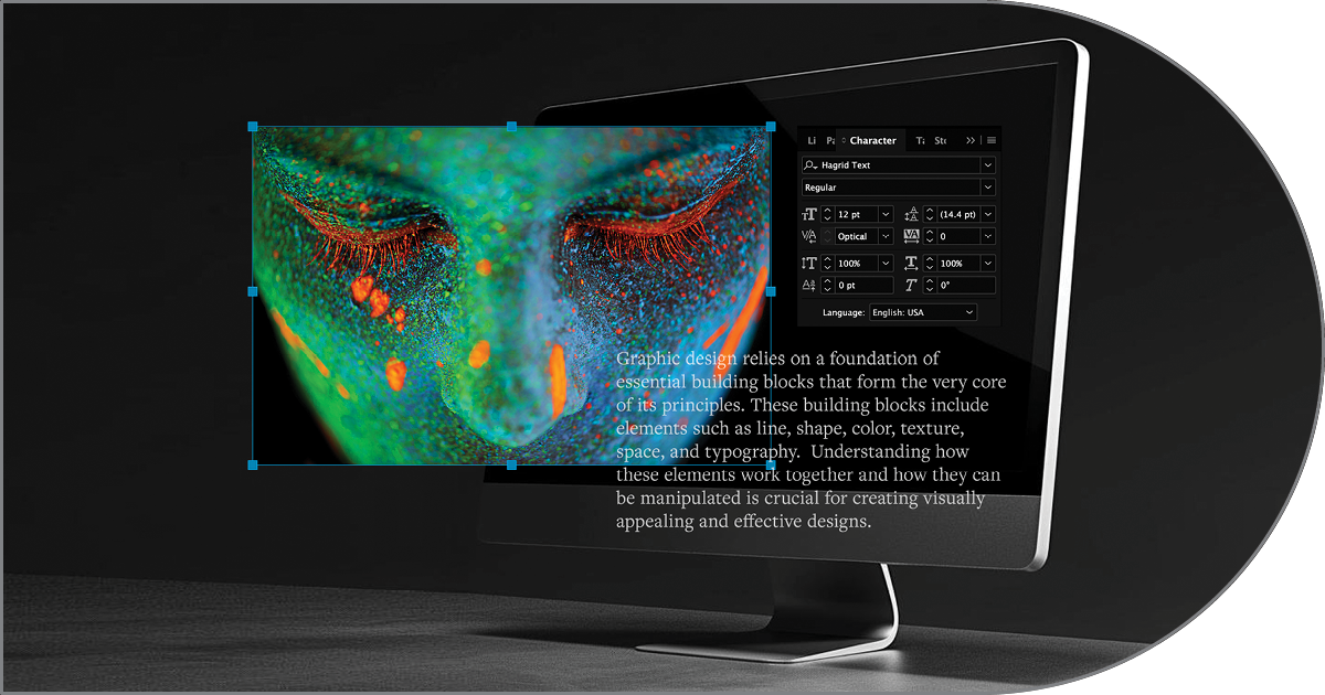
Adobe Photoshop has more useful tools than most of us could ever utilize. The images below, which only scratch the surface, highlight just of the few options a graphic designer might consider using to enhance or otherwise modify an image in getting a job ready for the printing press. Some of these tools are just as likely to be used in preparing an image for online use, although the photographer or graphic artist would work in the RGB “color space” rather than CMYK as shown below.

A—From Photoshop to Press: Conventional 4-Color (Process)
Introduction: The groundwork for CMYK printing was laid in 1867 by Scottish scientist
James Clerk Maxwell, who theorized that a combination of four inks could produce a vast array of colors. While earlier attempts at color printing existed, they were often expensive and impractical. The true birth of CMYK printing came in 1906. The Eagle Printing Ink Company in the United States demonstrated that using cyan, magenta, yellow, and black inks (CMYK) on a white background could achieve a near-unlimited range of colors. This innovative process, utilizing the
subtractive color model, laid the foundation for the full-color printing we rely on today.
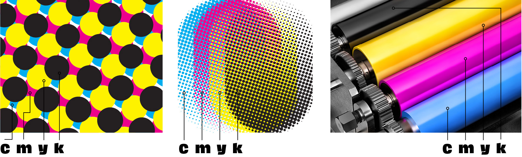
Above Left: The conventional way to print a basic full-color (also called process color) uses CMYK dots to create a near infinite number of new colors. Where the dots overlap, for example, cyan and yellow will create green. Depending on the finished color, black or magenta dots may also be added to make different values of green.
Center: The same CMYK dot plates zoomed out to see a more complete example of the dots and how each plate (channel) dots overlap other plate’s dots to form a nearly endless variety of new colors.
Right: The rollers on a printing press showing the four CMYK colors before plates are made. Note: Your office or home printer most likely uses the exact same process. When you buy cartridges, they are most likely cyan, magenta, yellow and black.
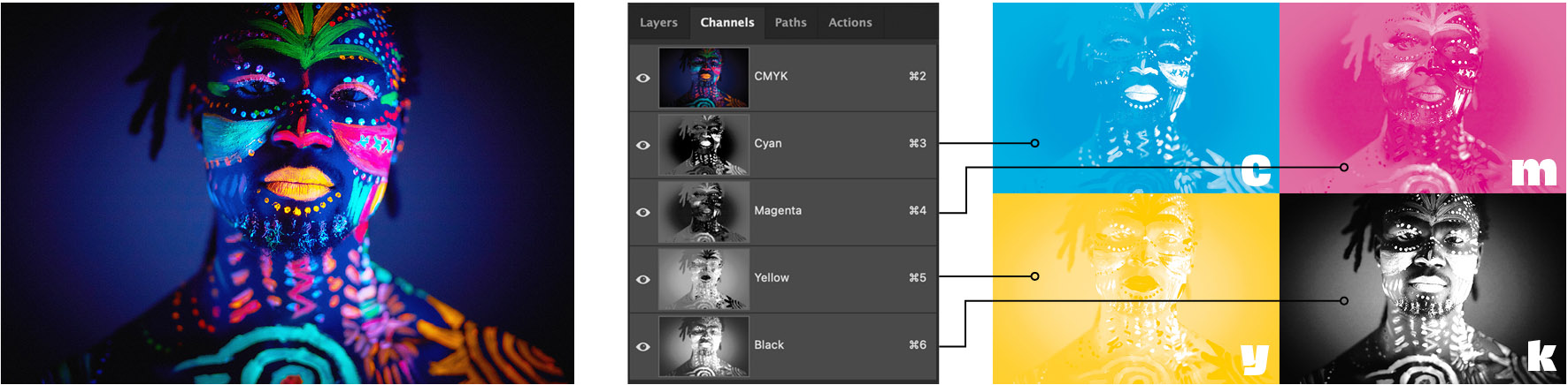
Above left: How a digital image appears in Photoshop by default.
Center: The channels palette in Photoshop showing the full color CMYK image channel (the top layer), then the individual cyan, magenta, yellow and black (CMYK) channels by selecting any of the CMYK channels, the photographer or graphic designer can adjust that channel if he or she wanted to change the amount of cyan, for instance, in the full color image (there are other ways of doing that—see curves and levels below).
Right: The four CMYK channels in the way the photographer or designer might picture them.
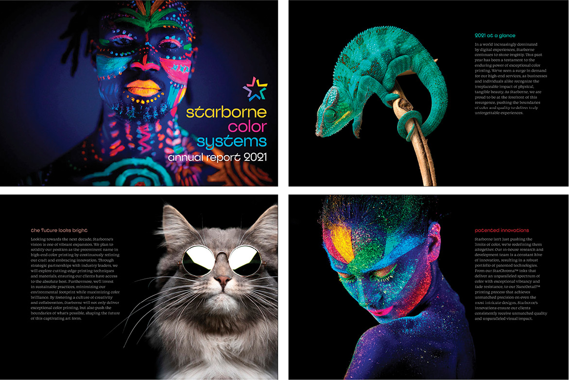
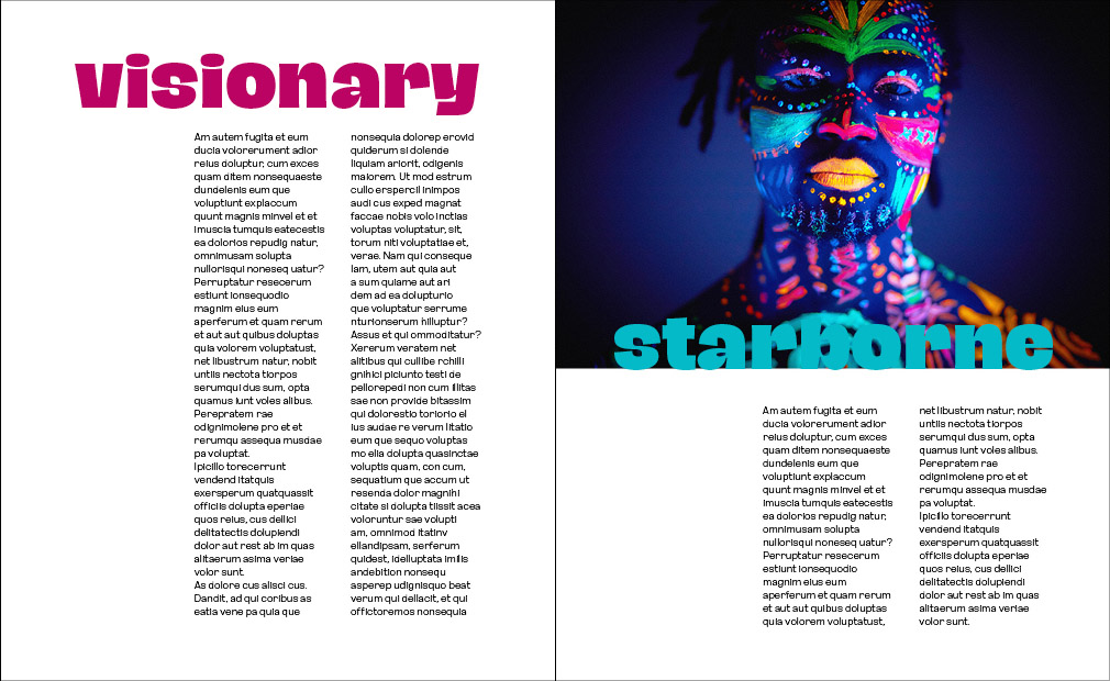
Above: Selected pages from the printed piece for Starborne Color Systems. Just as the cover photograph is composed of cyan, magenta, yellow and black inks, so is the logo and the colored type (see below), However, depending on the designer’s preference and the client’s budget, the bold headlines could also be made of “
spot colors” which would be solid colors (no CMYK dots). The sections that follow illustrate this.

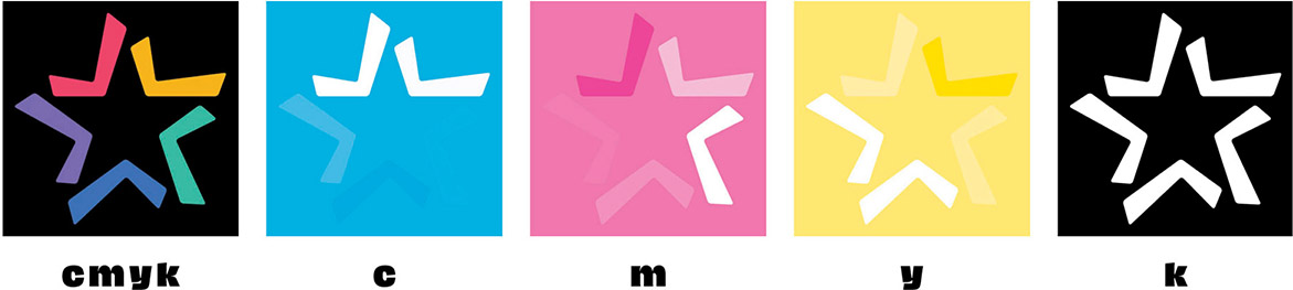
Above: The logo used on the cover of the Starborne brochure uses only CMYK inks. The file shows the C, M, Y and K components of each of the five colored shapes. Logos and other vector artwork are generally created in graphics applications such as Adobe Illustrator and are placed in page makeup applications such as Adobe InDesign along with “continuous tone” elements such as the photographs shown.
Above: The logo used on the cover of the Starborne brochure uses only CMYK inks. The file shows the C, M, Y and K components of each of the five colored shapes. Logos and other vector artwork are generally created in graphics applications such as Adobe Illustrator and are placed in page makeup applications such as Adobe Indesign along with “continous tone” elements such as the photographs shown.
Download a PDF of This Page
B—When 4 Colors Aren’t Enough—Black Touch Plate on Uncoated Stock
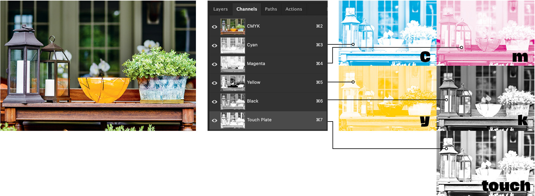
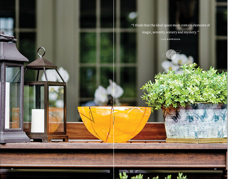
Above: For an anniversary booklet celebrating a local luxury florist and garden center, we wanted to print on an uncoated sheet to take advantage of the feel that only an
uncoated sheet can provide. We had viewed a printed sample that used a black “touch” plate in addition to the standard CMYK printing inks in order to add depth to the amazing photography featured throughout the booklet.
In general, since uncoated paper absorbs ink, printing just CMYK tends to suffer from lack of depth, sharpness and contrast. By adding a fifth plate to the mix (we duplicated the conventional black plate, then increased the contrast and added sharpness to that fifth plate).
Upper right: you can see and compare the touch plate to the original black plate. Note that by increasing the contrast quite a bit, we “opened up” the highlights and increased the saturation in the darkest areas.
All of this was a bit of a leap of faith, since our designer had to imagine the effect of printing two black plates. However, our printer offered to run “press proofs” to see the results of adding more black. We were printing black over black, with the touch plate ink essentially being laid down on top of the conventional black plate ink. Our first press proofs were remarkably good and the amount of contrast and sharpening applied by our designer was perfect.
The booklet was a huge success. The piece looked and felt perfect. Our printer uses it to this day to show potential clients that printing full color on uncoated stock can be a success.
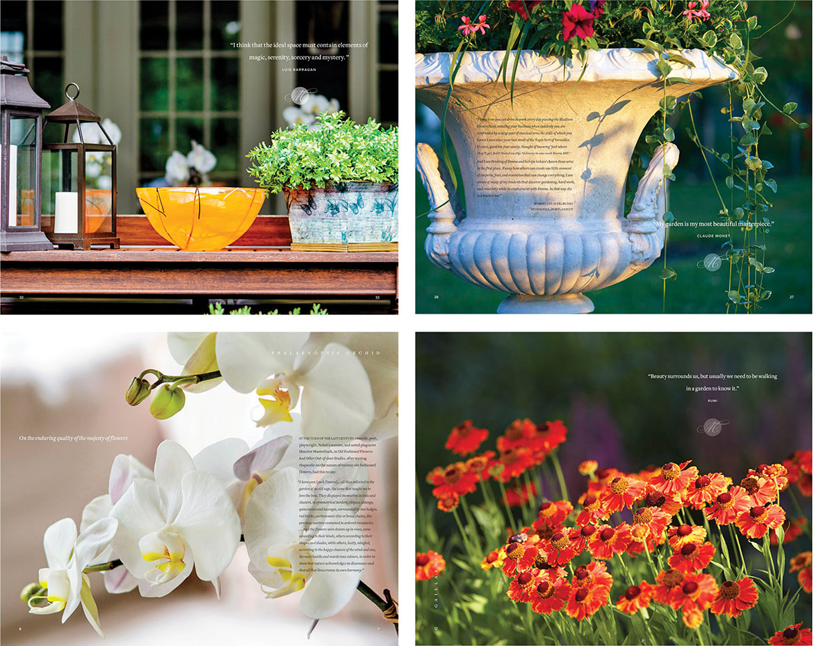
Some spreads from the Madison Flower Shop anniversary promotional brochure.
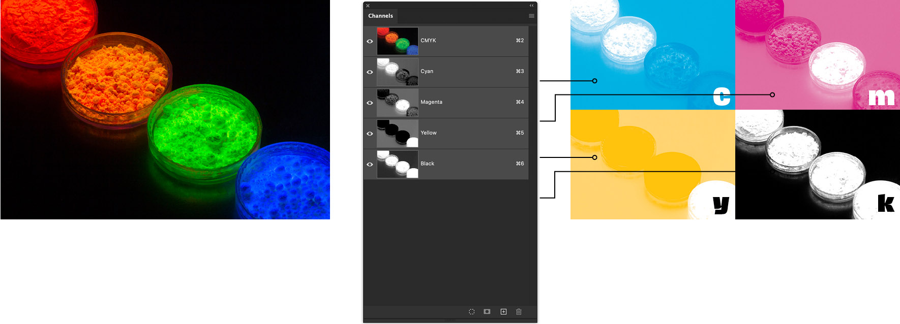
C—When 4 Colors Aren’t Enough—Adding New Channels for More Vibrant Color on Press
This step-by-step will walk you through the basics of adding new channels (plates) to an image in Photoshop and using
several spot fluorescent inks on press to really bring an image to life. Here we see the original photograph viewed in Photoshop and its cyan, magenta, yellow and black inks. But, rather than limit ourselves to the color spectrums available with just CMYK, we’ll add four additional channels, each made up of a single Pantone ink isolated using Photoshop’s selection and
feathering tools. At the printer, instead of just producing the basic CMYK color plates, four additional plates will be created. In this case, we’ll use four Pantone fluorescent inks wo really give the image some kick.
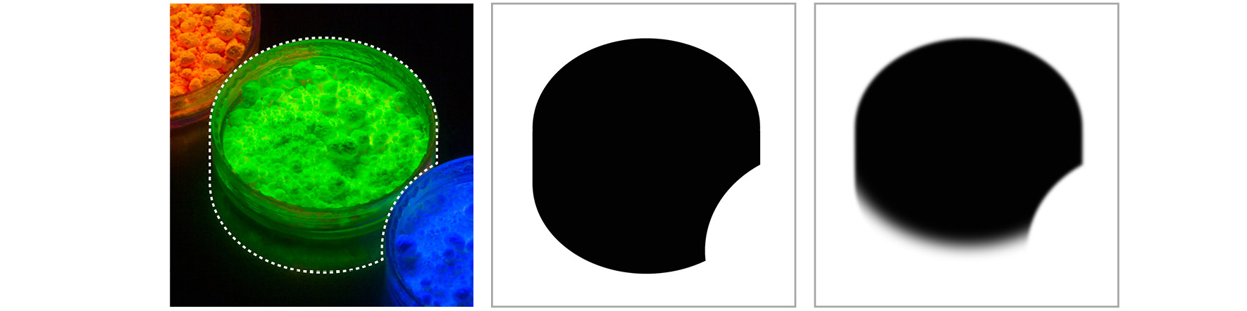
Above, left to right: To begin, our designer creates a hard-edged shape indicating where the fluorescent Pantone 802 green ink will print. The dotted line shows that shape. We then make a new “layer mask” to “knock out” the area around that shape (center). To make sure the green plate will print with soft edges (close to the original image), we then use one of Photoshop’s many blur tools (here we use “gaussian” blur on the whole channel) Finally, we want the green to blend seamlessly into the black background below the dish, so we use other Photoshop tools to make a smooth transition from the green channel into the black background of the original image.
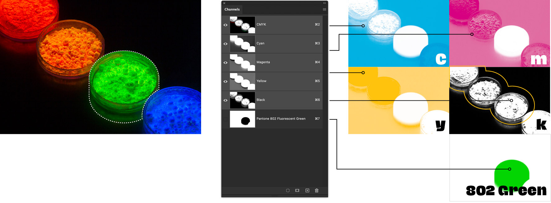
Above center: We use the layer mask for the green channel to knock out the green area in the cyan, magenta and yellow plates so only green and black will print there. We leave the black plate as is, since it will define the detail in the green dish.
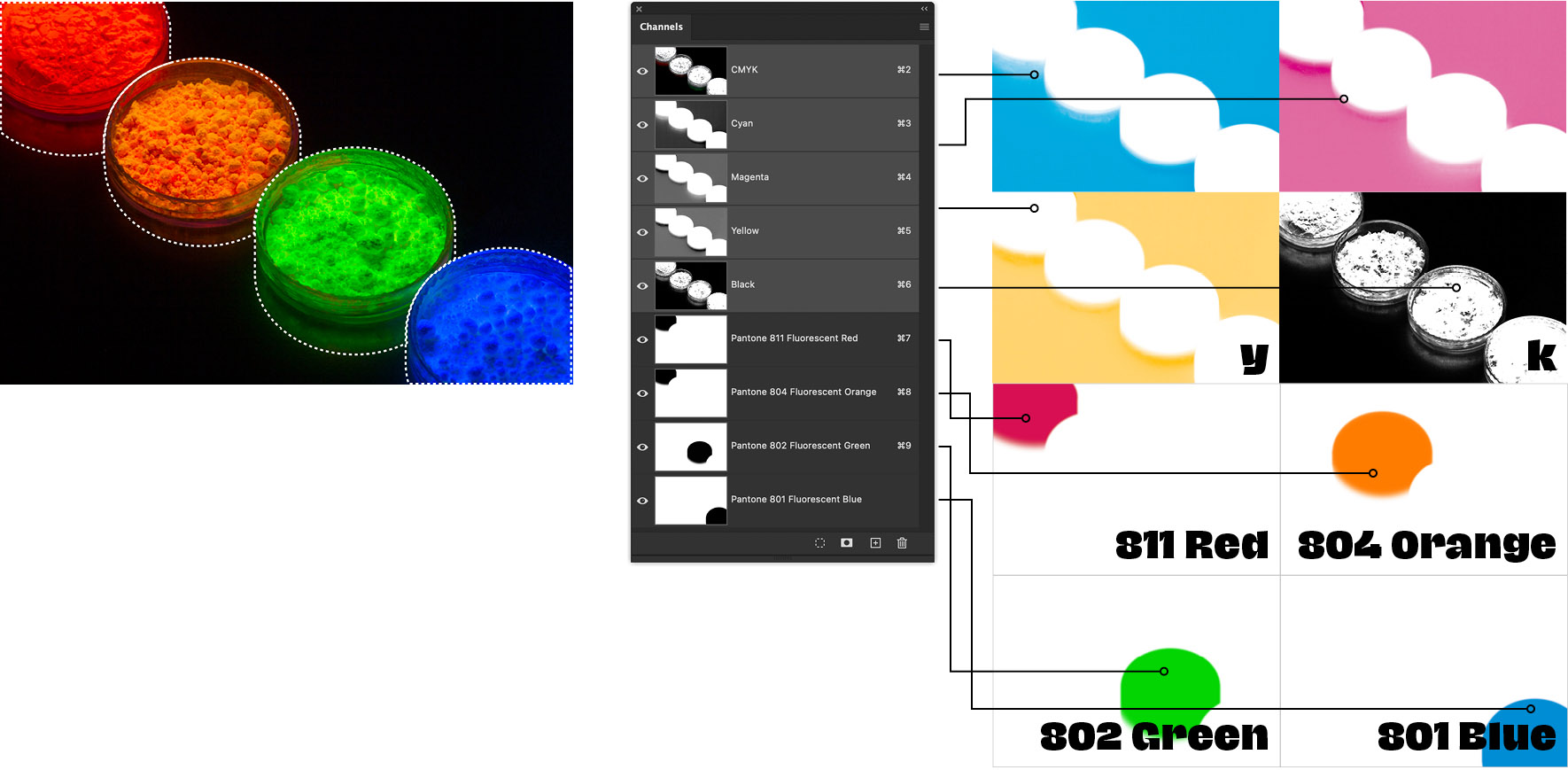
Above, left to right: We repeat the step above for each of the other three Pantone fluorescent inks, isolating each from the other plates. When the Photoshop file is saved, the four additional fluorescent ink plates are saved along with the original CMYK channels. When the printer gets the file he/she will output each channel separately and create a plate for each of the eight channels. The result will be an eye-popping color-intense photo. Note: this method is only available with conventional offset printing. In digital printing, most printers are limited to CMYK inks, although (depending on the digital printer) the digital version with only CMYK inks will probably be a bit more intense than the conventional offset printed version.
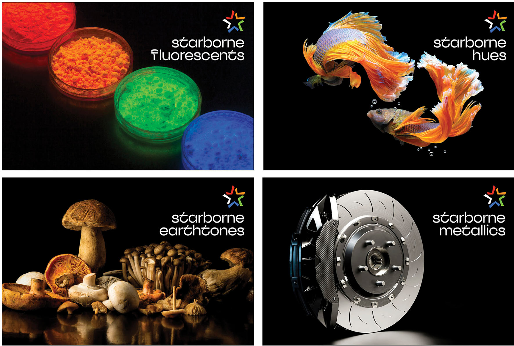
Above: sample pages from the printed piece. Starborne Color Systems is a highly specialized ink supplier and printer. For this piece, each of the pages shown utilizes a set of custom CMYK inks in addition to another set of custom made inks. These range from the fluorescent Pantones in the upper right, to specially formulated hues, earth and metallics.
D—Using Photoshop’s Curves to Alter Overall Image Color
Below: Some of Photoshop’s many other tools include the curves dialog box. This tool allows the photographer or graphic designer to alter different values in an image. Below we show some examples. Note that these examples are deliberately exaggerated in order to show some optional adjustments.
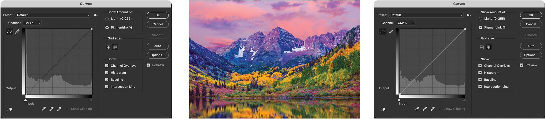
Above: Above: The original photograph’s curves settings in Photoshop. Note that the default curves are always a perfectly diagonal line from bottom left to upper right. Adjustments can be made to all four CMYK channels at once, or as shown below, to individual CMYK channels depending on the desired effect.
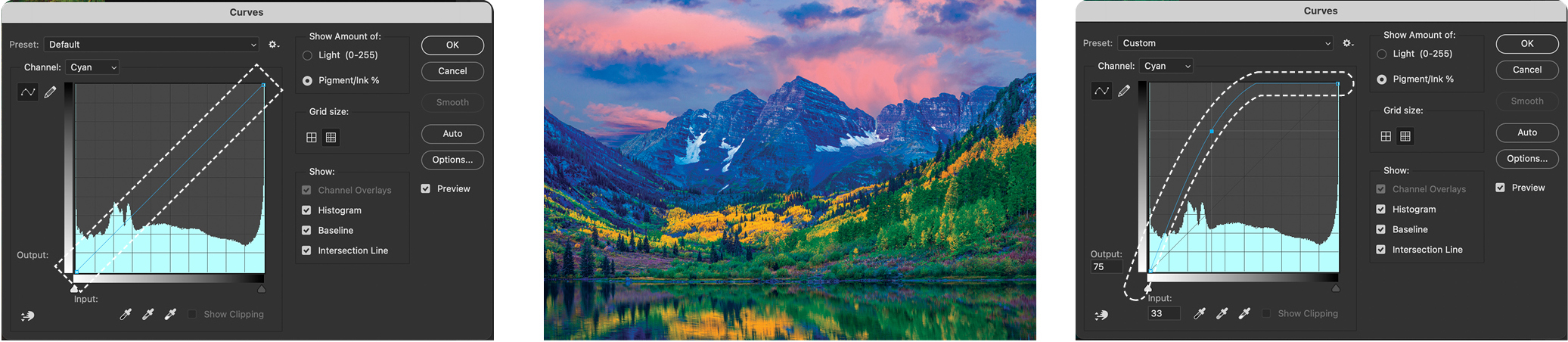
Above: Starting with the original photo’s cyan channel. the photographer or designer drags the curve’s diagonal line to the left and top (see dotted outlines in the upper left and upper right), dramatically altering the cyan data in the digital image. The altered image (above center) shows the resulting color shift.
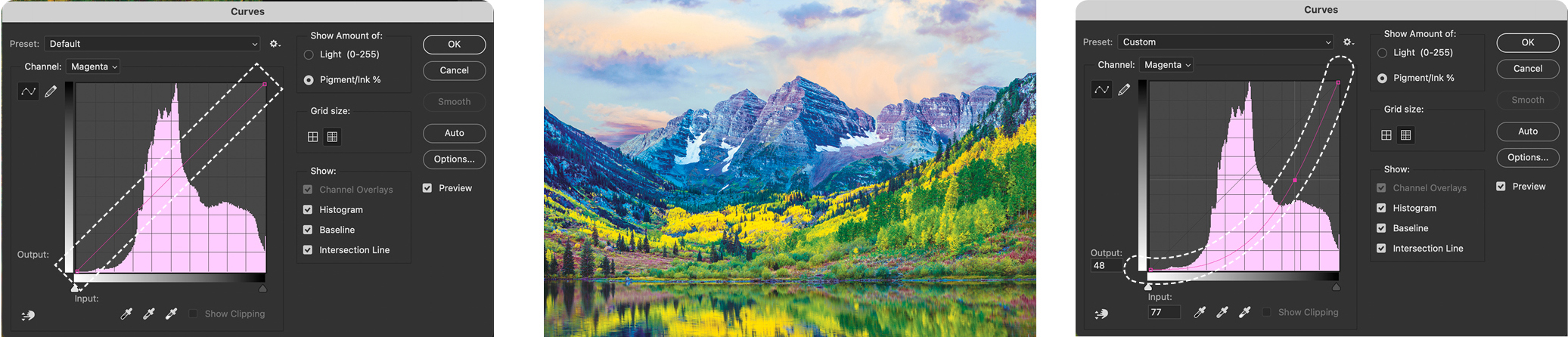
Above: This time, the photographer or designer selects the magenta channel, and drags the diagonal line to the bottom right. The original dotted line (upper left) and modified curve (upper right) dramatically reduces the image’s magenta content as show above center.
Depending on the use, an image can be endlessly modified using the curves dialog box or many other tools.
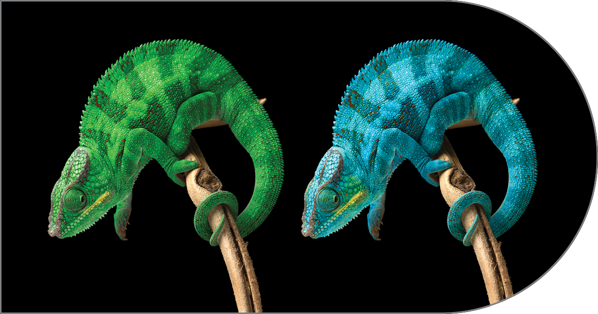
E—Using Photoshop’s Hue / Saturation to Change Targeted Colors
Our final example shows how a designer or photographer can use the
hue/saturation dialog box to modify an images overall color balance.
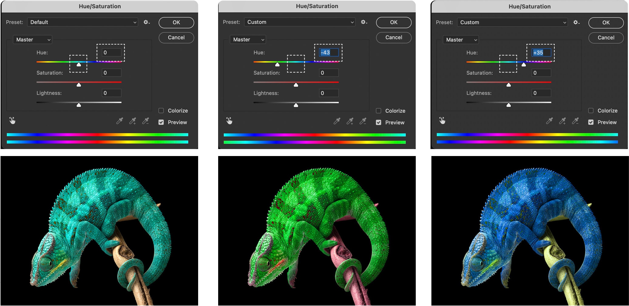
Above left: The original digital photograph in Adobe Photoshop along with the default hue/saturation dialog box with all values set to zero).
Above center: Working with the master (we can also work on individual CMYK channels as in the mountain image in the step above), see how dragging the hue slider to the left, alters the amount of cyan in the image to make the chameleon more green.
Upper right: Similarly, by dragging the hue slider to the right, decreases the yellow and increases the magenta in the chameleon. You’ll see that in the dialog boxes in the top row above, we also have a saturation slider and a lightness slider. Those adjustments have a nearly infinite number of image modifications applied to the master channel or individual cyan, magenta, yellow or black.
A final note: All of the samples above use the CMYK color model, but depending on the ultimate use of the image, a photographer or designer can just as easily work in the RGB color model.
Learn More About Graphic Design Building Blocks
adobe photoshop
cmyk & rgb color spaces
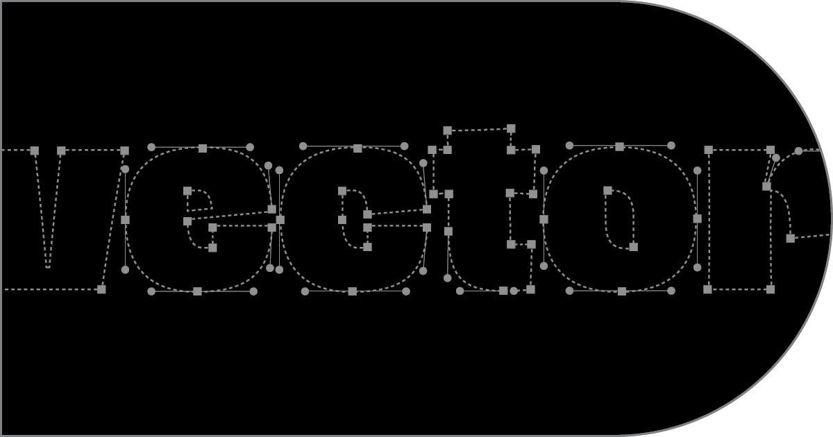
vector graphics
printing spot colors
photography
typography
creativity

white space
infographics
websites: css & html
way finding & signage

branding & identity
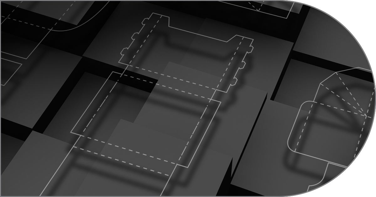
packaging
page makeup
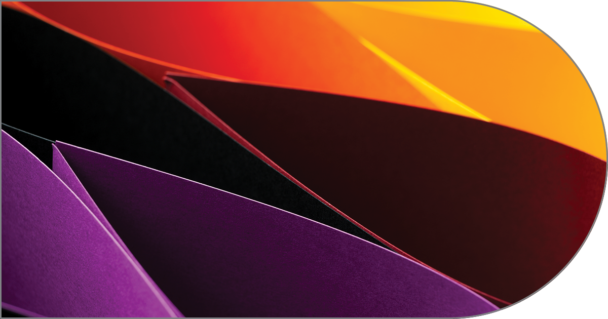
paper