![]()

“A color strategy is like a recipe for harmony – a set of color relationships that are proven to work well and can be used as a formula for building our color composition.”
MITCHELL ALBALA

Above: How halftone screen dots of cyan, magenta, yellow and black (CMYK) overprint on press to form a nearly unlimited number of colors.
Color is a visual perception resulting from the presence of light and the reflection or absorption of specific wavelengths. It has the power to evoke emotions, convey messages, and create a sense of atmosphere. A wide range of colors exist, each with its own unique qualities and associations.

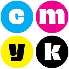
Above: Cyan, magenta, yellow and black (CMYK) are used by commercial printers and most office printers.
CMYK (Cyan, Magenta, Yellow, Key/Black) is a color model used primarily in printing, where colors are created by varying percentages of these four ink colors. CMYK is subtractive, meaning colors are created by subtracting light from a white background. This model is used in everything from magazines and newspapers to packaging and signage. Upper right: a typical dot pattern as used in conventional CMYK printing; where dots overlap, new colors are created. bottom, top left: a designers uses a graphic design application to mix a CMYK color (solid magenta); bottom, top right: using the same tool, the designer mixes a custom CMYK color (purple). A printer makes plates from the designer’s file(s) and overlapping cyan, magenta and black dots will combine to make purple.

Red, green and blue (RGB) form the foundation for most computer and television displays.
RGB (Red, Green, Blue) is a color model used primarily in digital media, such as web design and photography. RGB is additive, meaning colors are created by adding light to a black background. Computer screens and digital cameras use RGB to display images with a wide range of colors and brightness levels. Left: overlapping red, green and blue circles (as used for web display). Unlike CMYK, in RGB, where the colors overlap, lighter colors display (yellow, magenta and cyan). In the middle, where all three colors overlap, pure white is created.

Above: How a designer can mix colors within an application in either CMYK (left) or RGB (right). The triangle is a warning that this color mix is “out of gamut” for printing.
Designers play a crucial role in both print and web design by utilizing the CMYK and RGB color models to create visually appealing and cohesive designs. While CMYK is commonly used for print projects due to its ability to accurately reproduce colors on physical substrates, RGB is ideal for web design as it can display a wider range of colors on digital screens. By leveraging these color models effectively, designers can ensure that their creations maintain consistency and impact across different mediums, ultimately enhancing the overall visual experience for their target audience. The sliders above show how a designer uses an application, such as Adobe Photoshop, Illustrator or InDesign to mix CMYK colors (top) and the approximate RGB equivalents. The yellow “warning” triangle is telling the designer that printers can’t print the color because it’s out of the gamut (range) of CMYK printers.
Color Theory and the Color Wheel

A graphic designer uses color theory and a color wheel to create harmonious and visually appealing designs by selecting complementary colors and understanding how different colors interact with each other.
Graphic designers use color theory and the color wheel in a variety of ways to create visually appealing and effective designs. By understanding the principles behind color theory, such as the relationships between colors and how they interact with each other, designers can make intentional choices about which colors to use in their projects. The color wheel serves as a useful tool for selecting complementary colors, analogous colors, or creating color schemes that convey specific emotions or messages. By applying these concepts, graphic designers can create designs that are not only aesthetically pleasing but also effectively communicate their intended message to their audience. Ultimately, the strategic use of color theory and the color wheel can enhance the overall impact and effectiveness of a design.
Everyday Uses of CMYK and RGB
CMYK registration (below left) is essential for printers to produce high-quality, accurate prints. Registration refers to the alignment of the four color plates – cyan, magenta, yellow, and black – on top of each other to create a precise and crisp image. If the plates are not properly aligned, the colors will not line up correctly, resulting in blurred, misaligned images. Printers use registration marks, also known as crop or trim marks, on the edges of each print to ensure that the colors are aligned properly. By carefully adjusting the plates and monitoring the registration marks throughout the printing process, printers can achieve perfect color registration and produce professional-looking prints every time.
RGB test patterns (below right) are an essential tool for calibrating and adjusting the color settings on a television or monitor. These patterns consist of a grid of squares or lines in varying shades of red, green, and blue, allowing users to fine-tune the color balance and contrast of their display. By displaying these patterns and adjusting the RGB levels accordingly, users can ensure that their television is producing accurate and vibrant colors. This process is particularly important for professionals working in video editing, photography, and graphic design, as it helps ensure that the colors they see on screen are true to life. Overall, RGB test patterns are a valuable resource for achieving optimal visual quality on television screens.

Calibrating a CMYK printing press is similar to adjusting a television’s RGB test pattern, as both processes involve fine-tuning color accuracy and consistency across different mediums.
