
Restifo Plastic Surgery Brochure
Restifo Plastic Surgery
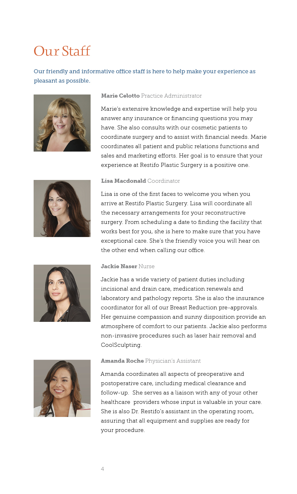
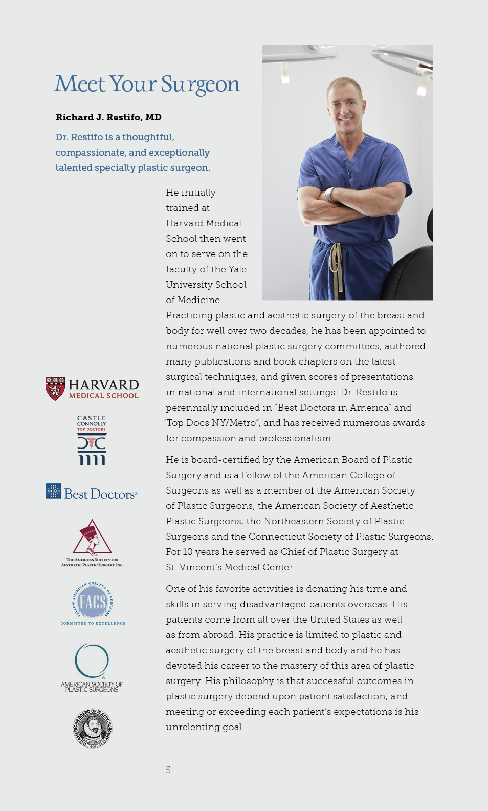
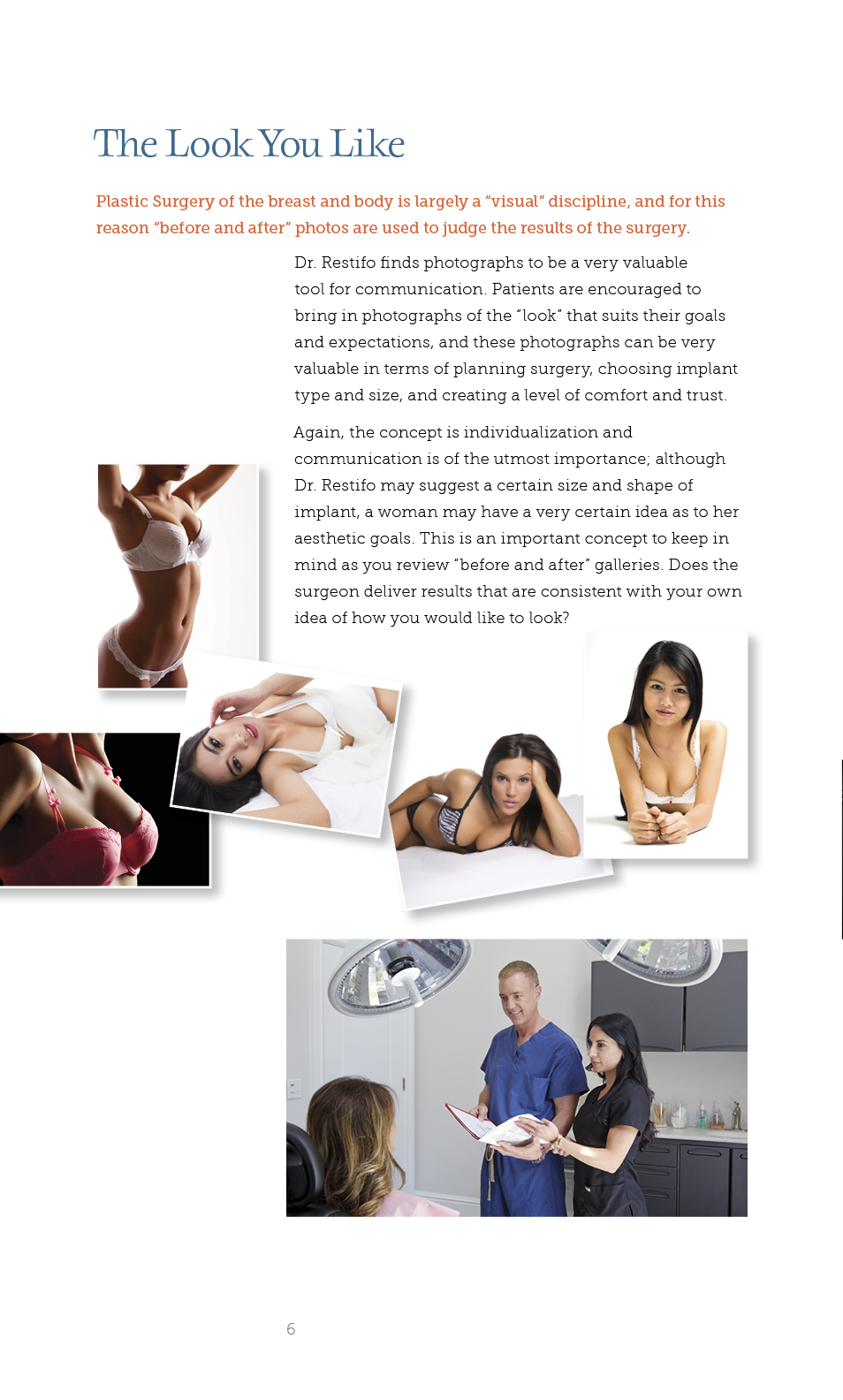
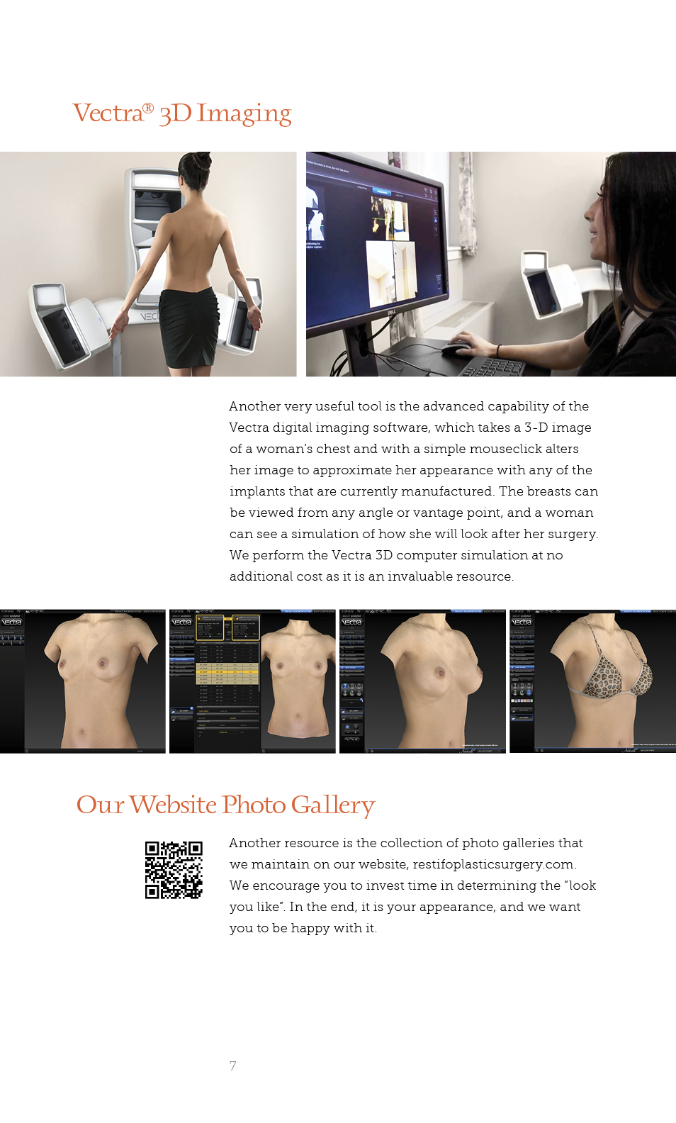
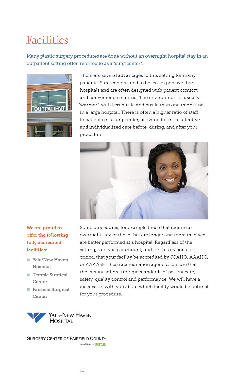
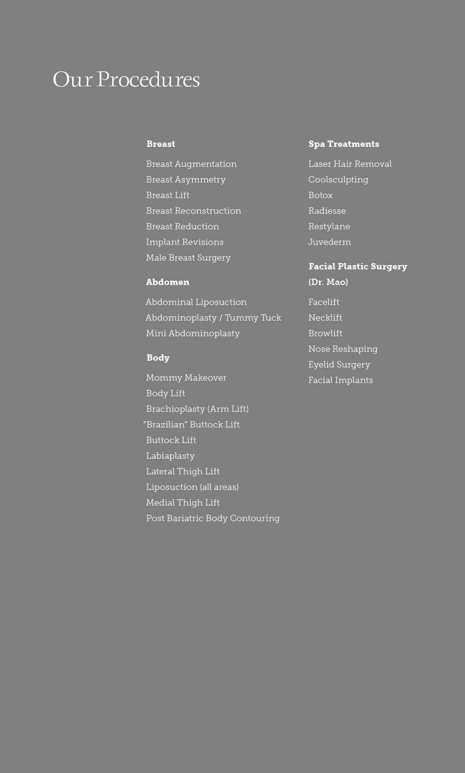
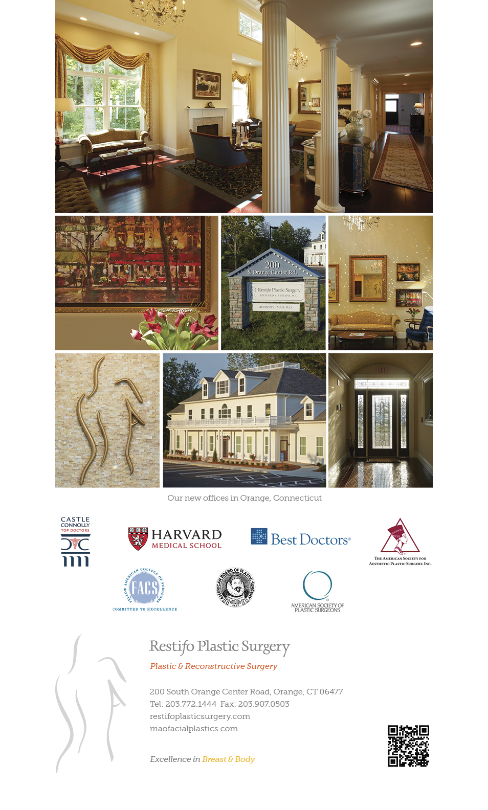
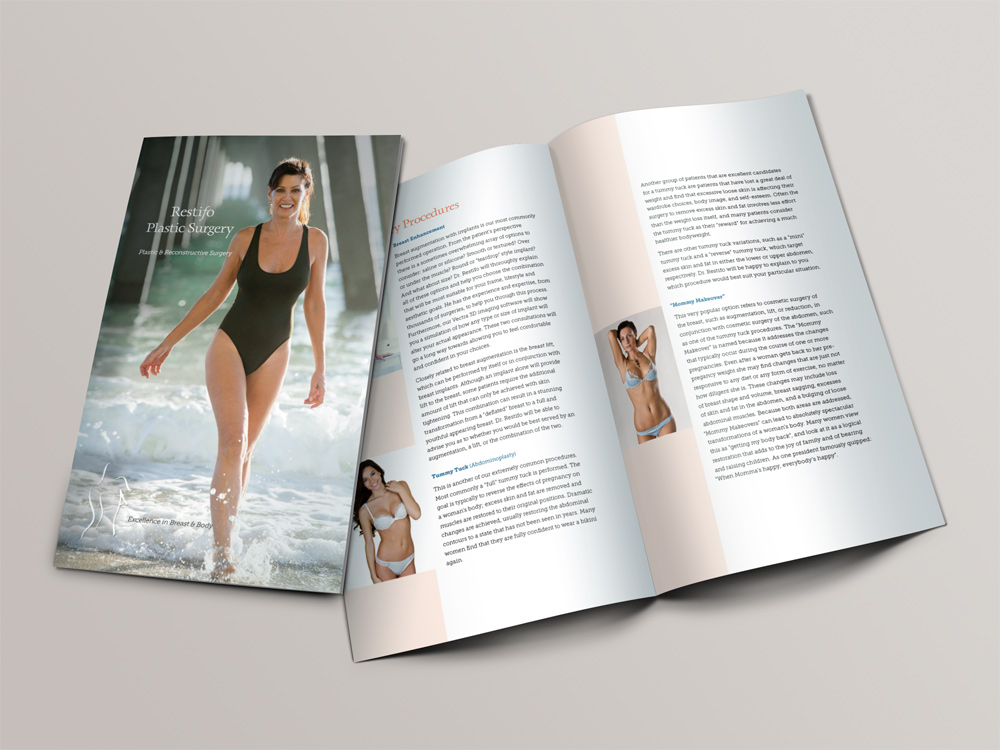
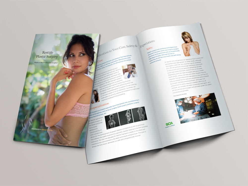
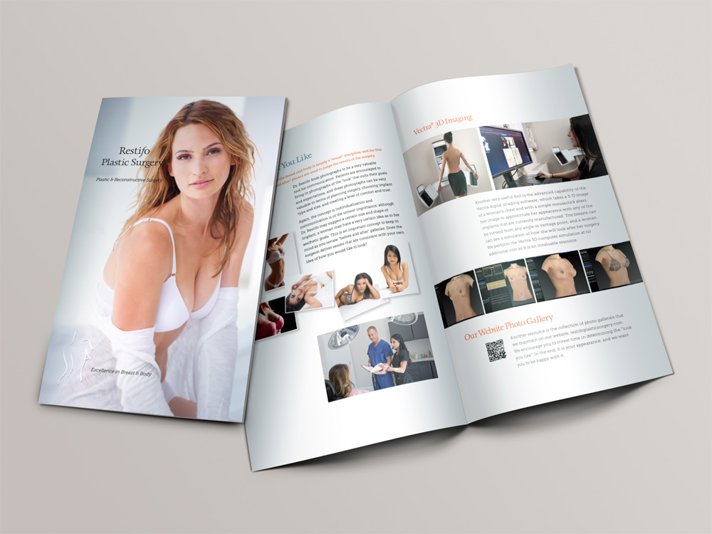
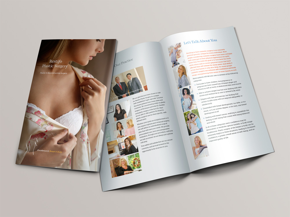
was beginning the process of moving their offices to a larger, more contemporary building and wanted to use that occasion to publish a new brochure. Dr. Restifo wondered how he might tailor the brochure to varied audiences. I thought it might make sense to print four different covers, each designed to appeal to a different audience. Those four covers, along with some of the interior spreads, are shown below. Some of the photography was by Tom Hopkins. We also used very high quality stock images for the covers and a few inside photographs.We also decided to create a folder which would hold the brochures and other materials. Some of those early attempts and layout options are detailed here.
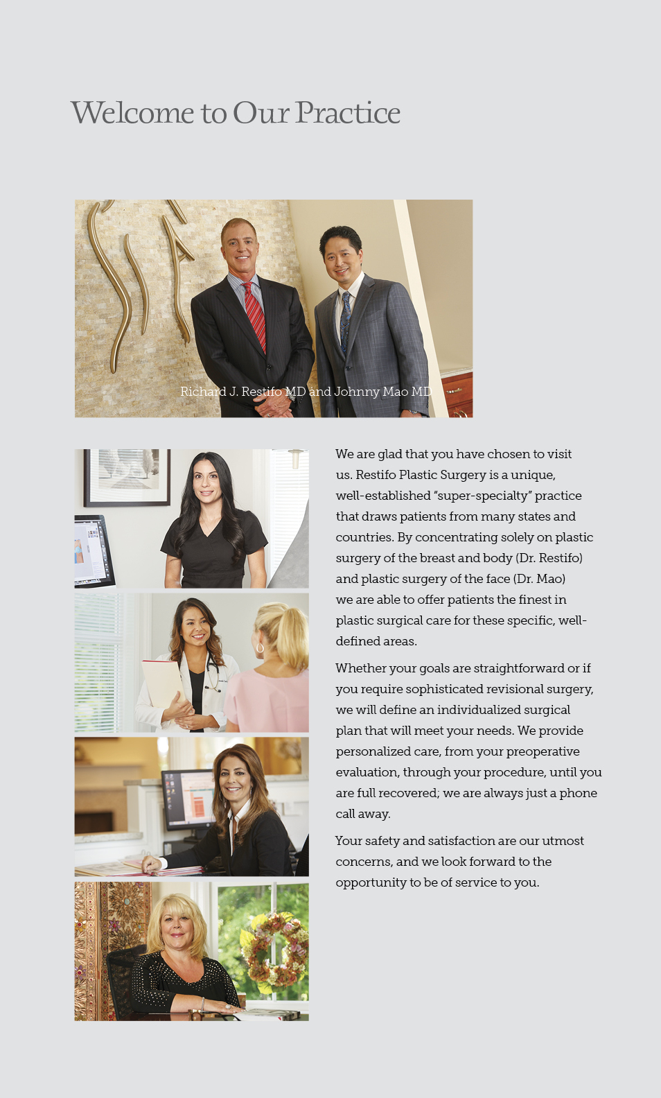

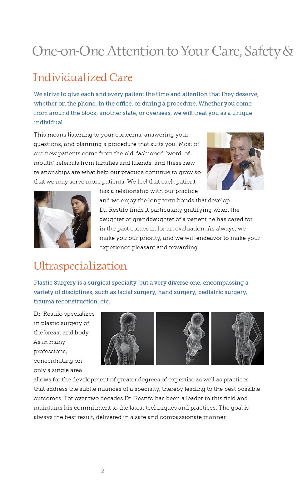
Good brochure graphic design relies on a clear visual structure that transforms complex information into an intuitive, tactile experience. Because a brochure unfolds in sequence, its layout must manage flow across multi-panel spreads, using grid alignment, consistent margins, and generous white space to prevent visual clutter. A strong front cover serves as the hook, combining a single high-impact hero visual with a crisp title to prompt the opening fold. Inside, a deliberate typographic hierarchy—using distinct header styles, readable body copy, and pulled quotes—guides the reader’s eye effortlessly from left to right. Ultimately, successful design bridges digital composition and physical production, ensuring that fold dimensions, CMYK color profiles, and paper textures work together to present a polished, professional brand message.