Download a PDF of This Page
“I like files. I like editing a CSS file without necessarily having to edit an HTML file. I like fixing a problem by replacing a corrupted file with a clean one. Maybe I’m set in my ways, but I don’t consider it a hardship to open a folder or replace a file.” Jeffrey Zeldman
A—HTML and CSS Overview
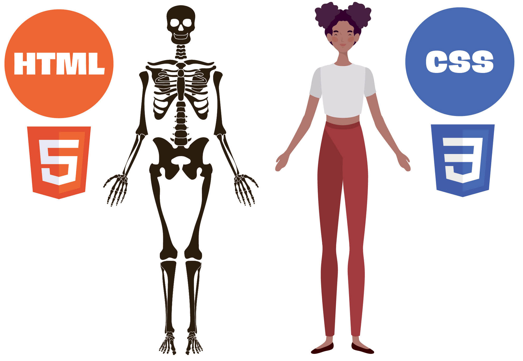
Graphic designers have embraced HTML (Hyper Text Markup Language) and CSS (Cascading Style Sheets) as powerful tools to bring their creative visions to life on the web. HTML serves as the backbone, structuring the content and elements of a website. Designers utilize HTML tags to define headings, paragraphs, images, links, and other components, laying the foundation for the visual hierarchy and information flow. This structural understanding empowers designers to create intuitive and user-friendly layouts that align with their design concepts.
CSS, on the other hand, is where the magic of visual design truly shines. By manipulating CSS properties, designers can meticulously control every aspect of a website’s appearance. From typography and color palettes to spacing, layout, and animations, CSS offers unparalleled flexibility to translate design concepts into stunning digital experiences. With CSS, designers can experiment with different styles, create interactive elements, and ensure their designs are responsive and adaptable to various screen sizes. This combination of HTML and CSS enables graphic designers to have greater control over the final product, resulting in websites that are not only visually appealing but also highly functional and engaging.
CSS, on the other hand, is where the magic of visual design truly shines. By manipulating CSS properties, designers can meticulously control every aspect of a website’s appearance. From typography and color palettes to spacing, layout, and animations, CSS offers unparalleled flexibility to translate design concepts into stunning digital experiences. With CSS, designers can experiment with different styles, create interactive elements, and ensure their designs are responsive and adaptable to various screen sizes. This combination of HTML and CSS enables graphic designers to have greater control over the final product, resulting in websites that are not only visually appealing but also highly functional and engaging.
B—The Basics of HTML and CSS
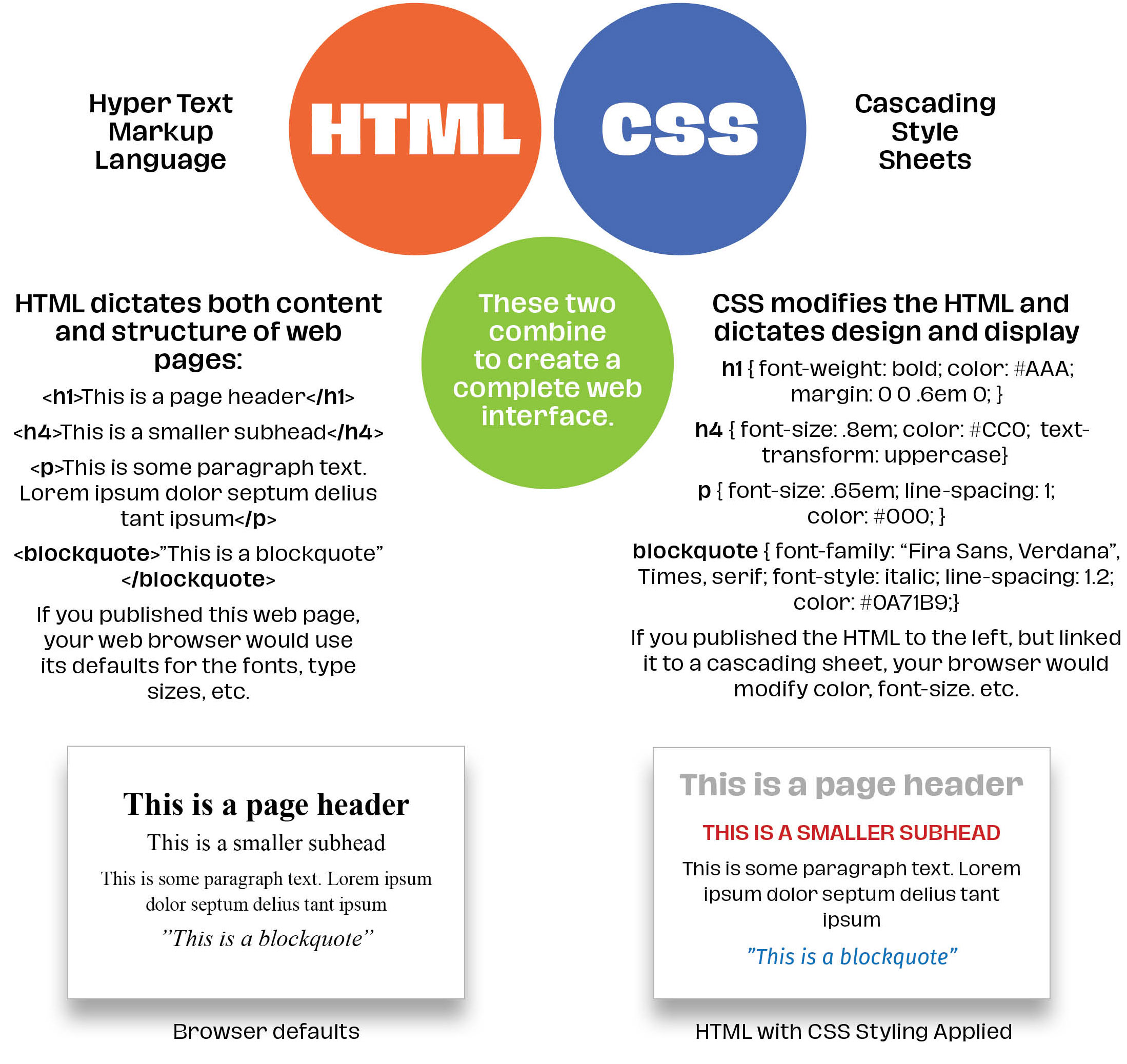
By using CSS that includes things like viewport sizes (a computer monitor vs. an iPhone or tablet) designers can adapt their websites to view as designed no matter how a visitor comes to their website. Some of this can also be dictated using relative sizes like em or rem or percentages. If done properly, relative measurements will also change as browser sizes change or a user switches from computer to phone. CSS allows us to change nearly everything about the content included in the HTML: fonts, colors, type size, etc.
C—Real World HTML and CSS
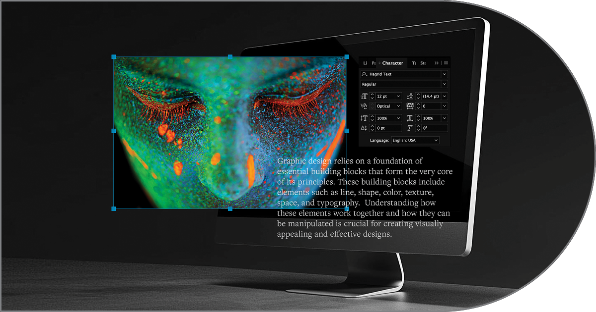
Below is section of another web page from the Granite Bay Design Building Blocks series. The sections below show the HTML for that page and just some of the many CSS “rules” that control the appearance of all of the pages in this series. The bold type below shows the HTML used and the CSS used to control its appearance. If we remove the code from the HTML, the text would switch to the browser’s default size, color, margins, and font, etc.
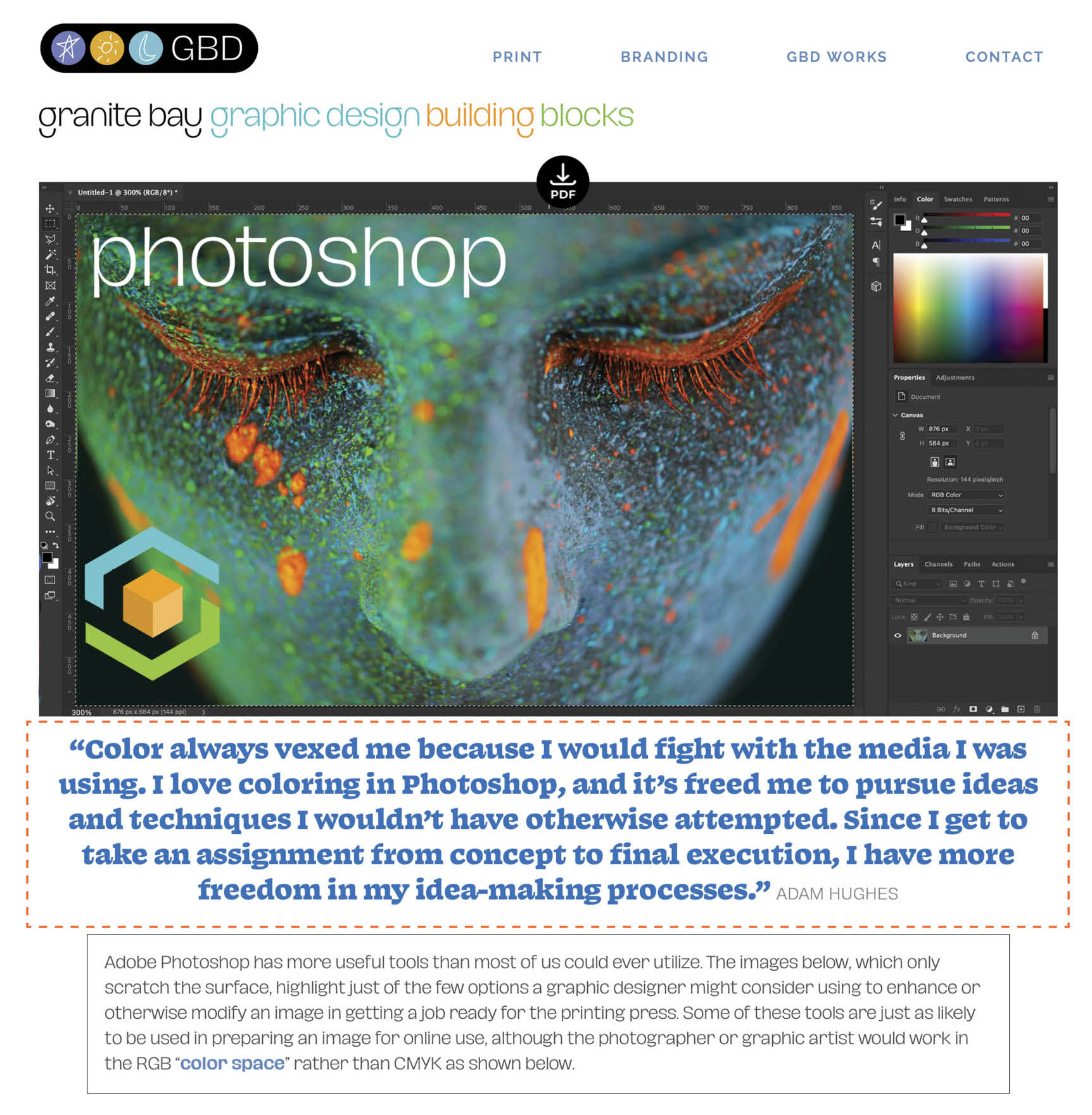
C1—Screenshot of another page in the Building Blocks series
C2—A portion of the HTML used to build the C1 page
The HTML code in bold orange bookends the quotation between the opening <div>and closing</div>
<img class=aligncenter wp-image-14295" src="https://granitebaydesign.com/wp-content/uploads/2024/04/NEW-Granite-Bay-Graphic-Design-Building-Blocks-White-Download-Arrow-Icon-I.png" alt="Granite Bay Graphic Design PDF Download Icon" width="24" height="32" /></div> </div> <div class="building-blocks-quote" "Color always vexed me because I would fight with the media I was using. I love coloring in Photoshop, and it’s freed me to pursue ideas and techniques I wouldn’t have otherwise attempted. Since I get to take an assignment from concept to final execution, I have more freedom in my idea-making processes." <span class="bb-quote-credit">Adam Hughes</span></div> <div class="bb-text-box">Adobe Photoshop has more useful tools than most of us could ever utilize. The images below, which only scratch the surface, highlight just of the few options a graphic designer might consider using to enhance or otherwise modify an image in getting a job ready for the printing press. Some of these tools are just as likely to be used in preparing an image for online use, although the photographer or graphic artist would work in the RGB "<a href="https://granitebaydesign.com/graphic-design-building-blocks-tutorials-step-by-step-rgb-cmyk-color-spaces" target="_blank" rel="noopener">color space</a>" rather than CMYK as shown below.</div> <div><span class="bb-on-this-page">On This Page:</span><a href="#ps-anchor-a"> <span class="bb-anchor-button">A—Photoshop and Conventional CMYK Printing</span></a><a href="#ps-anchor-b"><span class="bb-anchor-button">B—When 4 Colors Aren’t Enough—Black Touch Plate on Uncoated Stock</span></a><a href="#ps-anchor-c"><span class="bb-anchor-button">C—When 4 Colors Aren’t Enough—New Channels for More Colors</span></a><a href="#ps-anchor-d"><span class="bb-anchor-button">D—Using CMYK Curves to Alter Overall Color</span></a><a href="#ps-anchor-e"><span class="bb-anchor-button">E—Using Hue / Saturation to Alter Overall Color</span></a><a href="#ps-anchor-more"><span class="bb-anchor-learn-more">Learn More About Graphic Design Building Blocks</span></a></div> <div id="ps-anchor-a"></div> <img class="aligncenter size-full wp-image-3262" src="http://granitebaydesign.com/wp-content/uploads/2022/10/White-Spacer-2000-x-10.jpg" alt="" width="2000" height="10" /> <div class="bb-bold-serif-sub">A—From Photoshop to Press: Conventional 4-Color (Process)</div>
C3—A portion of the CSS that styles the web page elements
The CSS in bold orange style the HTML class of “building-blocks-quote”
.building-blocks-quote {
	color: #0271BB;
	font-size: 1.6em;
	text-align: center;
	line-height: 1.2;
	margin-bottom: .86em;
	letter-spacing: -.5px; }

.image-full-round {
	border-top-left-radius: 51%;
	border-top-right-radius: 51%;
	border-bottom-right-radius: 51%;
	border-bottom-left-radius: 51%;
	opacity: .7;
	position: relative;
	display: block; }

.image-full-round:hover {
	opacity: 1; }

body.bb-landing .one_fifth,
body.gbd-works-landing .one_fifth {
	padding-right: 1em; }

.bb-landing-circle-labels {
	color: #FFF;
	font-size: 1em;
	text-align: center;
	padding-top: .6em;
	opacity: .45; }

.bb-landing-circle-labels:hover { opacity: 1; }

body.bb-start .one_third,
body.building-blocks .one_third {
	width: 30%;
	margin: 0 12px 16px 0; }

body.bb-start {background-image: url(“http://granitebaydesign.com/wp-content/uploads/2024/05/Floating-Cube-Granite-Bay-Graphic-Design-Building-Blocks-C.jpg”);
	background-repeat: no-repeat;
	background-size: 100%;
	background-position: center;
	background-position-y: -3em;
 background-color: #000;
	margin-left: 5.6em; }

.bb-start-main-head {
	font-size: 2em;
	line-height: 1.1;
	color: #FFF;
	text-align: center;
	margin: 3.4em 0 4.8em 0; }
.bb-start-intro-box {
	margin: 0 45% 0 39%;
	width: auto;
	height: auto;
	background-color: #000;
	opacity: .7;
	border-top-left-radius: 2em;
	border-top-right-radius: 2em;
	border-bottom-right-radius: 2em;
	border-bottom-left-radius: 2em;
	border: 1px solid  #FFF;}
Download a PDF of This Page
Learn More About Graphic Design Building Blocks

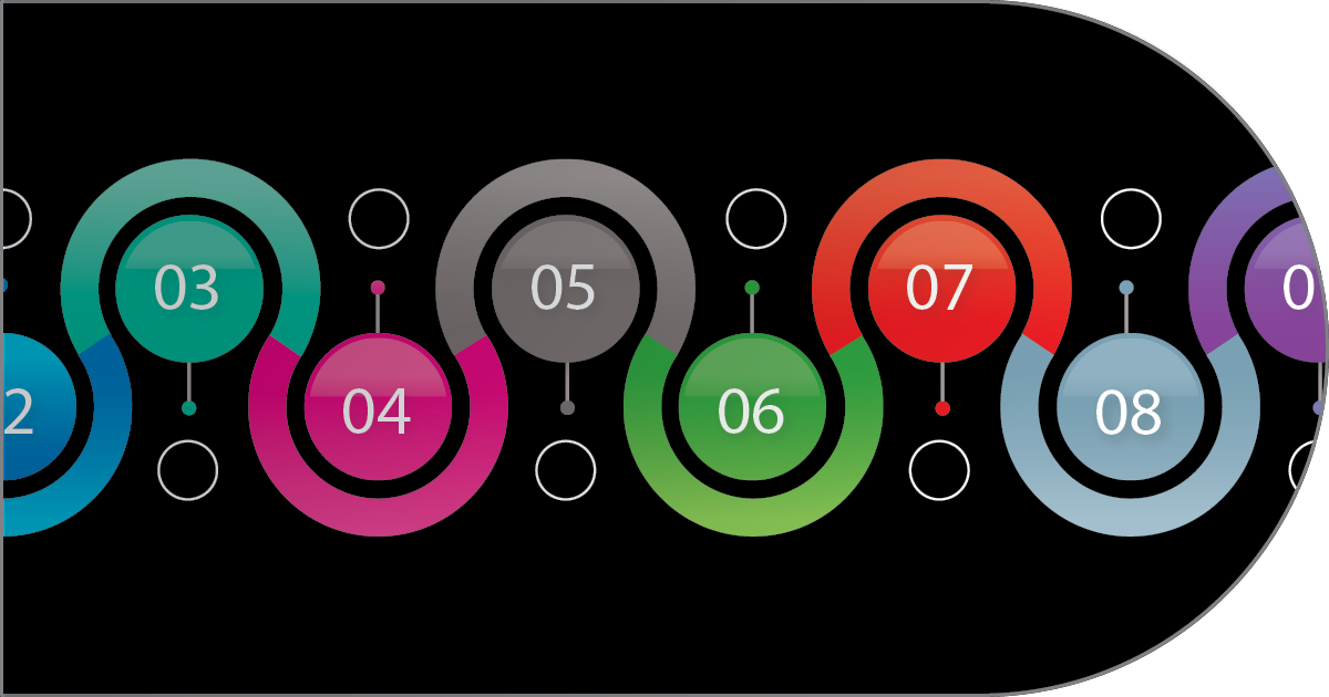
building blocks
start page

building blocks
start page

building blocks
start page

adobe photoshop

cmyk & rgb color spaces
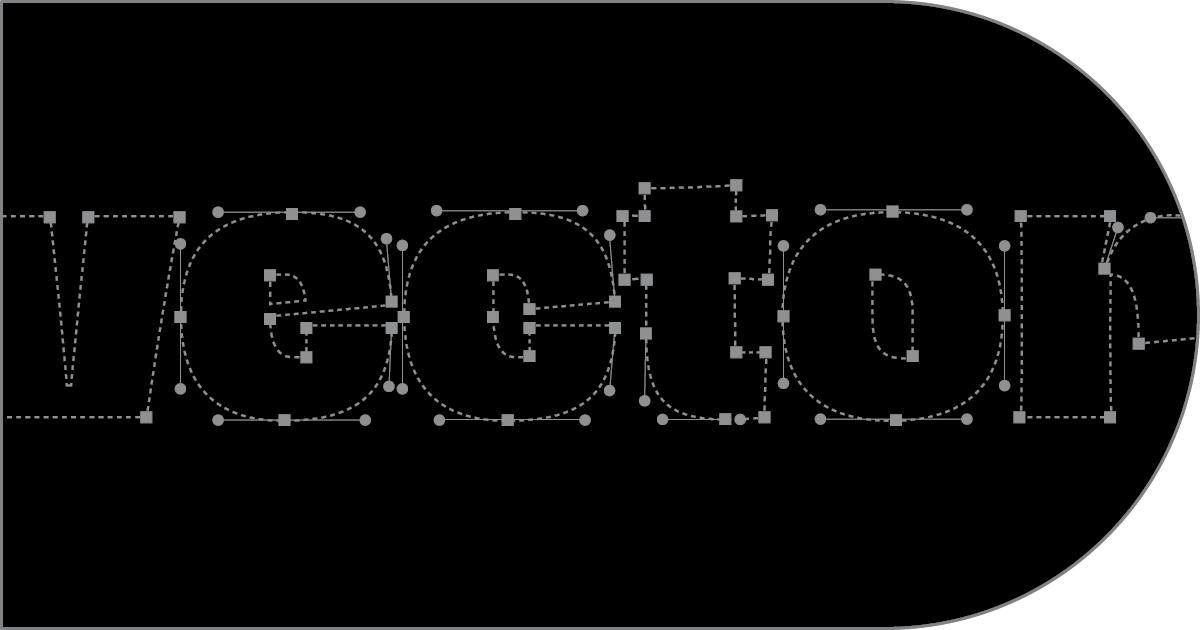
vector graphics
printing spot colors
photography
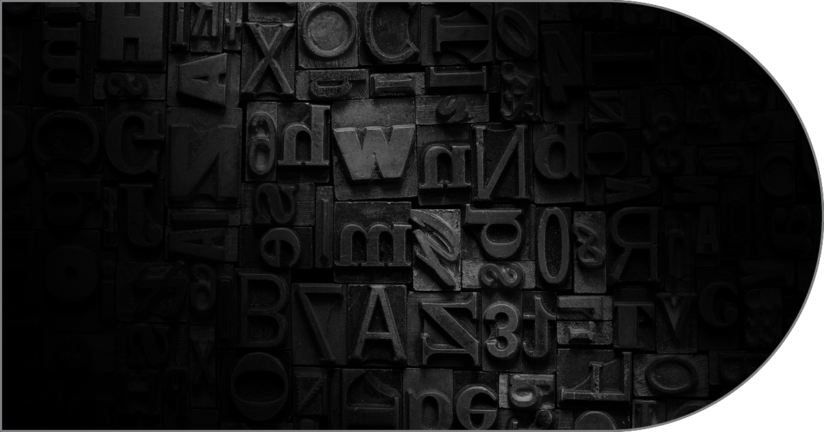
typography

white space
infographics
websites: css & html

creativity
way finding & signage
branding & identity
packaging
page makeup
paper