





Graphic Design Building Blocks 
Graphic Design Building Blocks: Page Makeup
Paul Rand
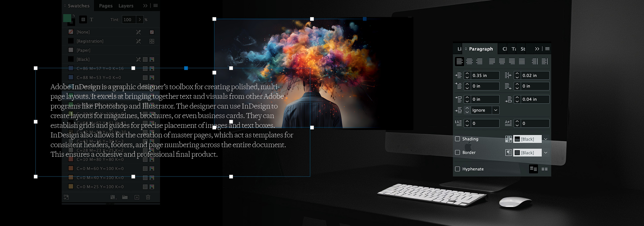
Below: Commonly Used InDesign Palettes
Below: In Adobe InDesign, palettes—often referred to as panels—are the foundational interface elements that drive control, efficiency, and precision in layout design. Operating as floating or docked utility hubs, panels like Swatches, Paragraph Styles, Pages, and Links house the specific controls needed to manage complex multi-page publication workflows. Rather than manually applying inline attributes, graphic designers rely on these palettes to establish structural consistency: the Swatches panel maintains precise print and digital color definitions (such as CMYK, spot colors, or RGB values), while the Character and Paragraph Style panels enforce rigid typographic hierarchies across hundreds of pages with a single click. By organizing, grouping, and saving customized palette workspaces, designers transform dense interface options into streamlined production pipelines, ensuring visual cohesion and rapid document management.
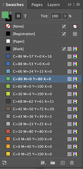
Swatches: This is our color palette. We can customize the default colors for every new document and add or change as many colors we need for each assignment.

Pages: We can create as many pages and spreads as we need and create as many “master” pages as we need allowing us to place objects and text and assign that master to any number of pages.
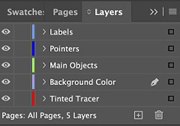
Layers: These allow us to place text and objects on different layers which can be reordered, locked or turned off.

Pathfinder: These tools allow us to modify objects. We can take two objects and combine them into a single object, subtract one object from another or divide objects a variety of ways.

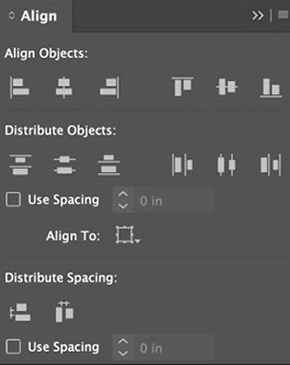
Align: This palette allows us to align any number of objects in any direction and allows us to select any number of objects and space them evenly horizontally or vertically,

Links: This is the control center for all of the images in a document. Here we can get info on an image, see its location on or computer change an image link and see if images are not linked.
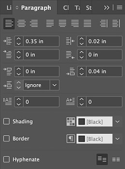
Paragraph: This useful palette allows us to select text and indent it left or right. We used this palette to set the space between the paragraphs in this document.
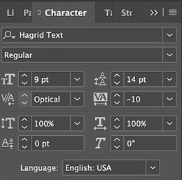
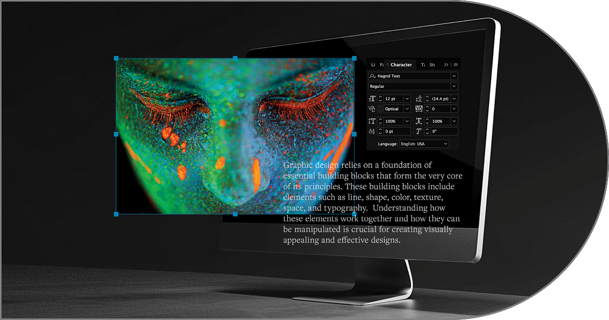
Character: Here we can select any text and set its font, font weight (regular, bold, italic, etc.), font size, leading, letter spacing, increase height or width and raise or lower characters.
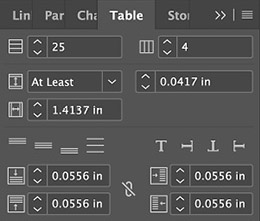
Table: This palette allows to create or modify tables, setting height, width and horizontal and vertical indents.
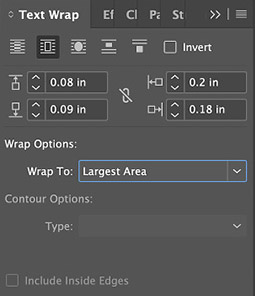
Text Wrap: The Text Wrap palette allows us select objects and create “runarounds”. This forces the text to wrap, using a rectangle or circle. We can set the spacing and further refine the wrap.
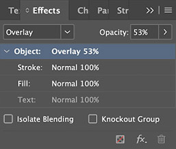
Effects: This palette allows us to select anything and apply effects, including transparency and a variety of other effects focused on lightening and darkening. Each effect can be set from 0–100%.
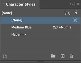
Character Styles: Using the settings from the Character palette (above) we can apply the style to any text. Any changes we make to the style are then applied to all text assigned to that style.
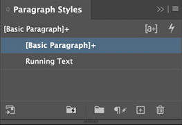
Paragraph Styles: Similar to the Character palette above except that these are assigned to a whole paragraph. Any changes to a style here affects all paragraphs assigned to that style.
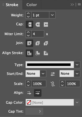
Stroke: Here we can apply or modify any lines (rules) in a document, assign weight (width or height), end caps, joins (corners), stroke allignment and male it solid or dotted, etc.
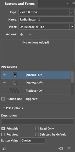
Buttons and Forms: This palette allows us to add those items to almost any object on a page before saving it as an interactive PDF. Buttons can link within the document or on the web. Lots of options.
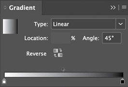
Gradient: This palette allows us to add that effect to any object, applying two or more colors, settiing it as linear or radial and setting any number of points for color transitions.
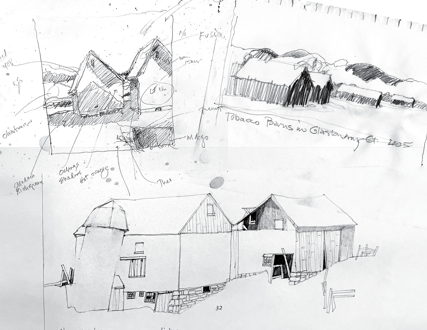
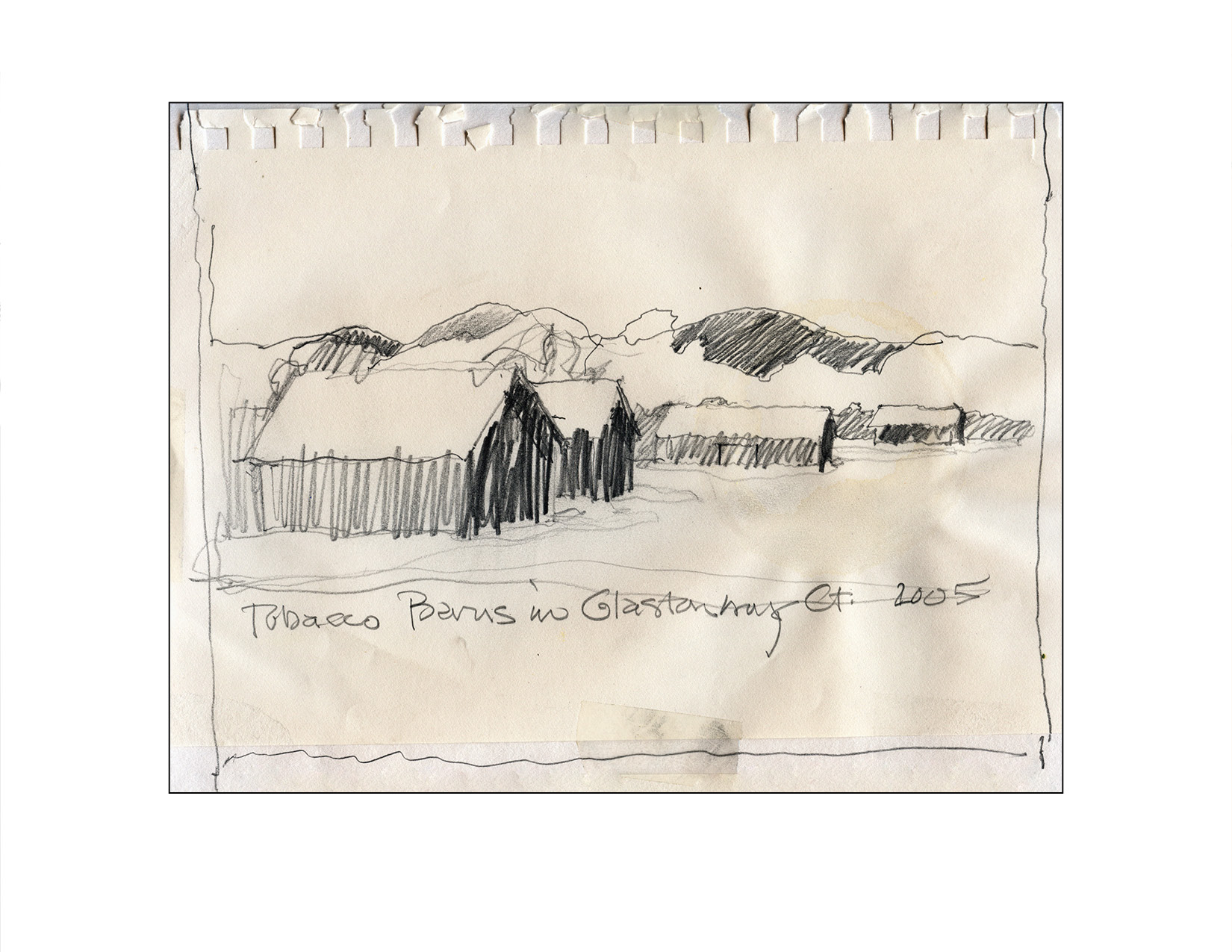
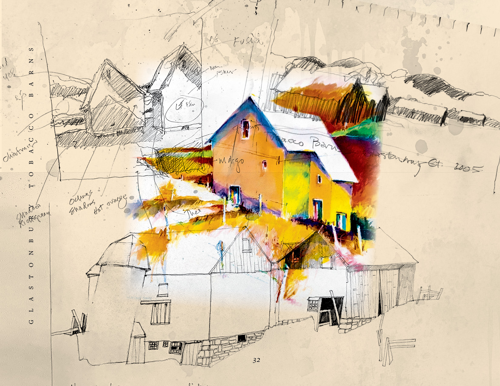
Below: Using InDesign’s Layers With Graphics to Create a Montage