GBD Works: ADA and Braille Wayfinding

QUINNIPAC UNIVERSITY AMERICANS WITH DISABILITIES ACT AND BRAILLE COMPLIANCE
ADA Overview
Americans with Disabilities Act (ADA) compliance in graphic design ensures that visual communication—spanning print layouts, digital marketing assets, websites, and electronic documents—is accessible to individuals with visual, auditory, cognitive, or motor disabilities. In digital media, ADA compliance aligns closely with the Web Content Accessibility Guidelines (WCAG 2.1/2.2 Level AA) and Section 508 standards, establishing concrete criteria for how visual information is presented. Accessible design is not merely a legal requirement for public-facing institutions and businesses; it represents a design philosophy that optimizes readability and usability for all users. Adopting these standards ensures that visual messages reach the widest possible audience without sacrificing aesthetic quality.
ADA Compliance for Quinnipiac University Wayfinding
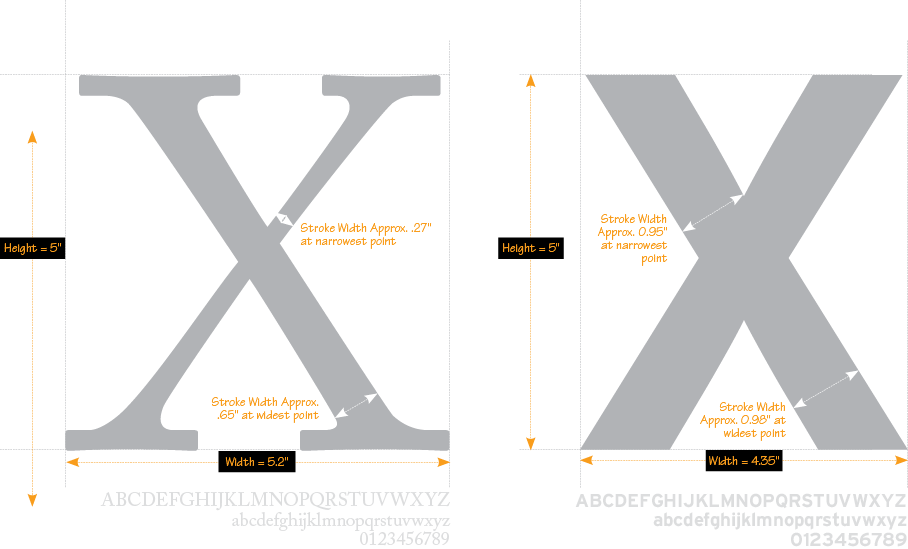
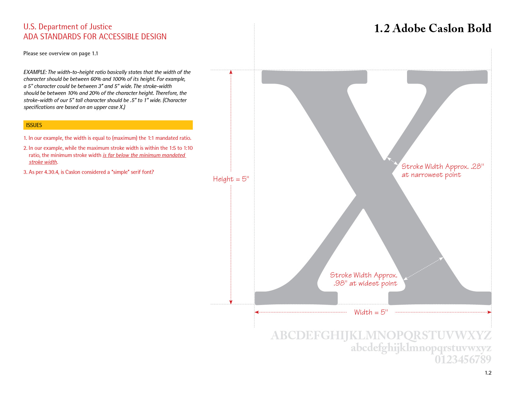
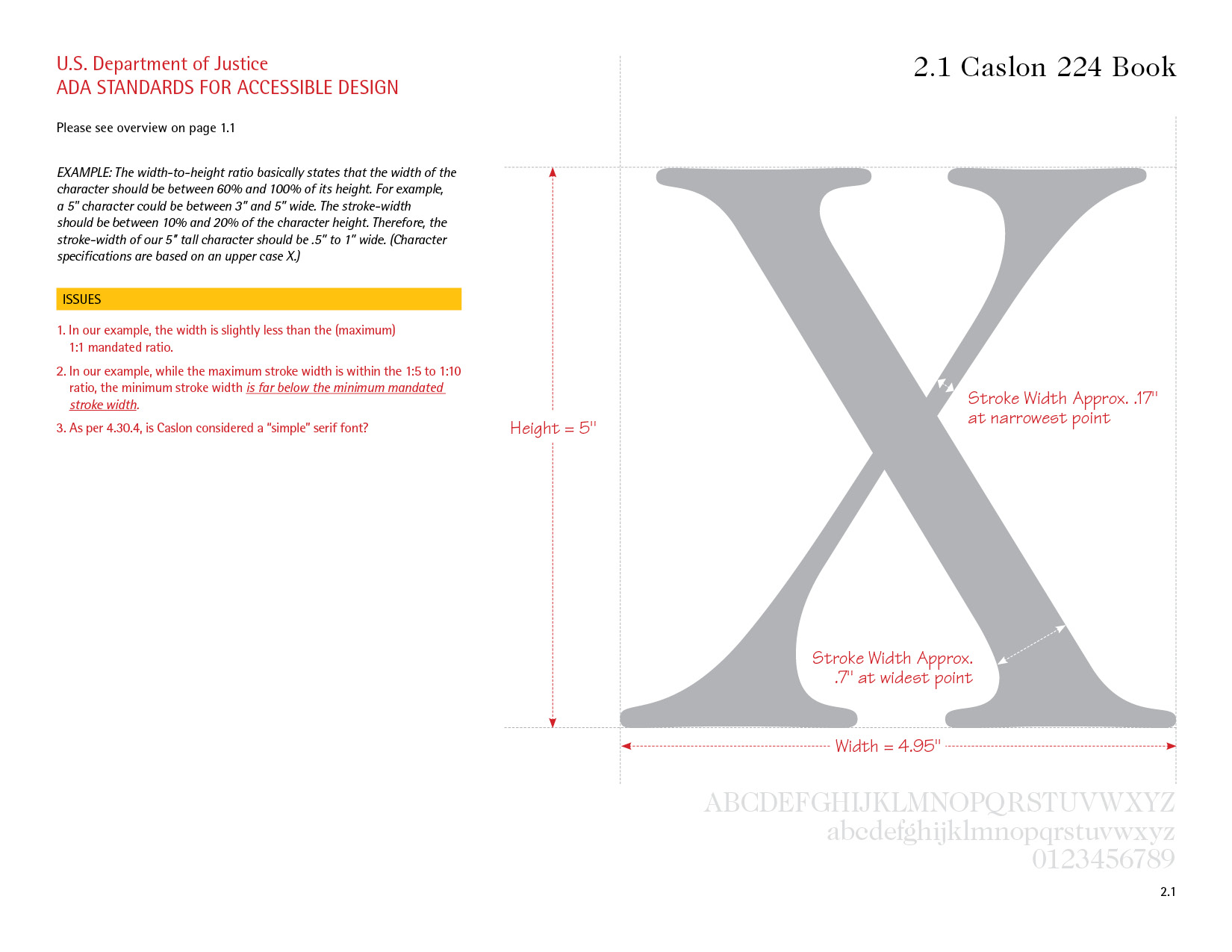
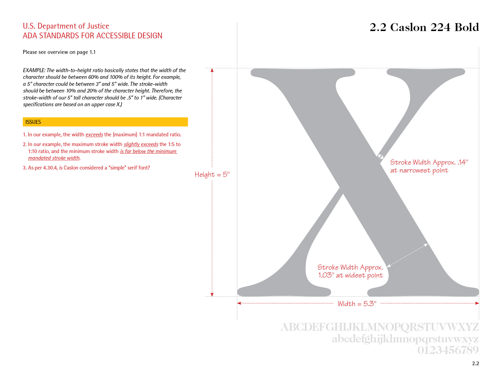
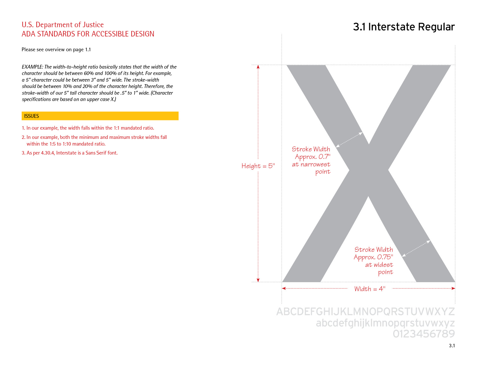
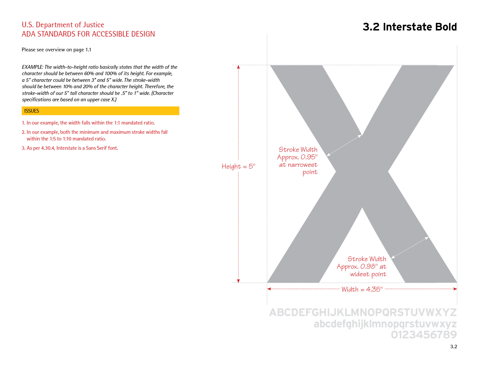
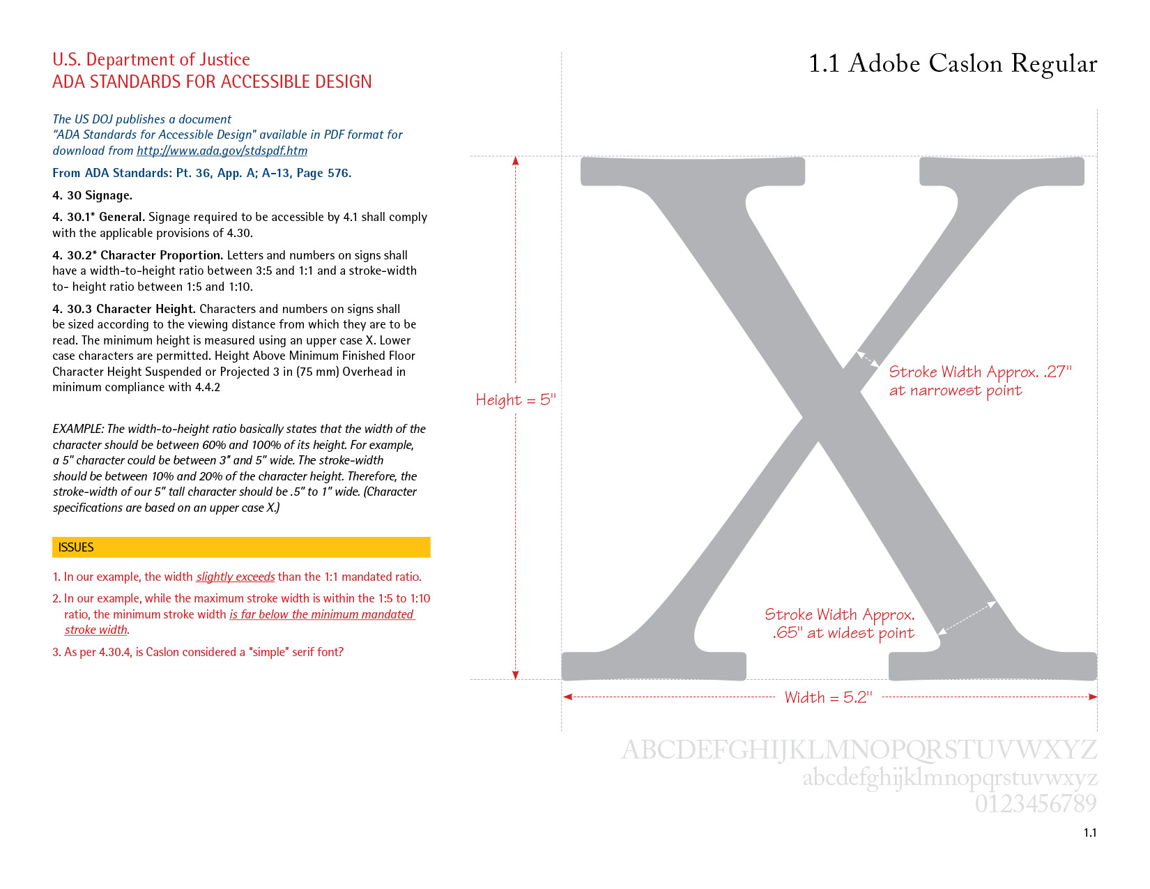
A primary pillar of accessible design is maintaining sufficient color contrast and avoiding reliance on color alone to convey meaning. Standard body text requires a minimum visual contrast ratio of 4.5:1 against its background, while large text (18 point or 14 point bold) requires a contrast ratio of at least 3:1 to remain readable for users with low vision or age-related visual decline. Furthermore, graphics must accommodate color vision deficiencies, such as red-green color blindness, by supplementing color indicators with shape, texture, icons, or explicit text labels. For instance, an interactive button or data visualization should rely on distinct visual cues or underlined text rather than hue changes alone to communicate state changes or distinctions.
Use of Braille for Quinnipiac University Wayfinding
Below: Excerpts of two (of hundreds) graphics by Granite Bay Graphic Design for Quinnipiac University’s extensive way finding manuals.
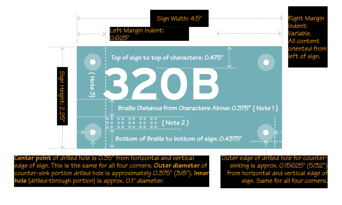
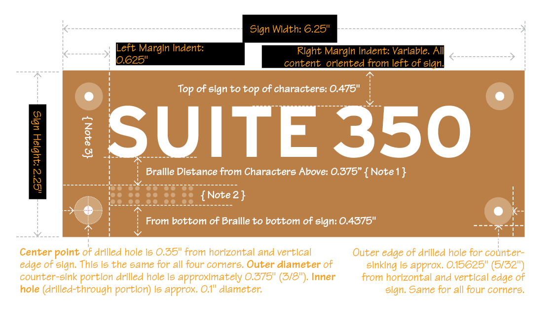
Inclusive graphic design bridges the physical and digital worlds by integrating tactile elements like Braille alongside strict adherence to ADA and WCAG accessibility compliance. In physical print and environmental graphic design, complying with ADA Standards for Accessible Design requires incorporating raised, tactile lettering paired with Grade 2 Braille—placed at precise mounting heights and locations to ensure individuals who are blind or low-vision can navigate physical spaces independently. In the digital realm, accessibility relies on the Web Content Accessibility Guidelines (WCAG 2.1 AA) to govern how content is structured and presented on screens. Design layout plays a central role in both environments: digital interfaces must enforce strong luminance contrast ratios (at least 4.5:1 for standard body text and 3.0:1 for large text or UI components) and clear typography, while print designs must pair readable, non-decorative typefaces with spatial planning that allows tactile features to coexist naturally with visual graphics. When designers synthesize physical tactile standards with digital WCAG guidelines, they ensure that branding, wayfinding, and visual communication remain fully usable for audiences across the complete spectrum of visual ability.
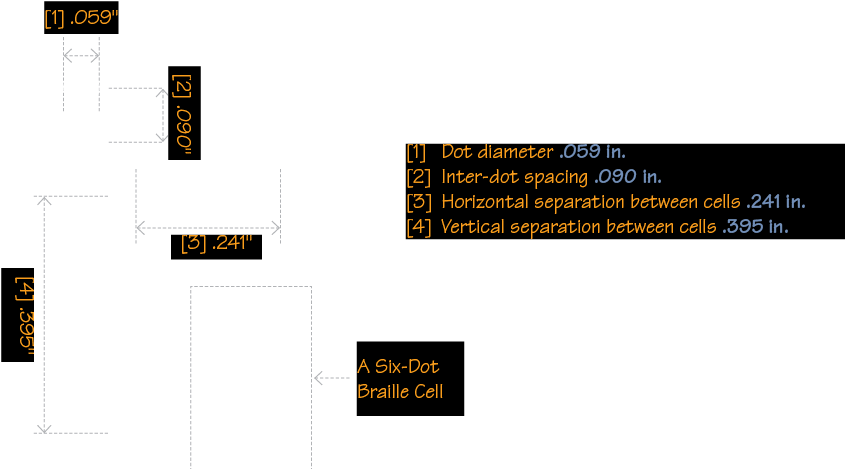
Below: Enlargement of Braille specifications by Granite Bay Graphic Design for Quinnipiac University’s extensive way finding manuals.
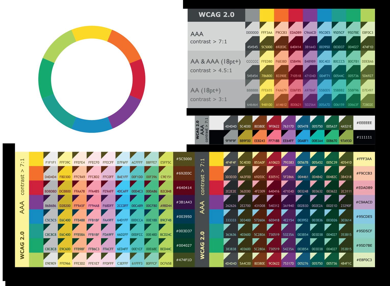
ADA compliance for digital platforms relies directly on the Web Content Accessibility Guidelines (WCAG) to establish legal standards for accessible color selection. While the Americans with Disabilities Act mandates equal access, it does not outline technical design specifications itself; instead, courts and regulatory bodies look to WCAG standards—specifically Level AA compliance—to judge whether digital content is accessible. WCAG evaluates color accessibility primarily through contrast ratios, measuring the relative luminance between text or functional elements and their backgrounds to accommodate users with low vision or color vision deficiencies. Under WCAG 2.1 Level AA, standard body text must maintain a minimum contrast ratio of 4.5:1, while large text (at least 18pt or 14pt bold) and non-text interactive components, such as form field borders and icons, require a minimum ratio of 3.0:1. Additionally, WCAG Success Criterion 1.4.1 dictates that color must never be the exclusive visual indicator for conveying information, requiring supplementary cues like underlines, patterns, or textual labels so that information remains fully accessible regardless of color perception.
ADA Compliant Colors
Below: ADA color compliance ensures that digital assets—such as websites, mobile applications, and electronic documents—are accessible to individuals with low vision, aging eyes, or color vision deficiencies. While the Americans with Disabilities Act itself does not specify exact color metrics, U.S. federal courts and regulatory enforcement rely on the Web Content Accessibility Guidelines (WCAG) Level AA as the technical standard for compliance. The primary technical requirement is maintaining adequate color contrast: standard body text must have a luminance contrast ratio of at least 4.5:1 against its background, while large text (18pt+ or 14pt bold+) and essential user interface components require at least 3:1. Additionally, ADA compliance prohibits using color as the only visual indicator for meaning—for instance, form errors, links, or visual charts must incorporate supplementary cues such as text labels, underlines, bold weight, or distinct icon shapes. Implementing compliant color systems protects organizations from legal liability while creating legible, universally usable digital experiences.