
GBD Works: Quinnipiac University “The Crescent” Wayfinding 01

MADISON FLOWER SHOP ANNIVERSARY BROCHURE: USING A TOUCH PLATE TO MAKE IMAGES POP ON UNCOATED PAPER (1/3)
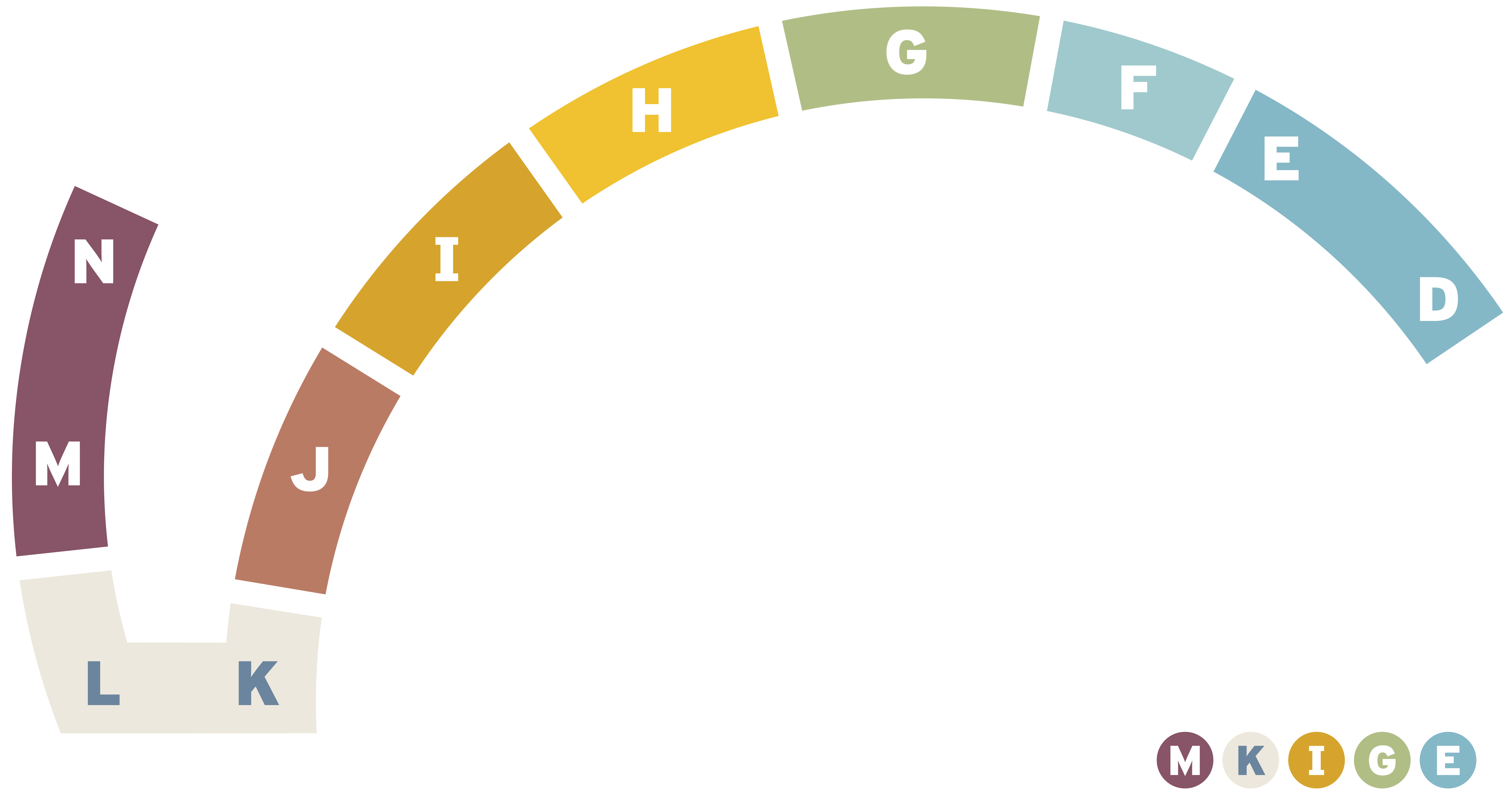
Effective wayfinding seamlessly guides people through complex physical or digital environments by relying on spatial logic, visual hierarchy, and intuitive design rather than overwhelming users with excessive signage. When implemented thoughtfully, it eliminates cognitive friction and navigation anxiety by answering four essential questions at every decision point: Where am I?, Where is my destination?, How do I get there?, and How do I return?. By combining high-contrast typography, universally recognized iconography, strategic lighting, and clear visual sightlines, effective wayfinding builds an inclusive, accessible ecosystem that empowers individuals to navigate unfamiliar spaces effortlessly and independently.



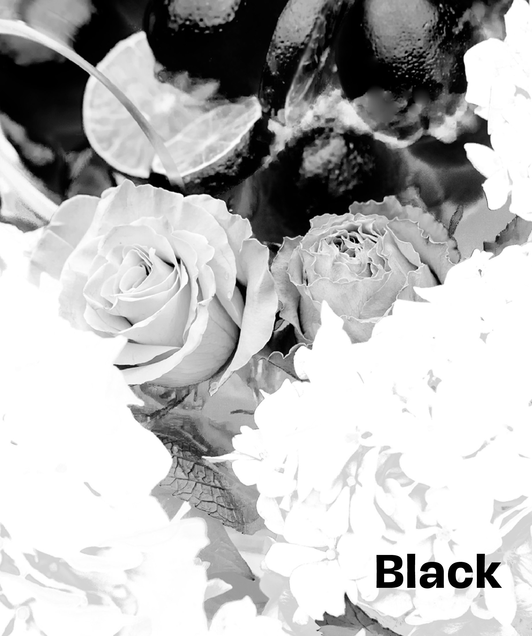
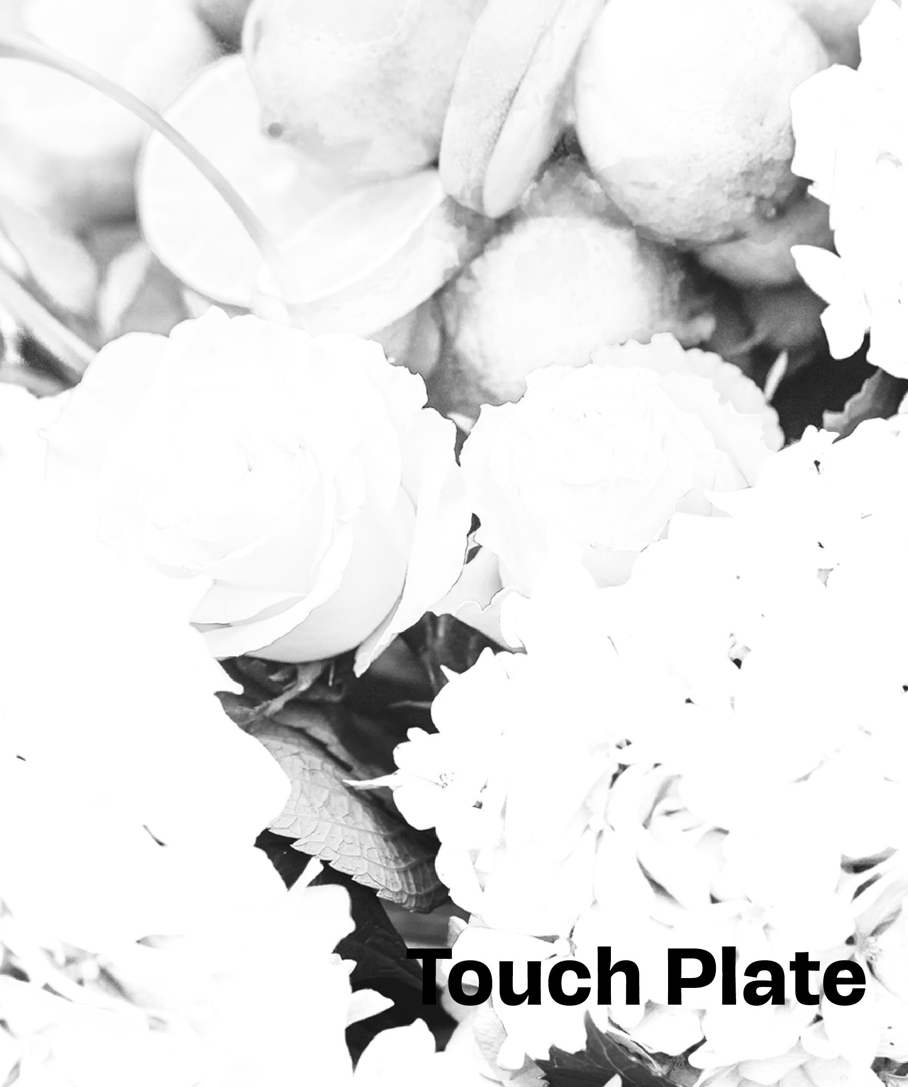
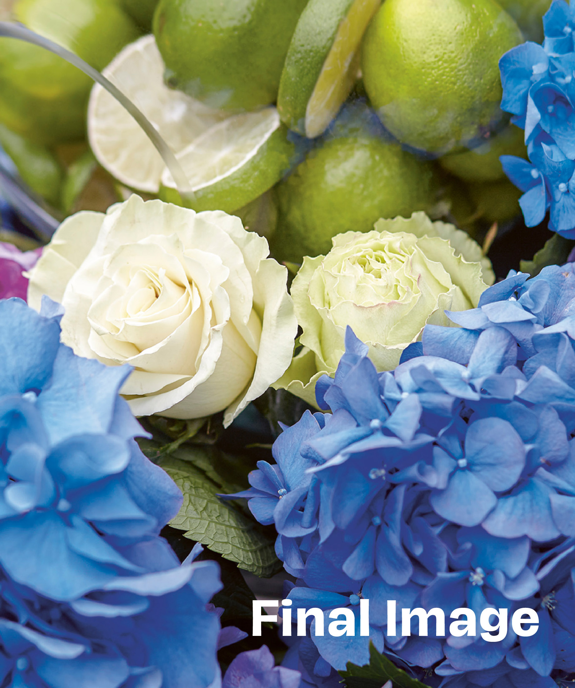
Working with Tom’s photographs in Adobe Photoshop, I started with the traditional four ink colors (cyan, magenta, yellow and black). I duplicated the black plate which became the black “Touch Plate”. Working on what was now a fifth plate, I “opened up” the lighter areas using the curves function in Photoshop until I had roughly about 1/2 to 2/3 of the original black in that plate. I then used Photoshop’s sharpening tools on that plate to add that extra touch of crispness on the uncoated sheet.
No one involved with the project had ever worked with a black “Touch Plate” before so we ran a press proof using the five-plates (four plates plus the black “Touch Plate”). The press proof was a success. The results actually exceeded everyone’s expectations and the brochure was a success.
GBDWORKS START PAGE