







Music at Yale Season Schedule/Calendar/Program
“Truly elegant design incorporates top-notch functionality into a simple, uncluttered form.”
David Lewis
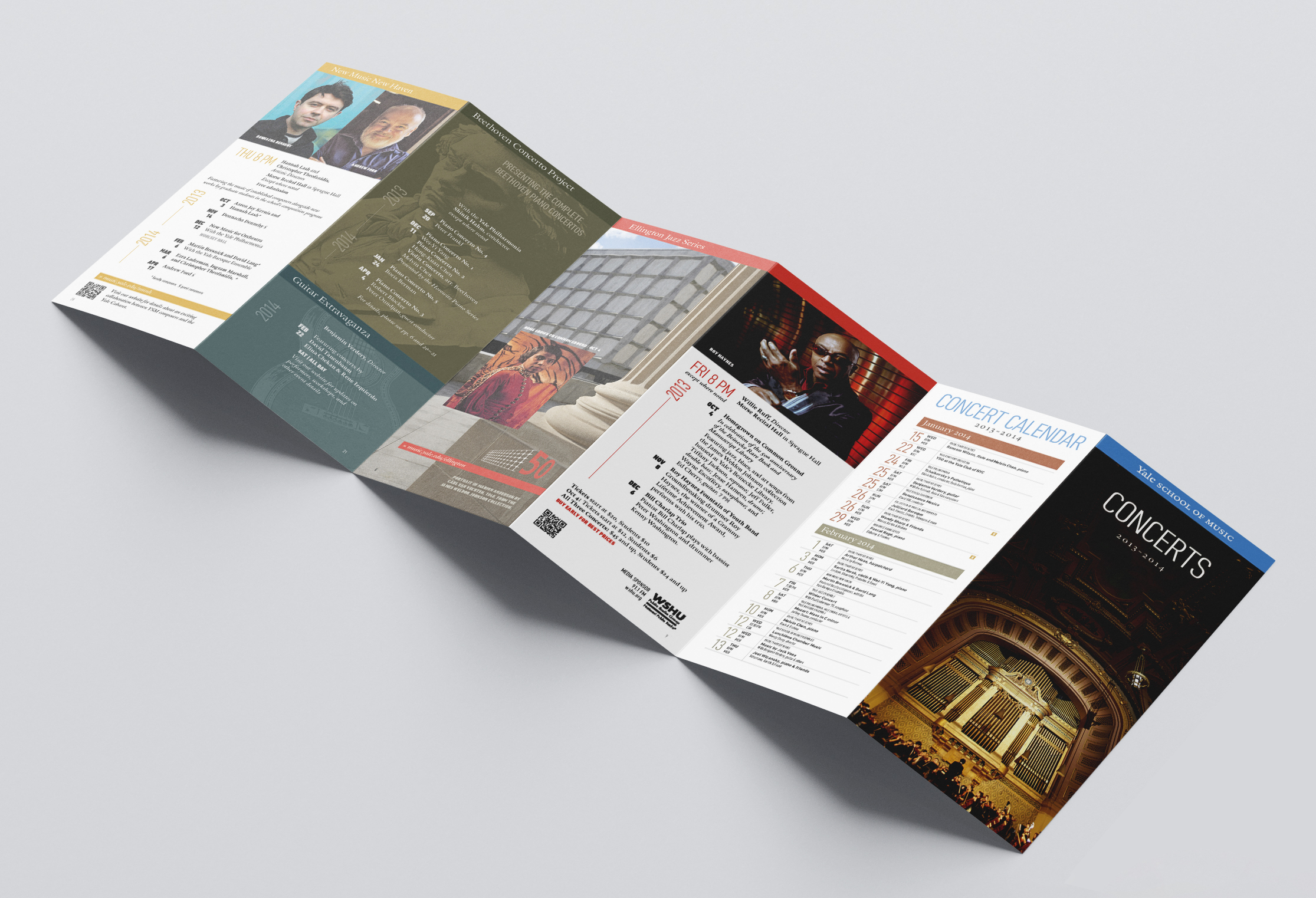
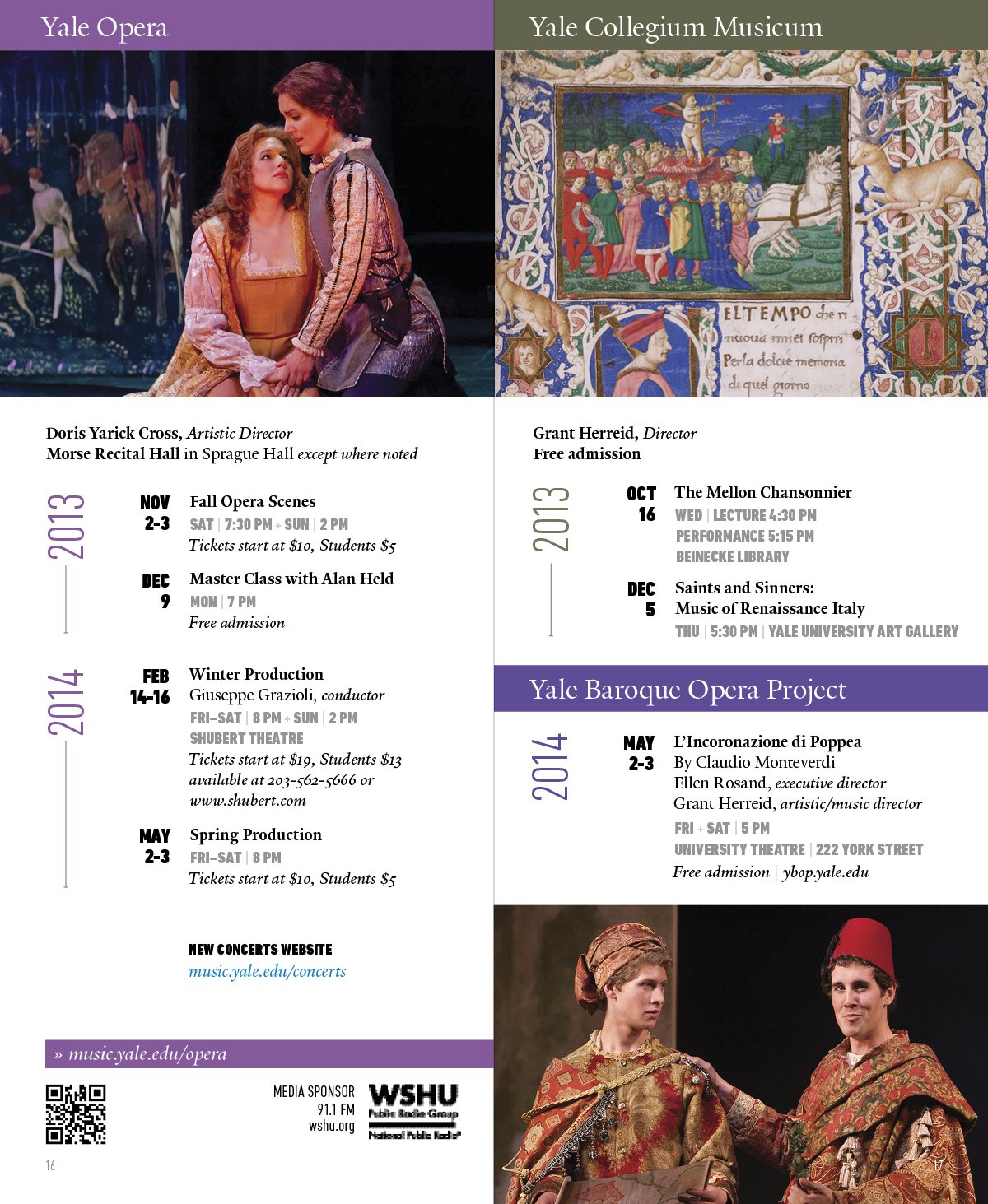
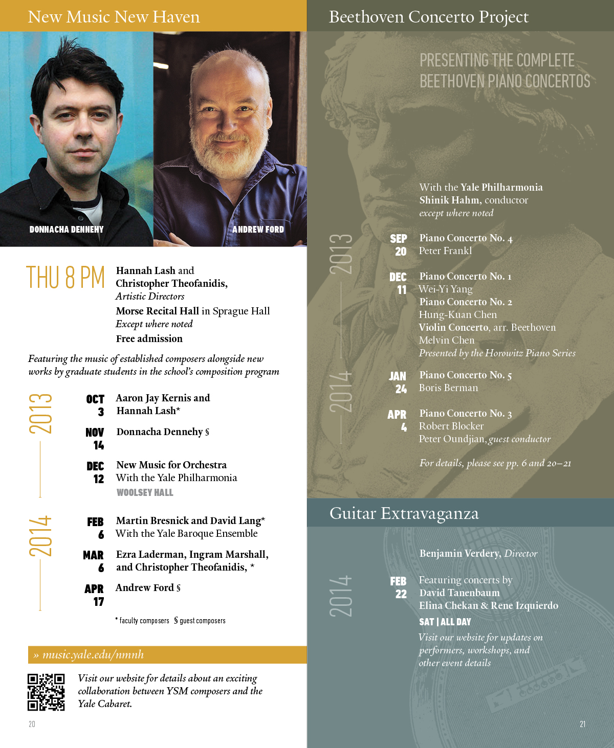
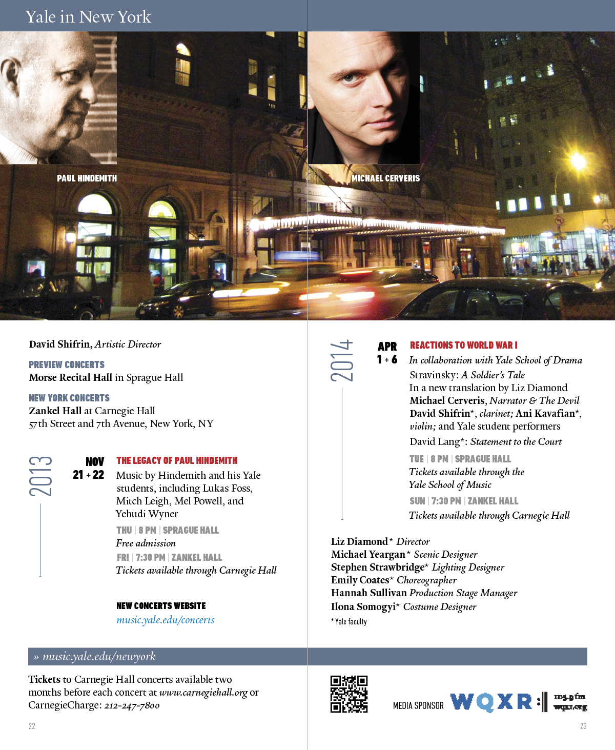
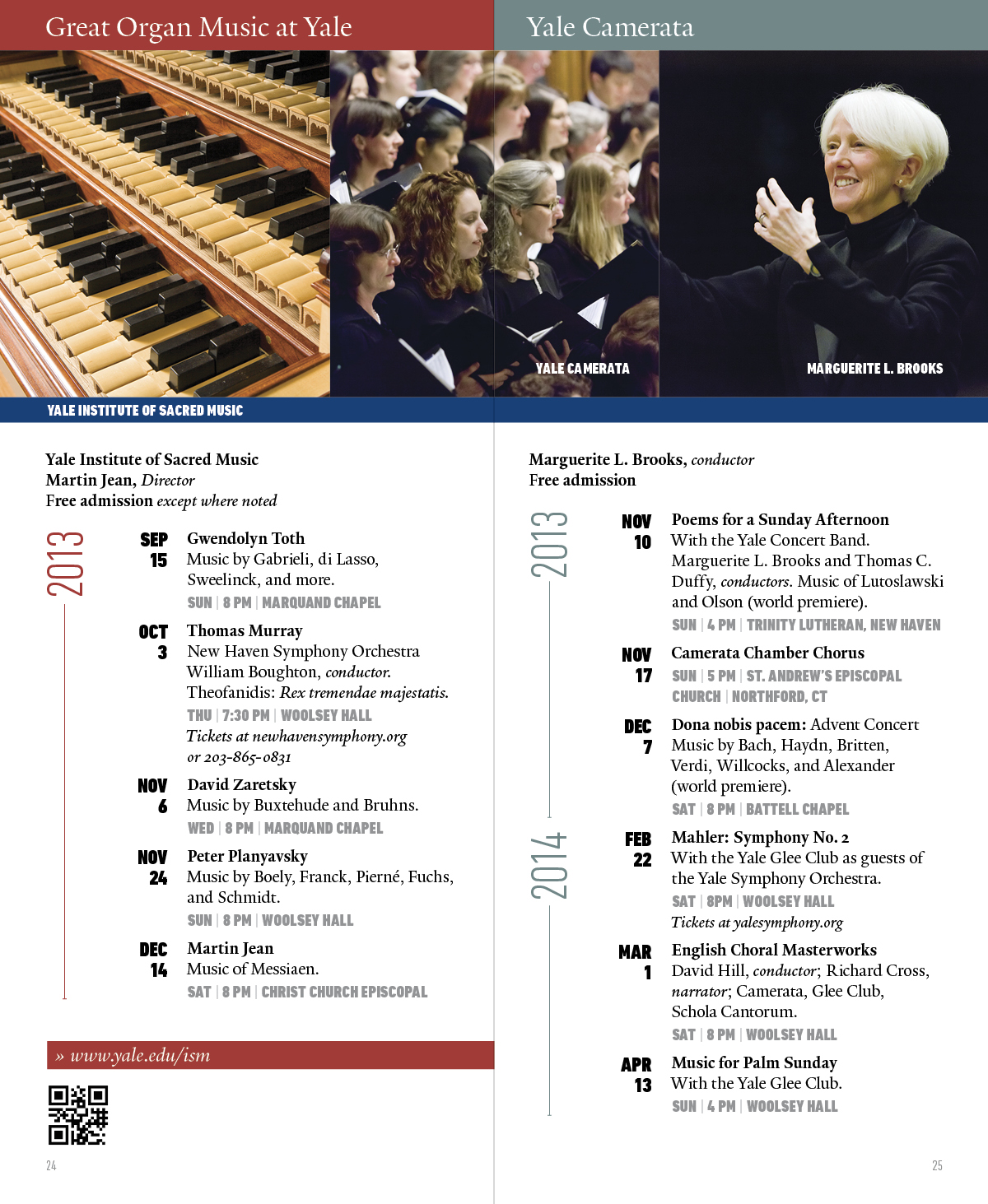
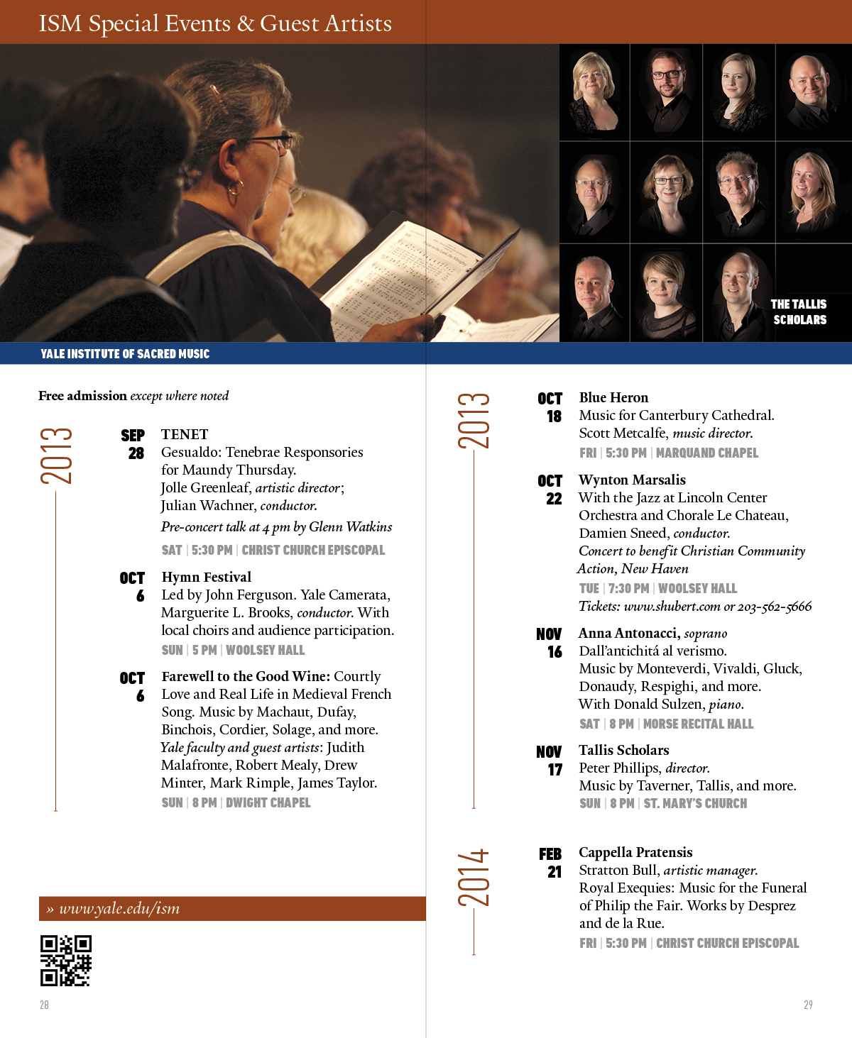
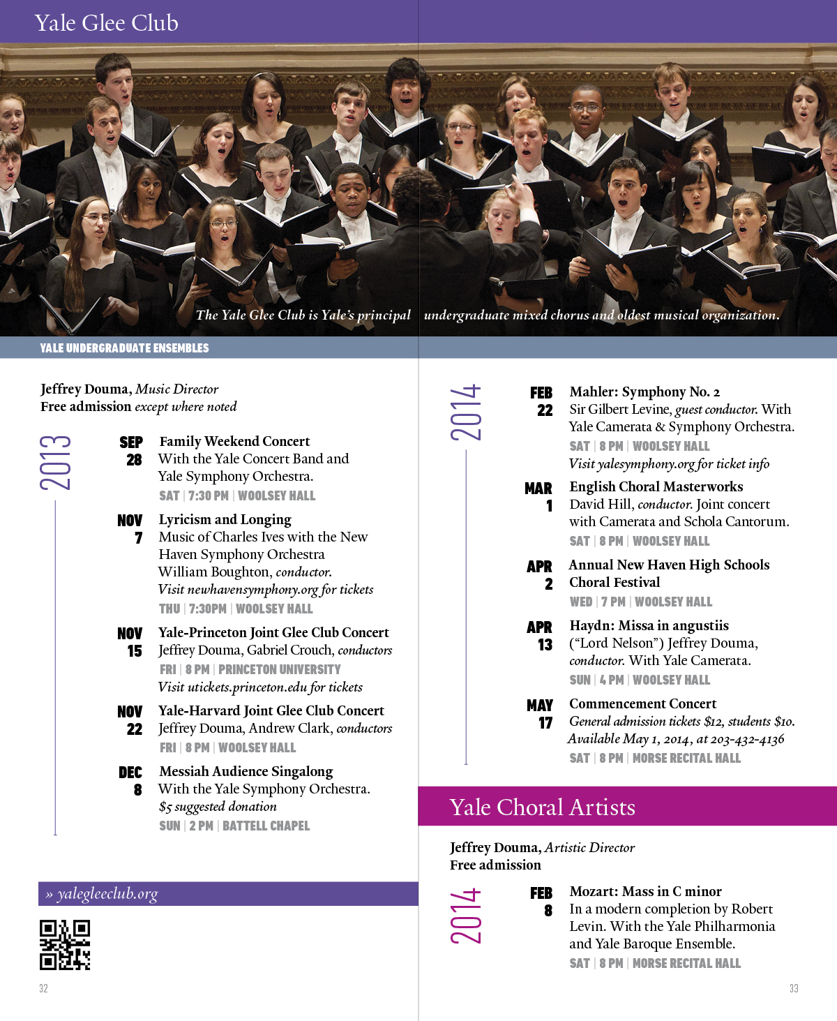
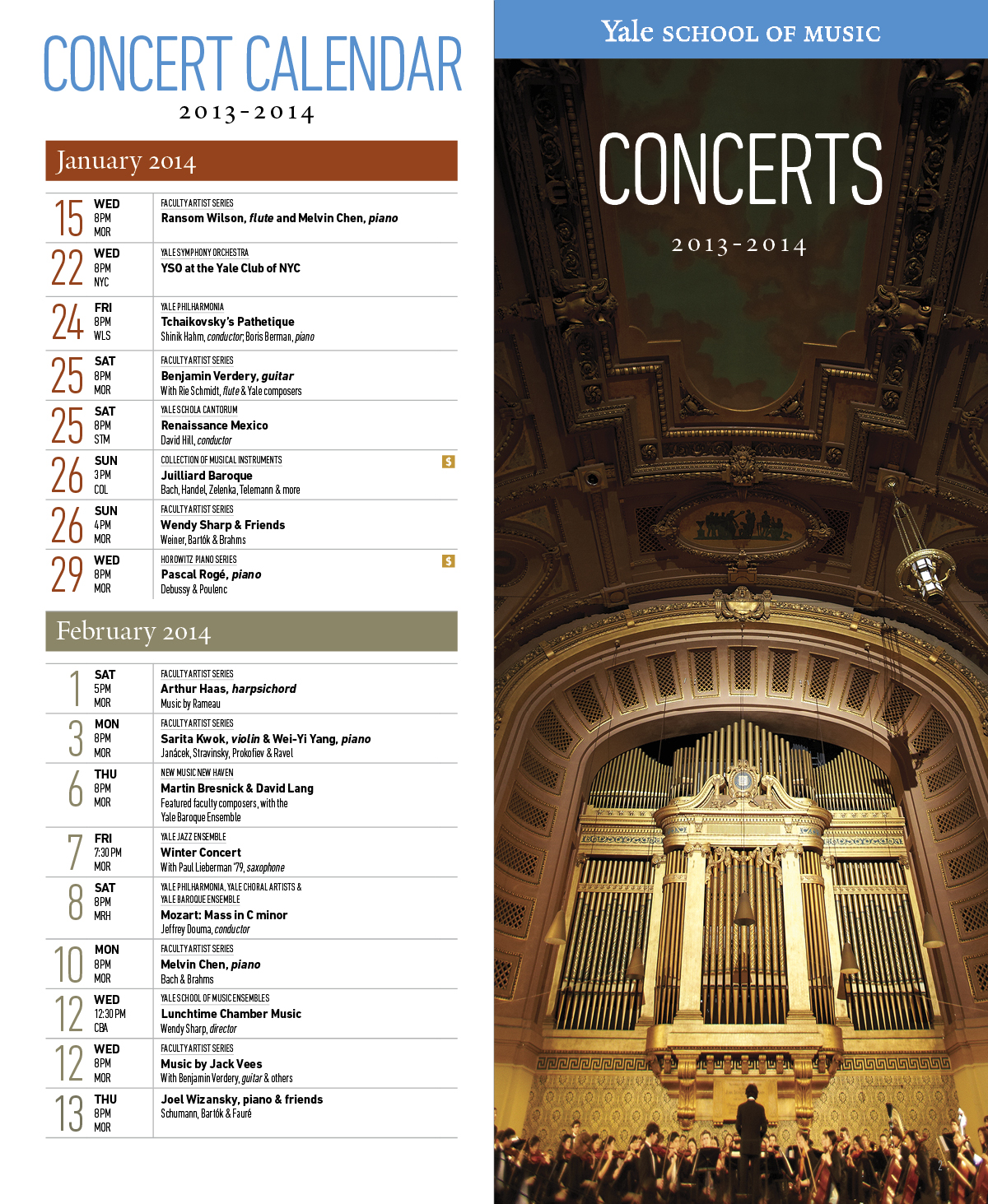
Granite Bay Design was tasked with creating a mailable concert calendar for the Yale University School of Music. The challenge was fitting a fair amount of content into a relatively small space. In addition to the interior 2-page spreads, we also came up with a 6-panel calendar fold-out which included the front cover and mailing panel. We think this solution addressed the assignment in a pleasing way, keeping everything legible and well-organized
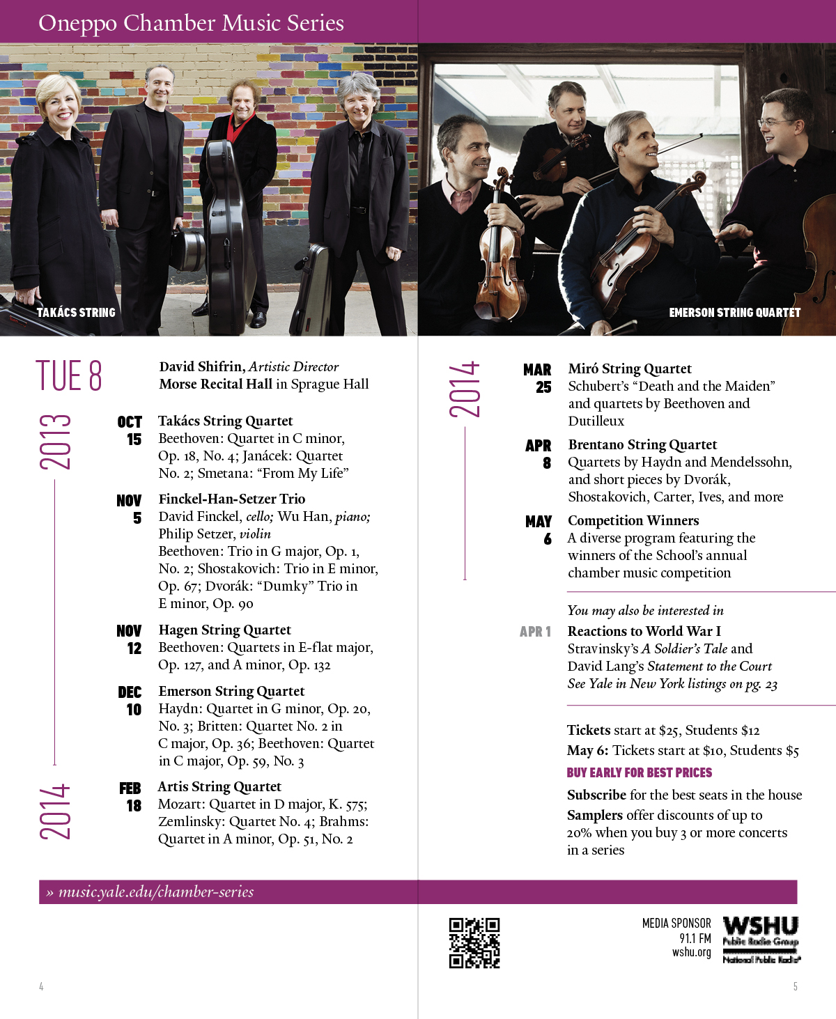

See Music at Yale Magazine
Effective calendar graphic design balances visual hierarchy with effortless functionality, transforming a dense grid of dates into a clear, intuitive tool. At its core, successful design prioritizes scannability and legibility through a deliberate contrast between primary elements—like month headers and prominent date numerals—and secondary details, such as day labels, moon phases, or holidays. Thoughtful grid layouts and consistent typography prevent visual clutter, creating clear spatial margins that allow the user’s eye to navigate easily between days and weeks. Color plays a vital strategic role, using subtle tonal shifts to delineate weekends, distinct palettes to define seasons, or bold accents to anchor key events without overwhelming the overall composition. Beyond utility, exceptional calendar design incorporates purposeful visual framing—whether through sleek minimalism, expressive illustrations, or elegant photographic accents—ensuring the calendar remains an appealing piece of functional art throughout the year.
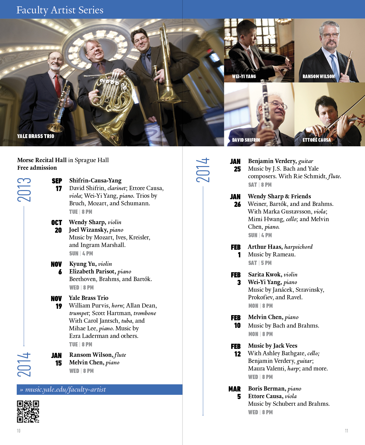
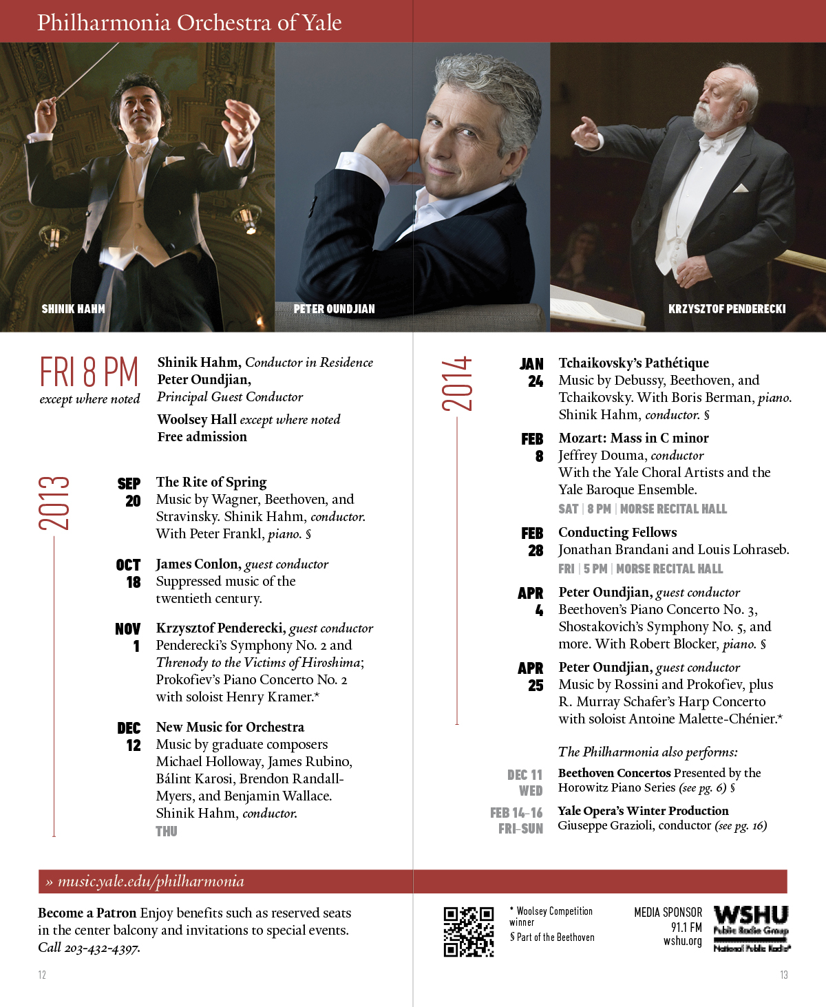
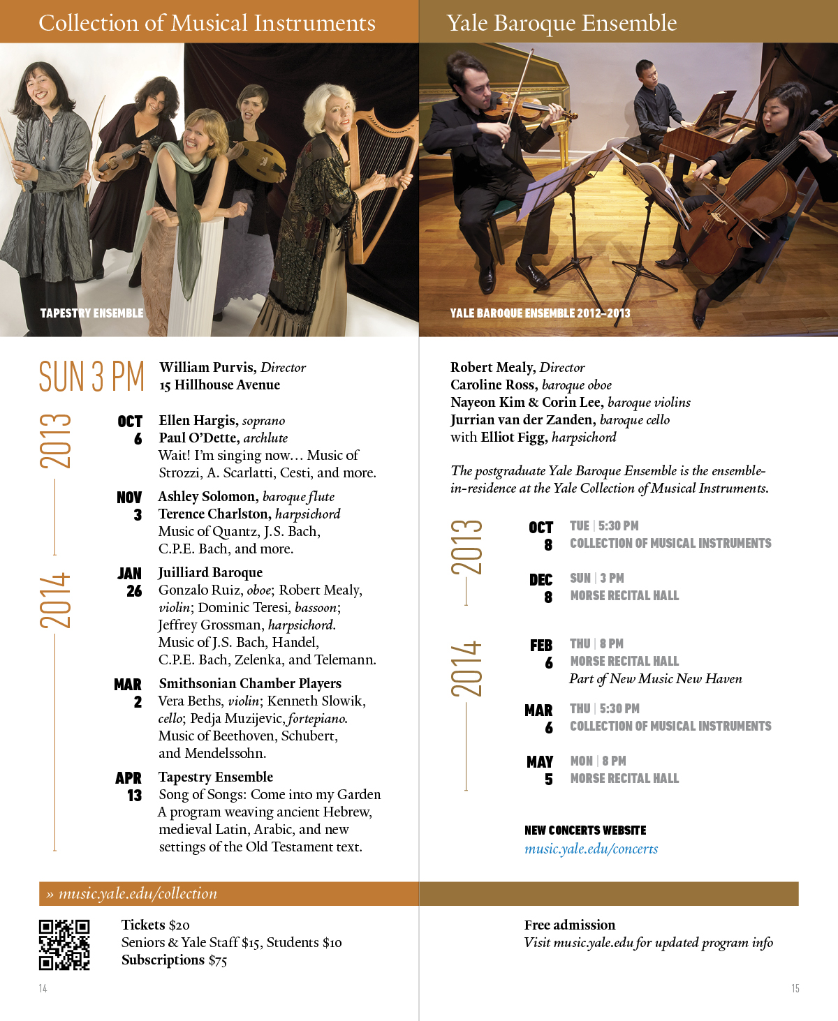
See Music at Yale Alumni Ventures
Effective pamphlet graphic design hinges on a clear visual hierarchy that guides the reader seamlessly through tactile, folded space. Because a pamphlet unfolds sequentially, every panel must balance tight grid alignment with deliberate white space to keep information scannable rather than dense. A compelling cover relies on a single dominant visual and a crisp headline to invite the initial unfold, while interior panels use contrasting typographic scale—pairing legible body copy with distinct headers—and purposeful imagery to maintain momentum. Crucially, high-impact design respects the physical print medium: accounting for fold panel widths, safety margins, paper stock selection, and precise CMYK color management so that the final printed piece delivers its call to action with clarity and tactile polish.