Quinnipiac University Signage/Wayfinding Guides: The Crescent
Quinnipiac University Signage/Wayfinding Guides: The Crescent
Granite Bay Design: Graphic Design and Production
![]()
Granite Bay Design was tasked with developing all of the new wayfinding for Quinnipiac University’s rapidly expanding campus and replacing existing signage that didn’t conform to any design standards. My original assignment was to come up with some navigational signage for a unique new dormitory (“The Crescent”) which was still in the early stages of construction. As I got deeper into the process, the scope of my graphic design tasks increased dramatically to eventually include campus-wide solutions to add new signage and replace much of the existing signage. All of this required weekly meetings with campus personnel including their in-house graphic designer.
My design tasks expanded to not only include designing the signs, but also developing some sort of standards guide for the university personnel to use going forward. Some samples of these guide books are shown below. There are also PDFs of full “chapters” which can be downloaded below. mariposacoffeecompany.com
The Crescent: Exterior
The sheer size of the dormitory, designed by Centerbrook Architects required developing signage to make it easy for students and visitors to orient themselves inside and outside the building.
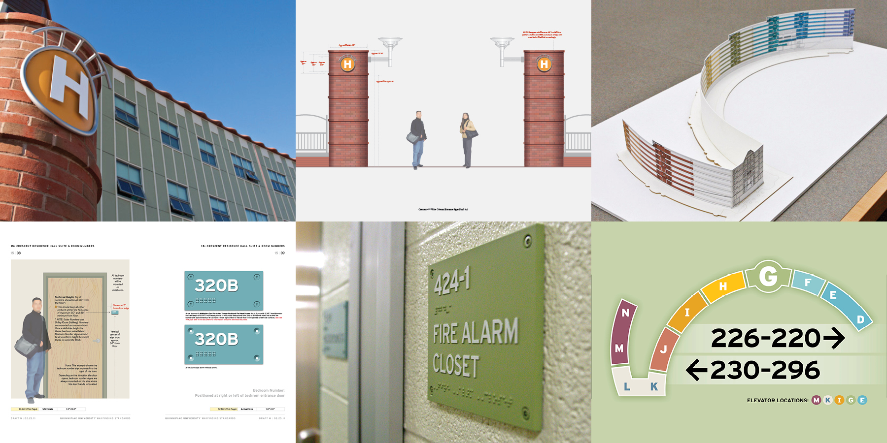
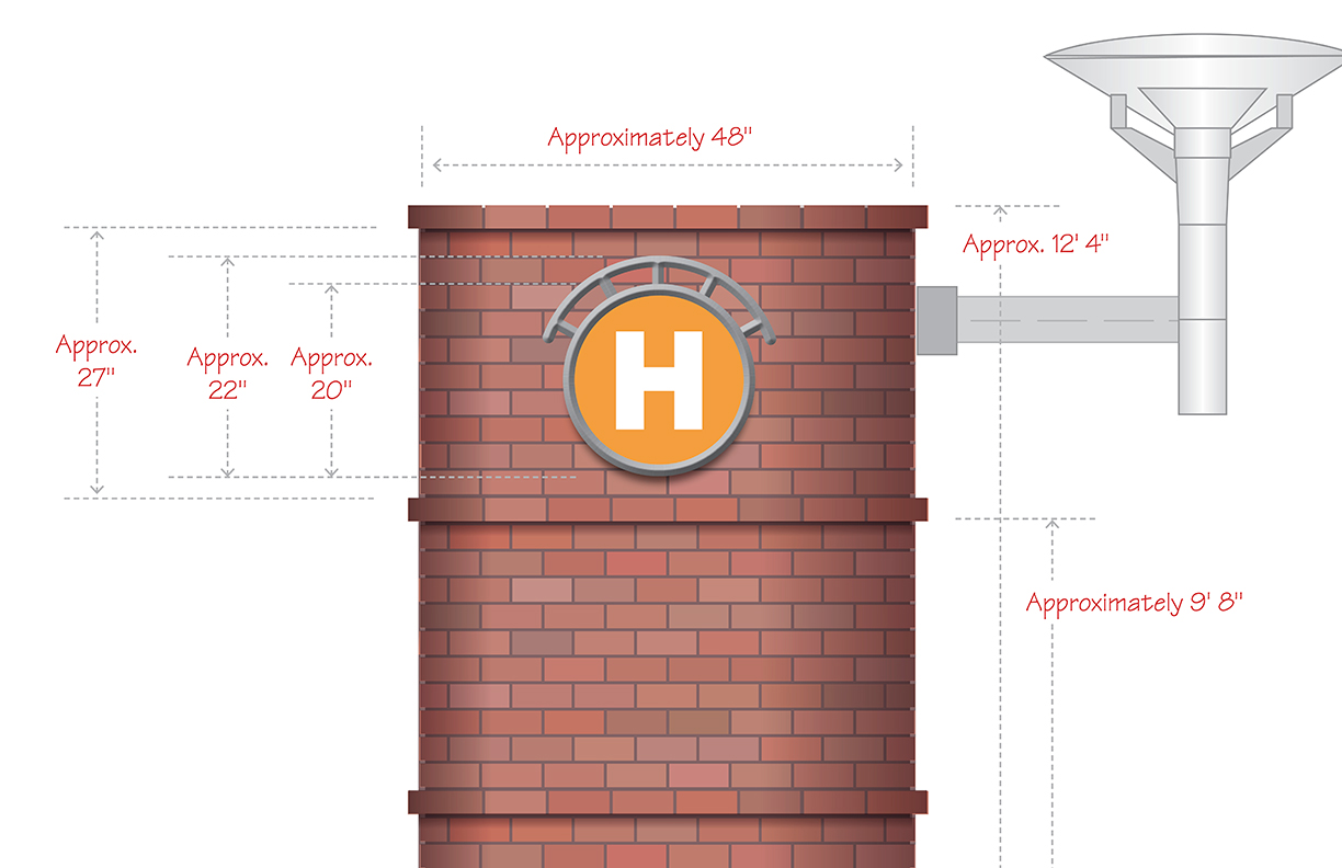
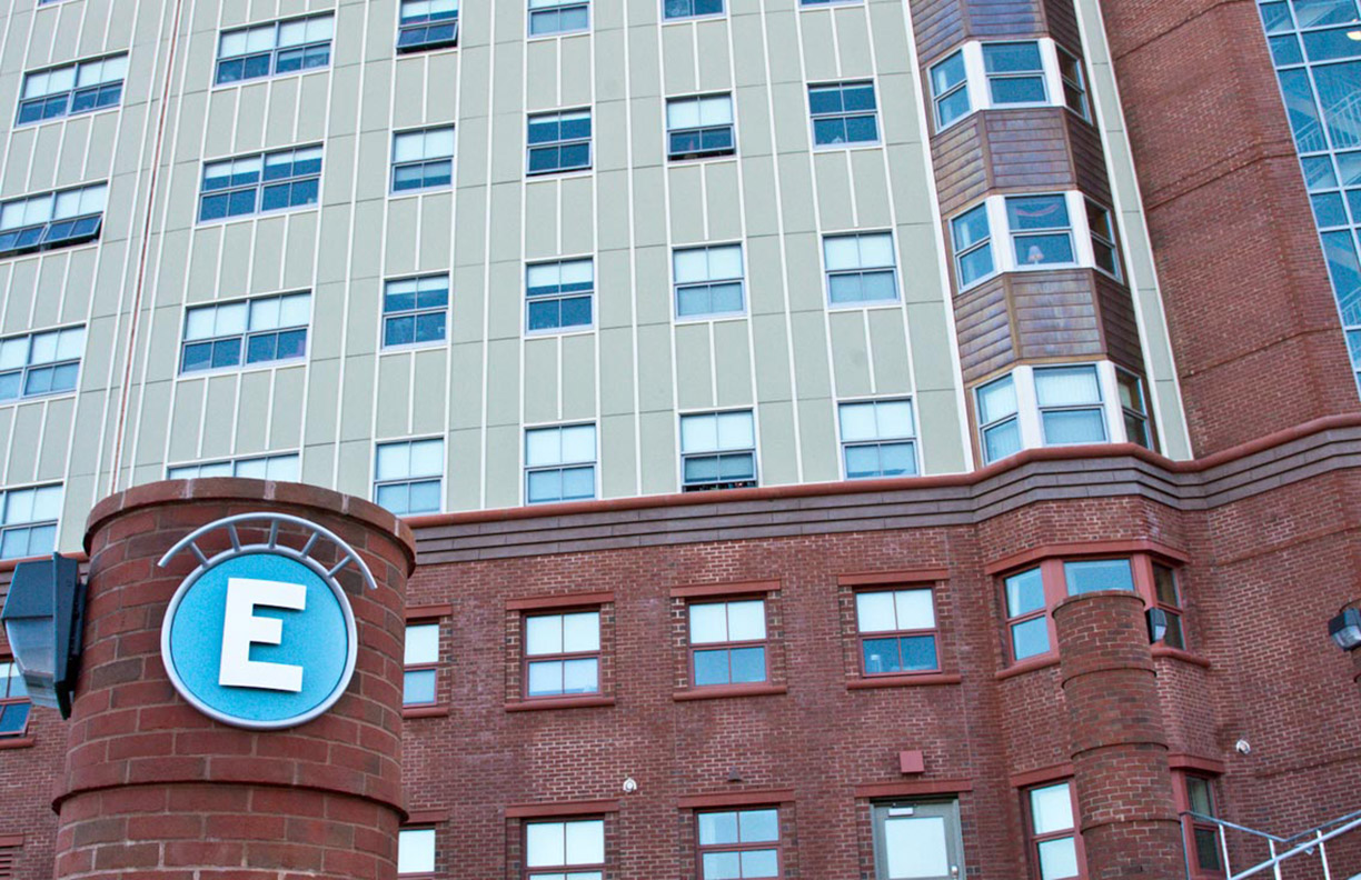
“The Crescent” is a nine-story dormitory located on York Hill away from the main campus. It is composed of 14 “pods” (D through N in the main Crescent building and A through C in “East View” which is near pod D in the main building). I developed a color scheme for each of the pods. A visitor will first encounter the color scheme upon arrival at the York Hill campus. The exterior signage features each letter in white on the color chosen for that pod. Each sign is surrounded by a silver circle topped with a silver crown.
Below: Various details from the standards guide showing the design, size and placement of the “pod” identifier signage. and a photograph of the sign on the completed dorm. digital.mediapex.net


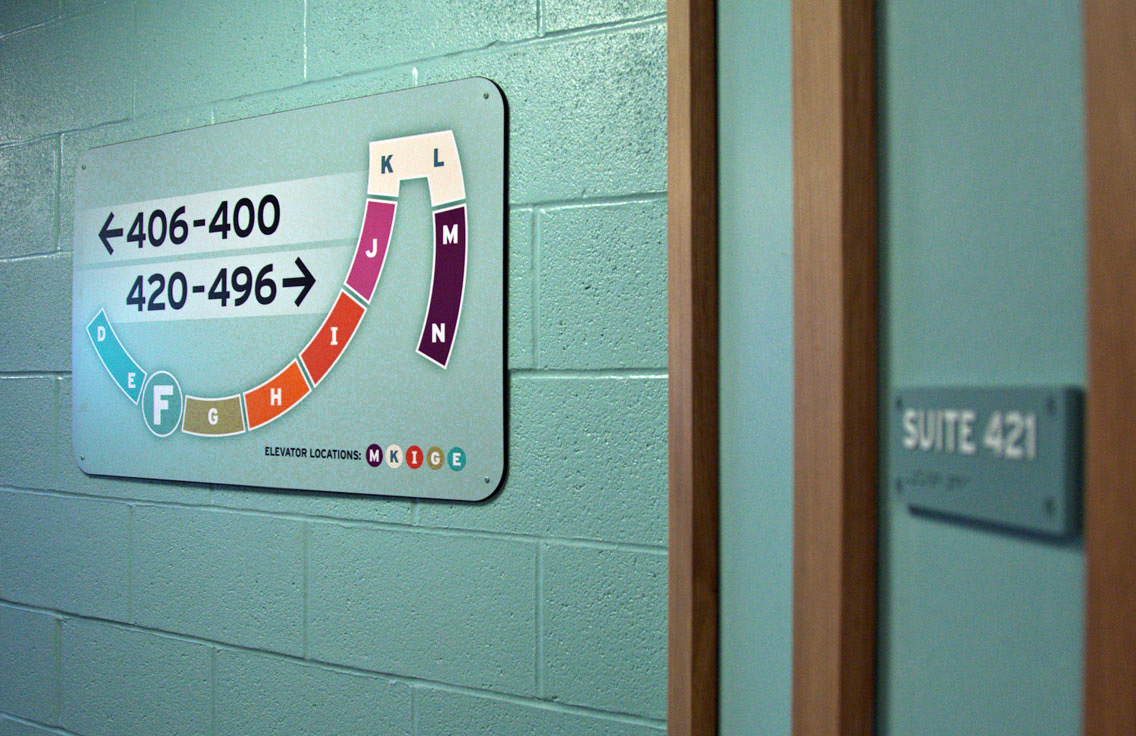
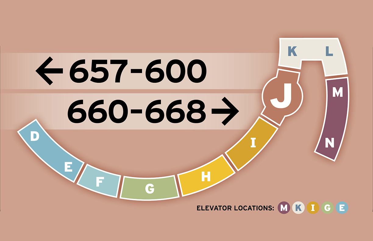
The Crescent: Interior Navigation
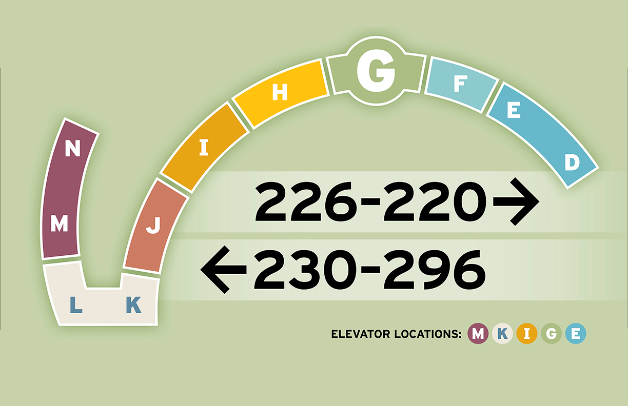
The interior signage consists of maps of the entire Crescent with a “you are here” larger circle. The color scheme continues throughout. avafoodie.com
Below: from left to right: While construction was still underway, we were already designing the interior signage. In this shot we were testing the dimensions of a sign to get a sense of it’s presence in the space. Examples of the finished signs.


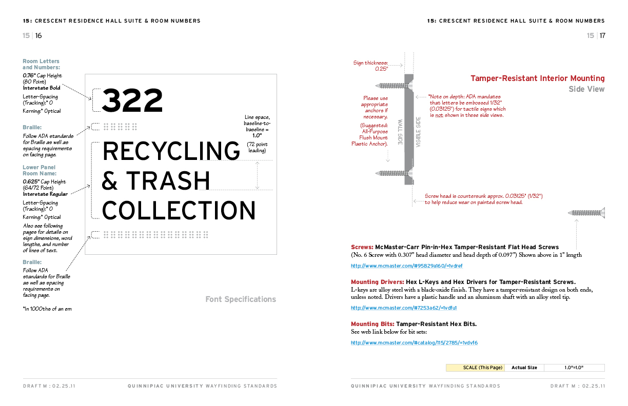
The Crescent: Interior Room Signage
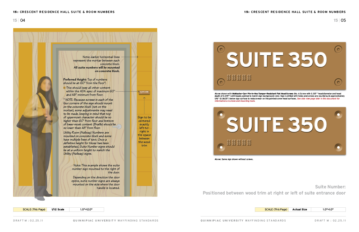
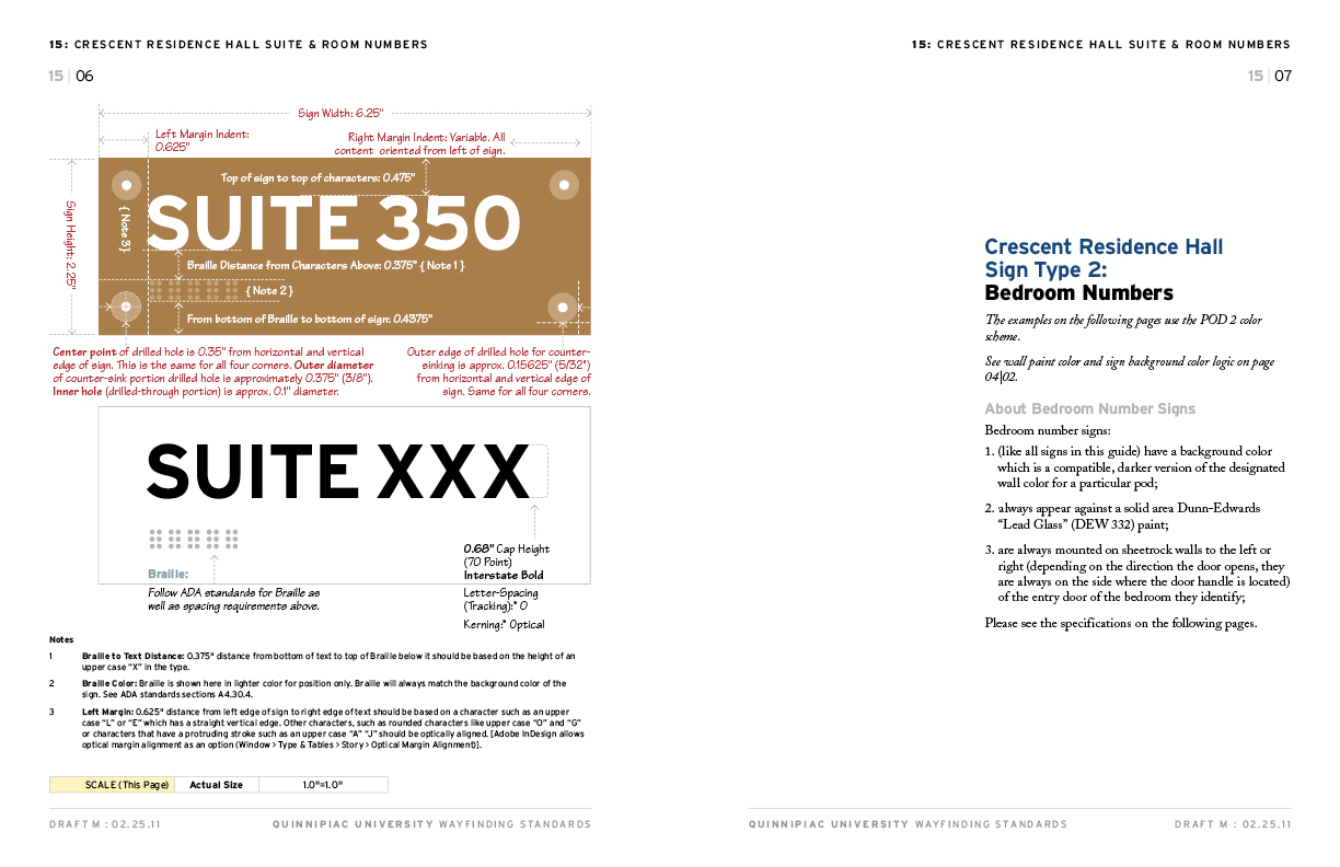
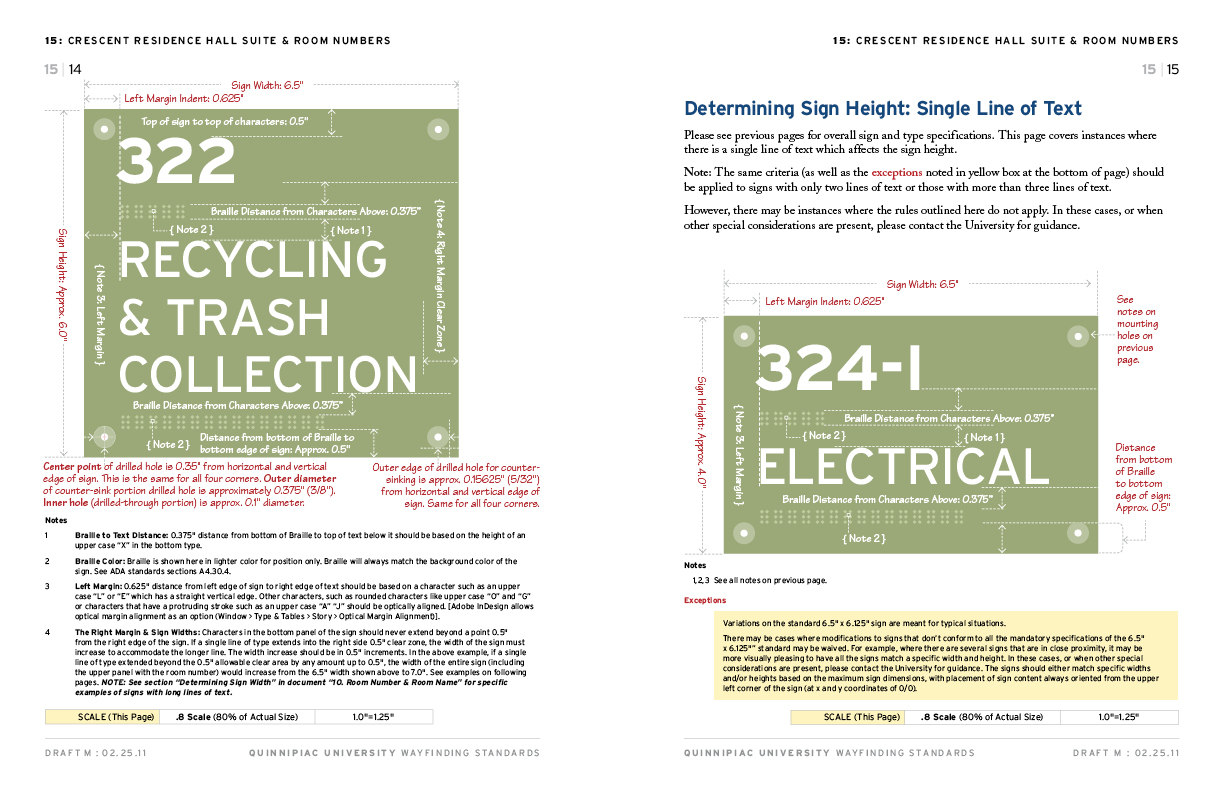
While construction was just beginning on “The Crescent”, we began the task of developing standards guides which would also serve as a guide for the rest of the campus. Working with the established color scheme for each “pod” the standard guides gradually took shape. As you can see in the pages below, the standards guides are very detailed are are still used to maintain consistency campus-wide.
Below: A series of spreads from the standards guide for “The Crescent” which became the model for a series of “chapters” in a larger master style guide enabling university personnel to establish wayfinding consistency across the university’s expanding campus.


Related Pages from Granite Bay Design: