Granite Bay Design: Graphic Design and Production
Granite Bay Design was tasked with developing all of the new wayfinding for Quinnipiac University’s rapidly expanding campus and replacing existing signage that didn’t conform to any design standards. A significant part of our early meetings was to establish font usage:
- Would we use the existing font?
- If we switched fonts, would that include changing the University’s logo?
- If we kept the existing font for some elements, how would we go about developing a well-implemented font pairing?
1. The Existing Font
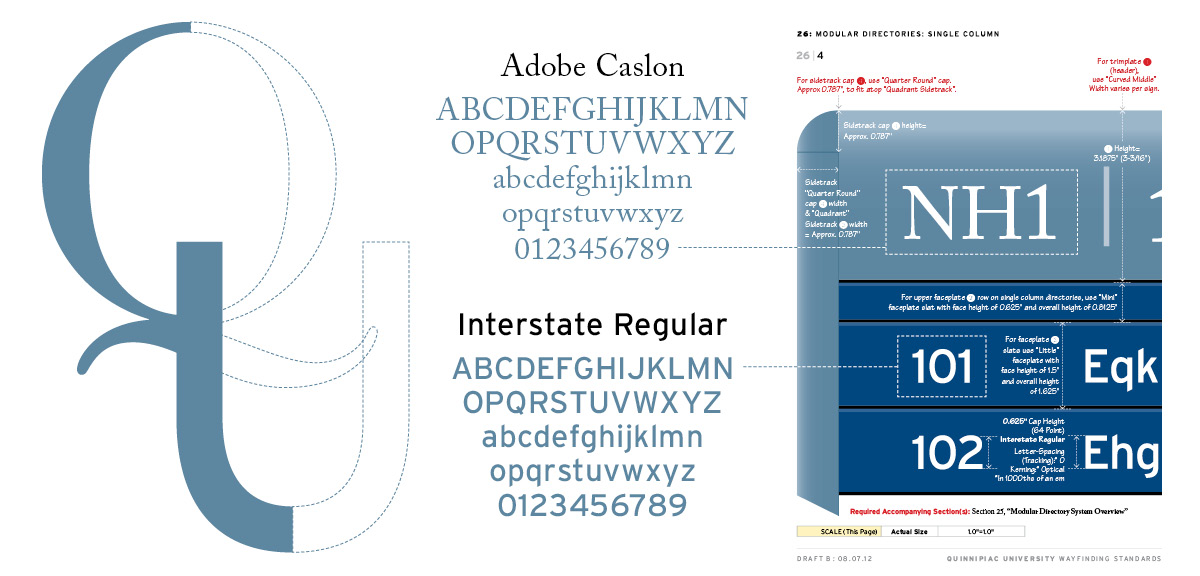
The Quinnipiac University (QU) logo in use at that time used the font “Caslon 224” (shown below). The “hook tail” (the curly element at the bottom of the uppercase Q) makes for an elegant overall logo design and we saw no reason to change that.
2. A Slight Change
After deliberations, we investigated other versions of Caslon, of which there are many. We all gravitated toward Adobe Caslon (shown below), a slightly more contemporary version of the Caslon font. We instituted one caveat: if the uppercase Q was used on any signage that character only would use the Caslon 224 version.
3. The Font-Pairing Solution
Since we would be using a serif font for some wayfinding elements, we looked at pairing it with a sans serif font and looked at many options. We settled on Interstate (shown below), based on the font colloquially known as Highway Gothic, the official typeface of the American Federal Highway Administration, designed by Ted Forbes in 1949. It has superior legibility and pairs nicely with Adobe Caslon.
Related Pages from Granite Bay Design:


