Quinnipiac University Signage/Wayfinding Guides: Directories
Quinnipiac University Signage/Wayfinding Guides: Directories
Granite Bay Design: Graphic Design and Production
![]()
Part of Granite Bay Design’s wayfinding design overhaul was developing solutions for all of the campus directories.
Research took us to the Slatz/Spandex modular wayfinding system.
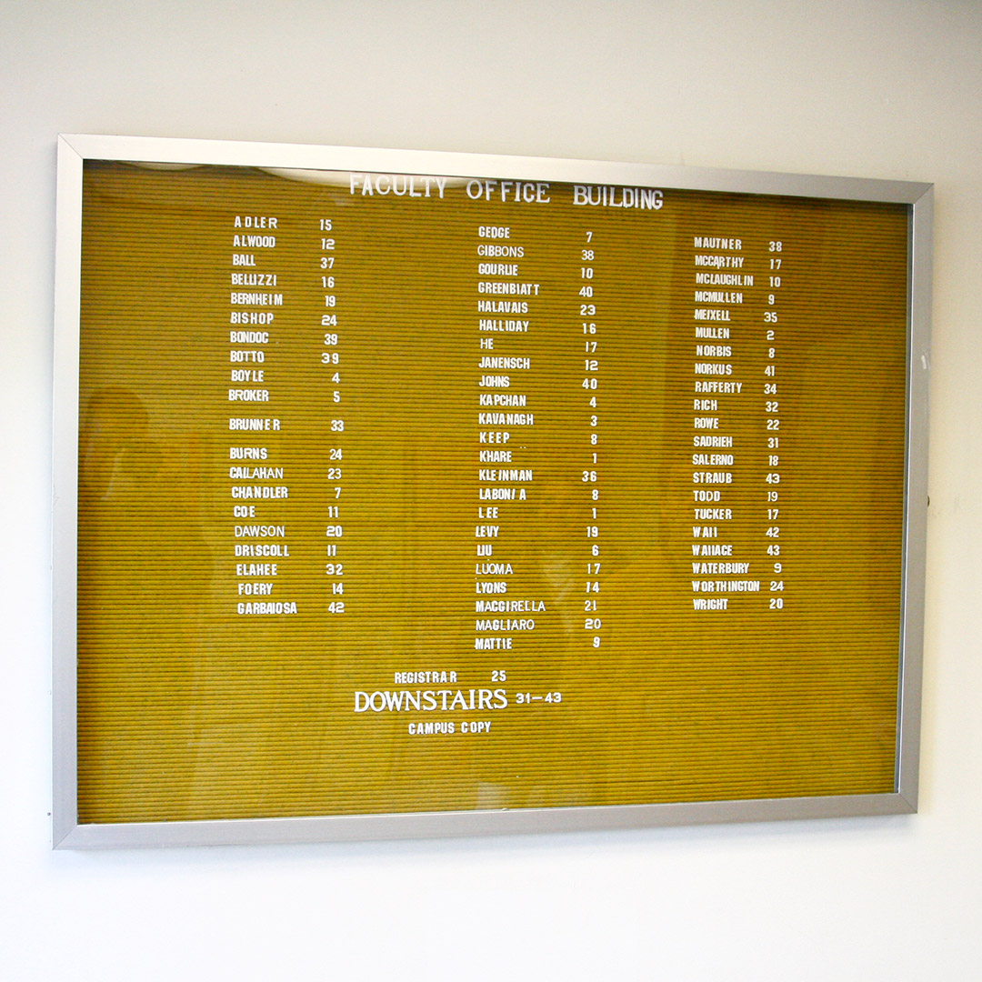
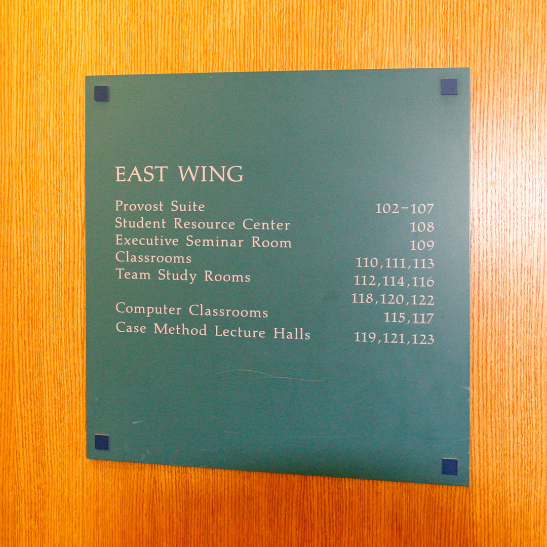
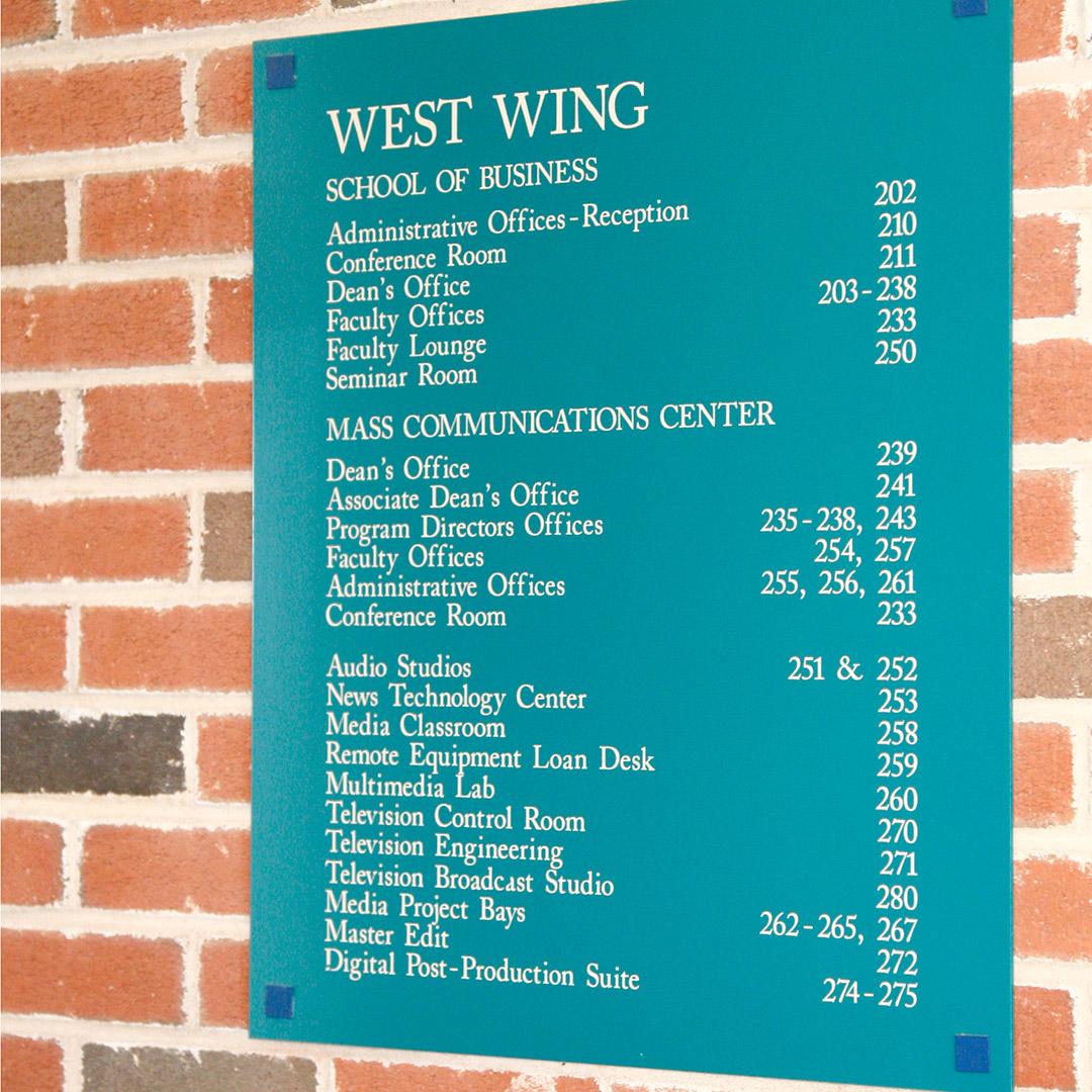
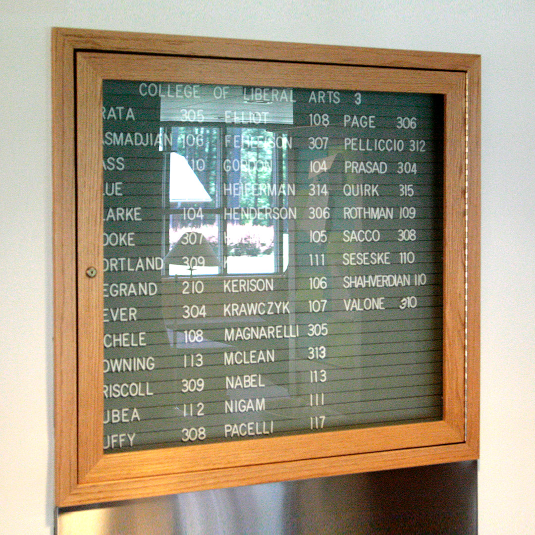
Below: Pages from our campus-wide photography where we documented every possible type of existing sign so that the chapters in our standards/style guide would encompass all the University’s wayfinding needs both presently and in the future:. robsroofingllc.com


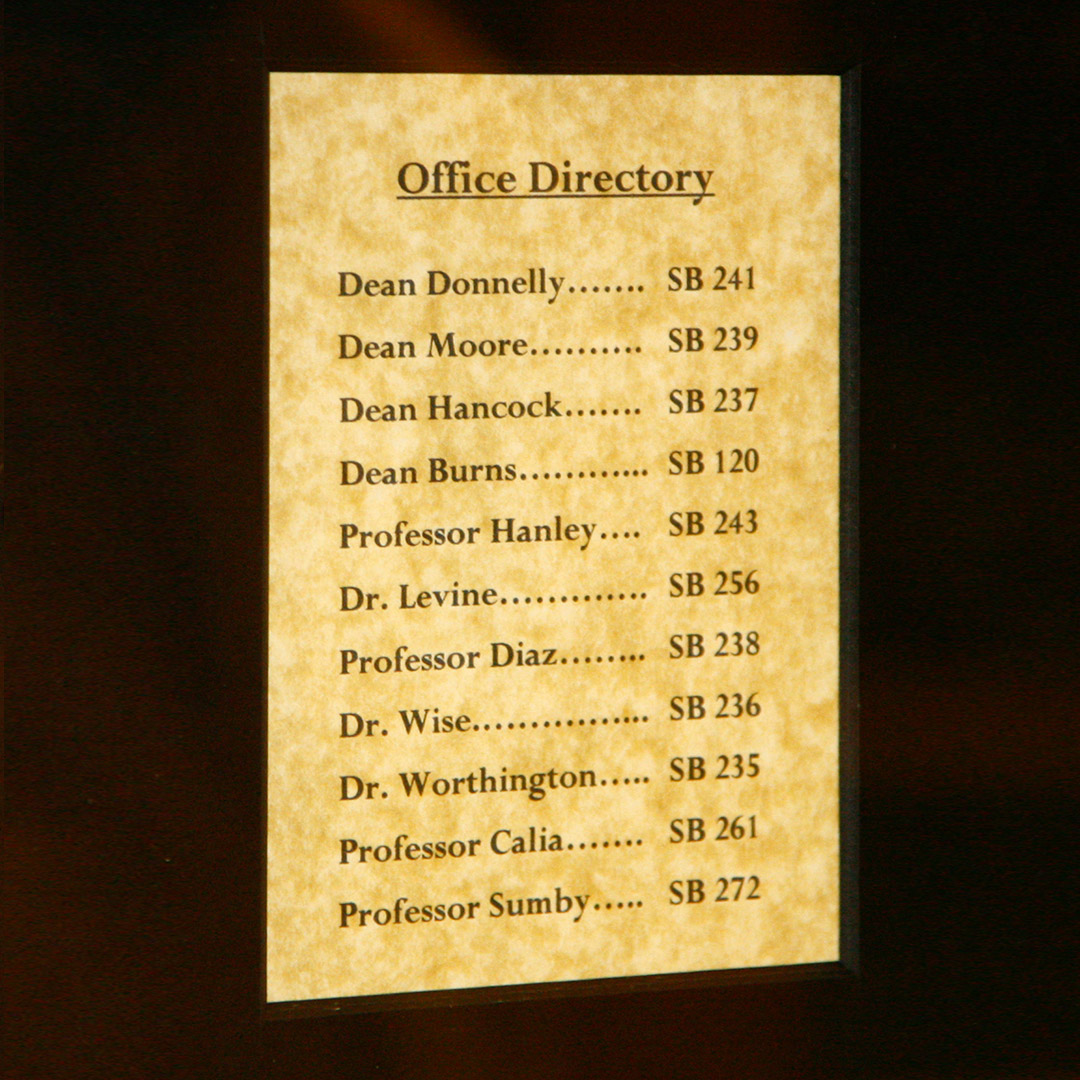
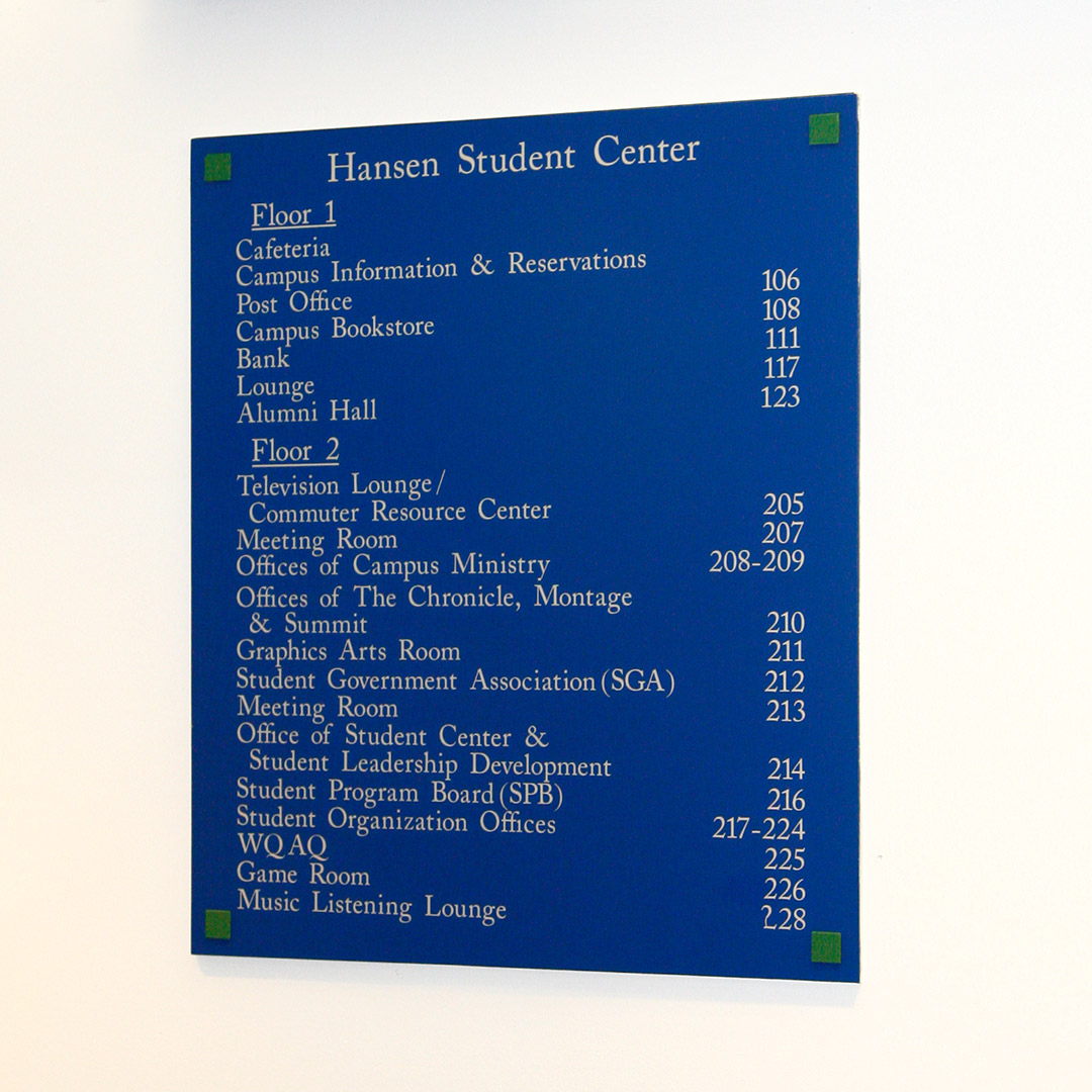
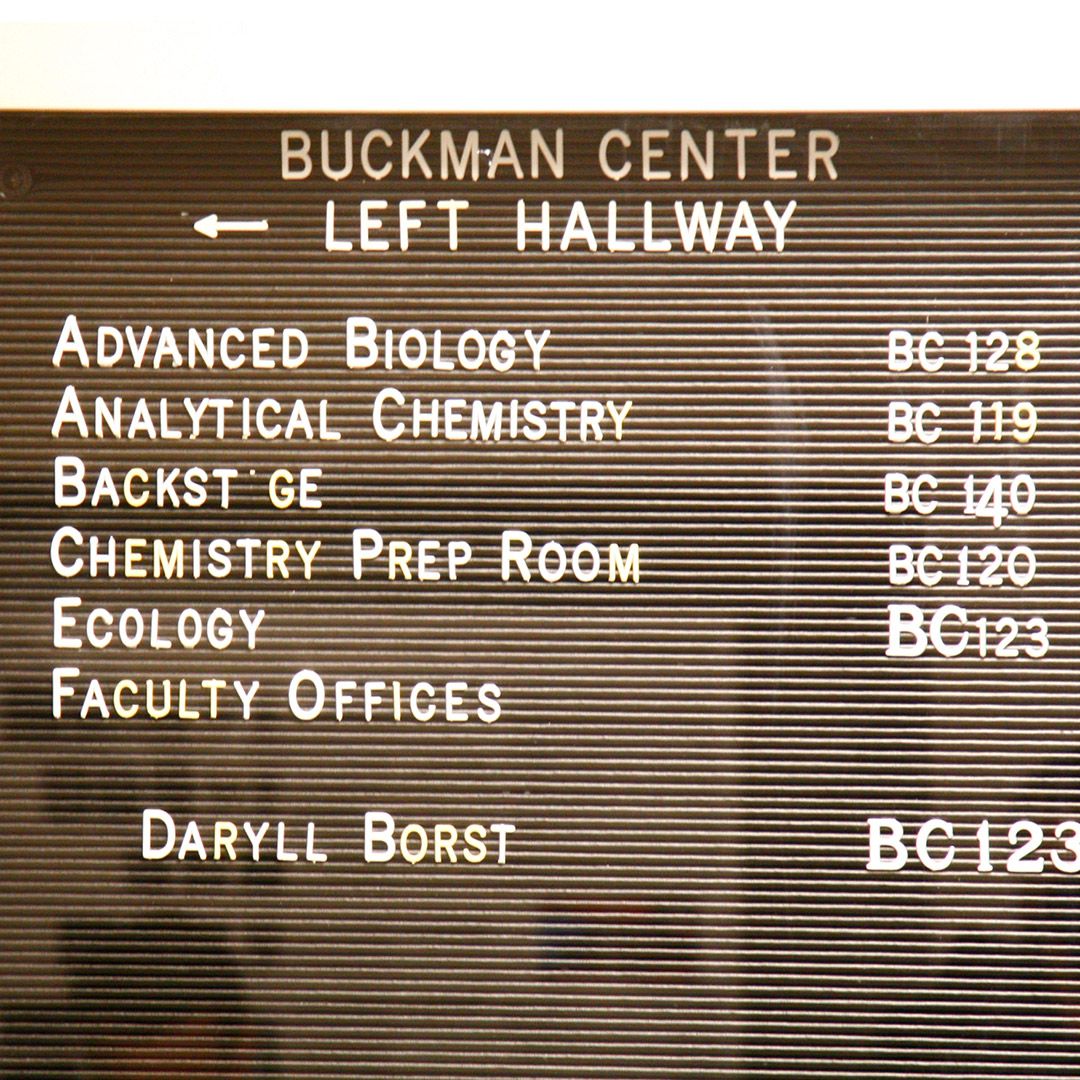
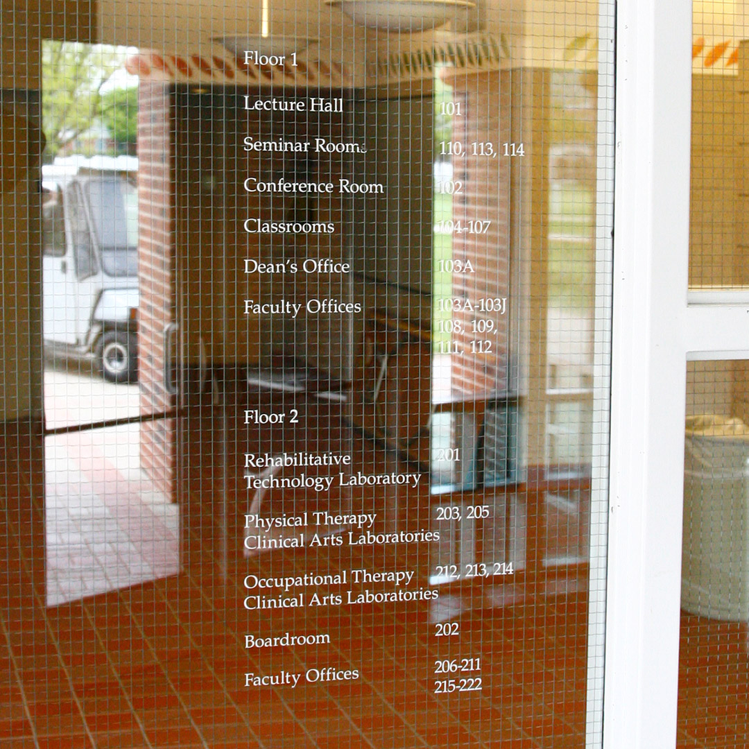
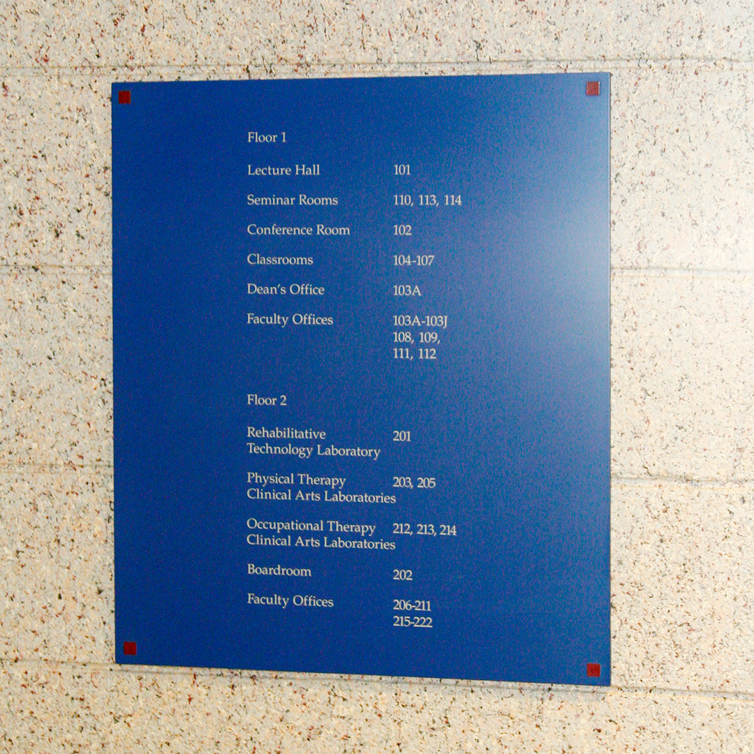
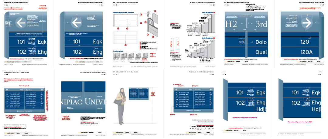
Campus-Wide Interior Directories
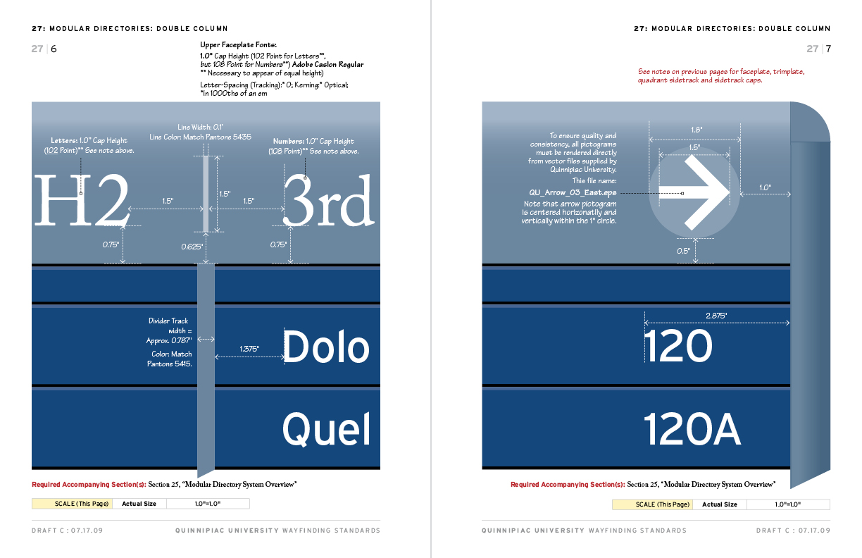
Following our campus-wide photo inventory (see above), and after several weekly meetings, the design process began. The core of the master plan are the chapters in the guide book. We had approximately 25 chapters, each dedicated to a specific type of sign including a modular signs overview and chapters dedicated to single and double column directories). [Samples of each of the above are shown below:]. comunidadesaada.com.br


How We Built the Chapters
In the beginning, we played around with various sizing that would fit well onto an 8.5″ x 11″ page, leaving plenty of room for the callouts that would be used extensively on virtually every page. In most cases, when we introduced a sign type (room number, room number with name, directional signs, etc.) we would include either a male or female “student” to show relative height. Obviously, these relative size pages with people (usually a left page) would appear at a different percentage than the close-up sign with dimensions on a facing page (usually a right page). aeae.me
Since the actual size that a particular sign close-up would appear might be different than the close-up of a sign in another chapter (see images number 1 and 2 above compared to image number 3 above, where the actual size of the sign pictured in number 3 was different from the signs shown in numbers 1 and 2), we needed to be very careful that our callout dimensions were correct for every close-up. This required a lot of checking and double-checking of our math.
Fonts and Layout
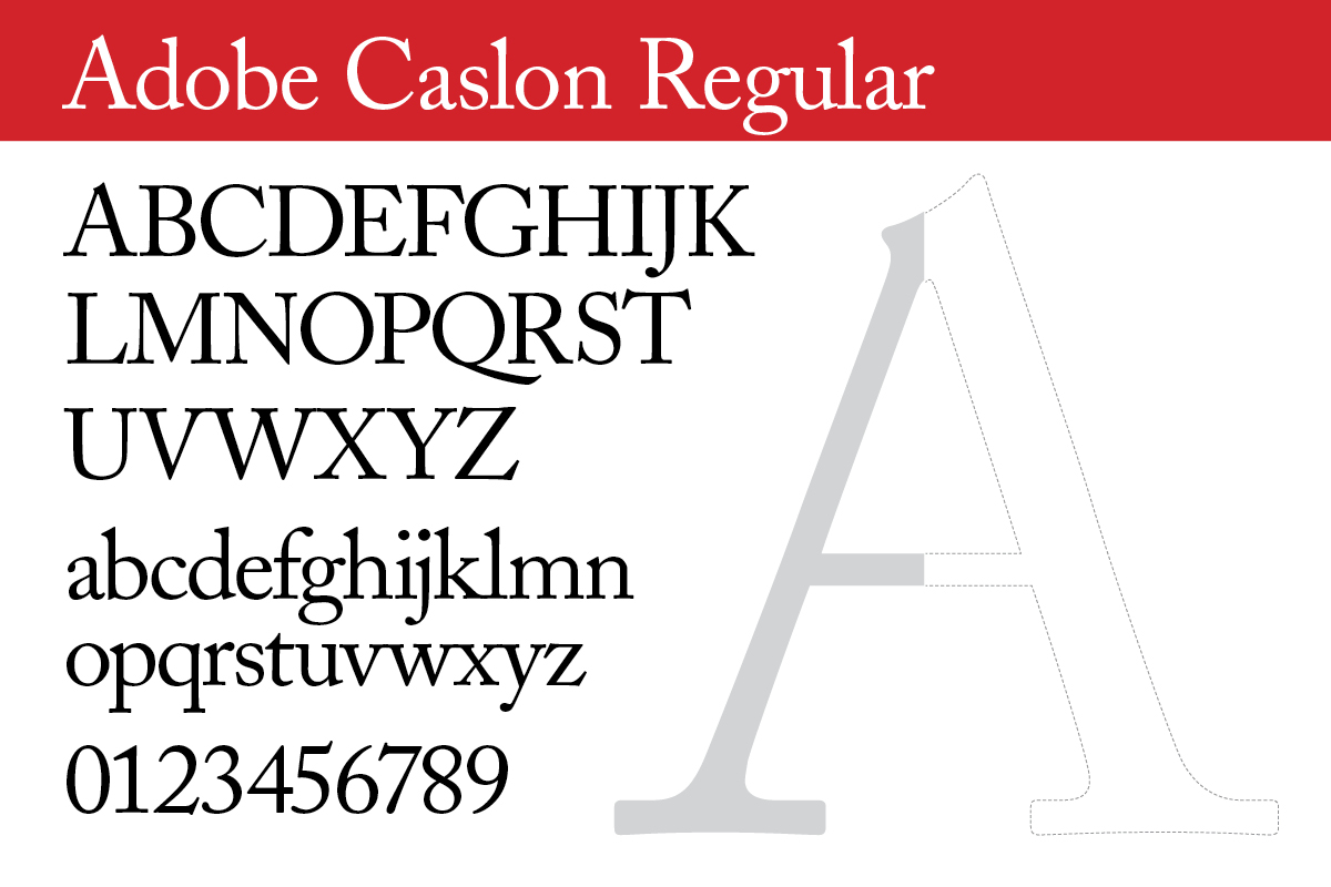
Choosing the serif fonts was easy since the University already had standard fonts which they had been using for awhile. [Note somewhere about fonts and ADA] Those are:.
• Adobe Caslon (Regular and Bold)
• Caslon 224 (Book and Bold)
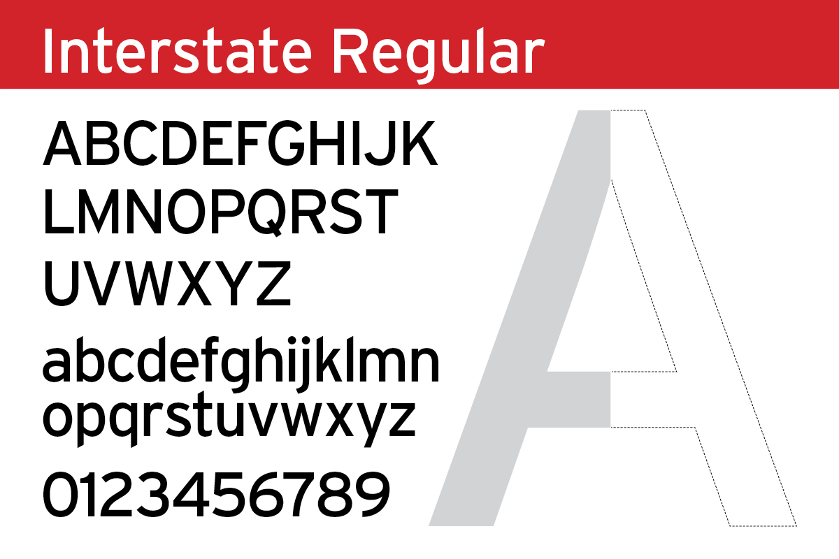
However, for the sans serif font that we would be using on all the pages in all the chapters, we tried several font families that would work and ended up with Interstate [add an anchor link to more about Interstate] which is a perfect match for use with the Caslon families.


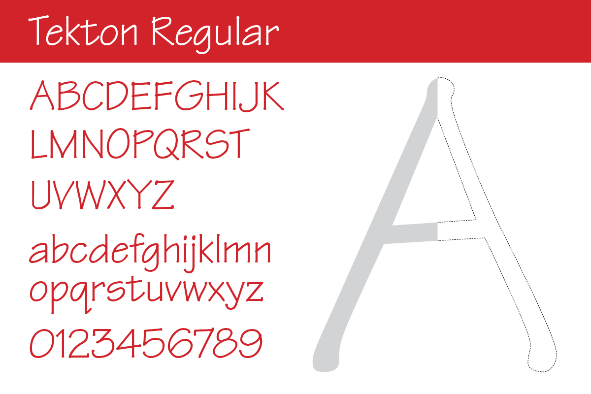
Finally, for the callouts, we used the Tekton font. This is not a font that is actually used on any signs—only in the style standards/style guides—because it has a hand-written feel to it, it works well for the callouts.
Related Pages from Granite Bay Design: