Portfolio: Music at Yale Magazine







Music at Yale Magazine

“If you think good design is expensive, you should look at the cost of bad design.”
Ralf Speth
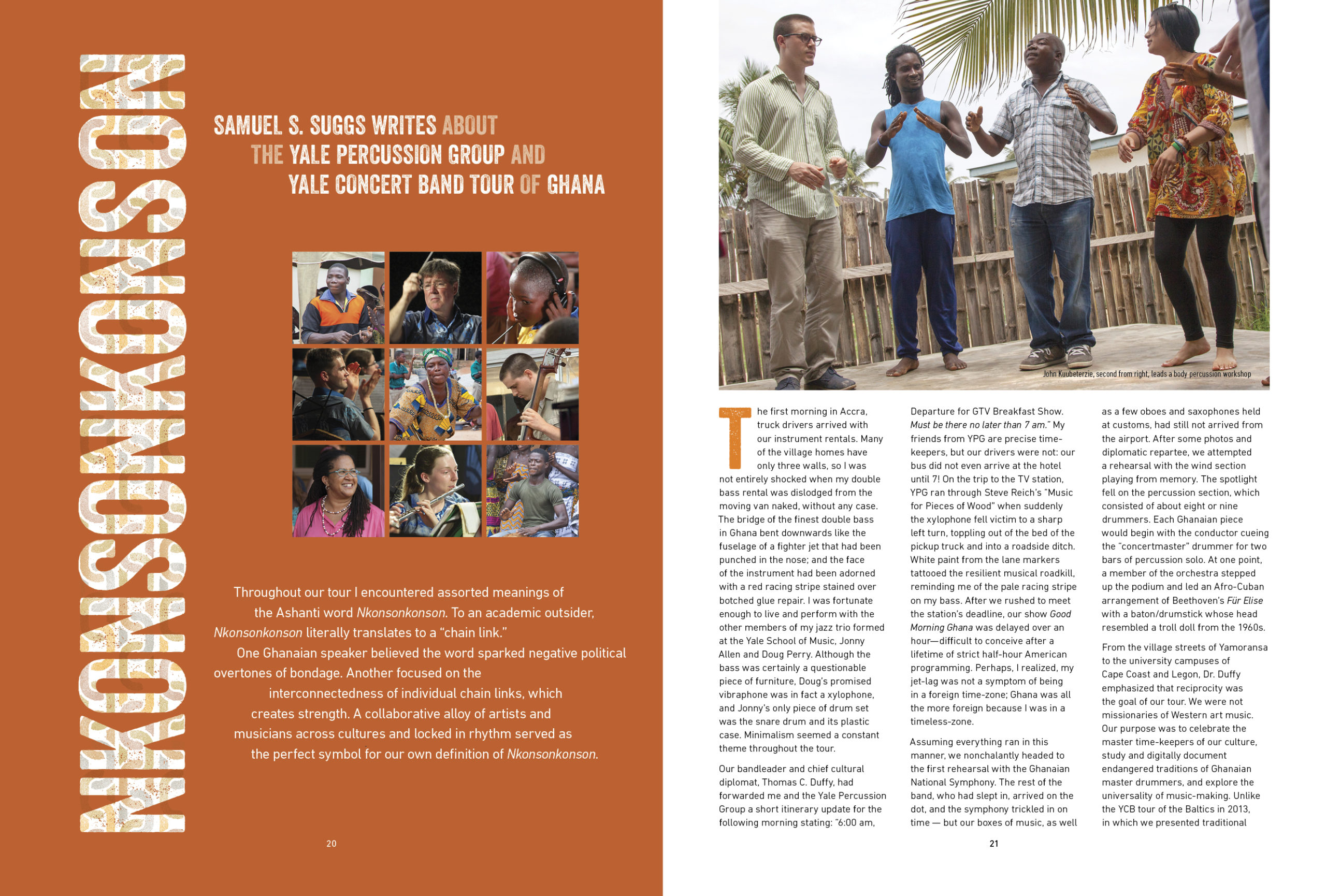
In a world saturated with fleeting images, graphic design remains the quiet architect of how we perceive, navigate, and connect with culture. It is where form meets function, and where bold typography meets human emotion. In this issue, we dive deep into the evolving landscape of visual communication—exploring the delicate balance between timeless print craftsmanship and the rapid rise of AI-driven digital design. From the underground indie zines redefining typography to global branding overhauls shaping consumer identity, we celebrate the innovators who refuse to settle for the visual ordinary and continue to push the boundaries of artistic expression.
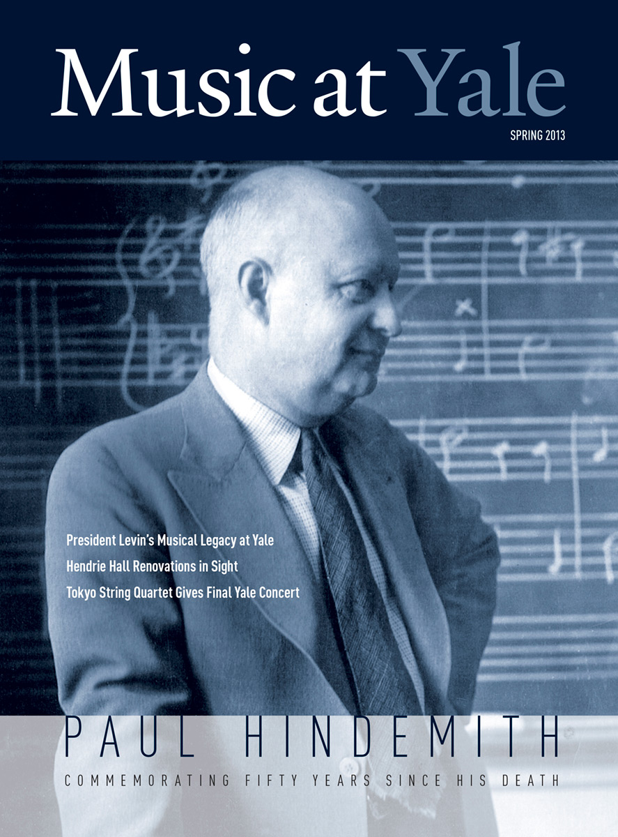
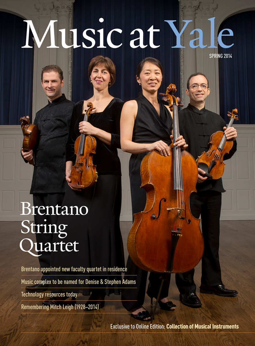
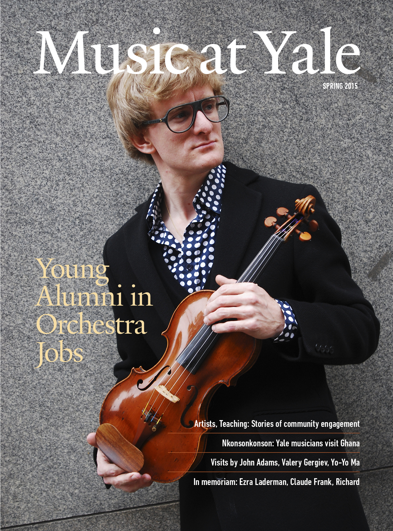
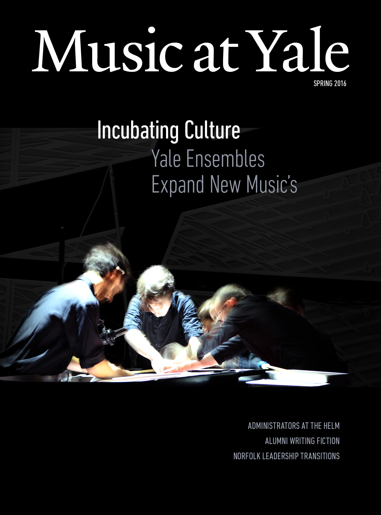
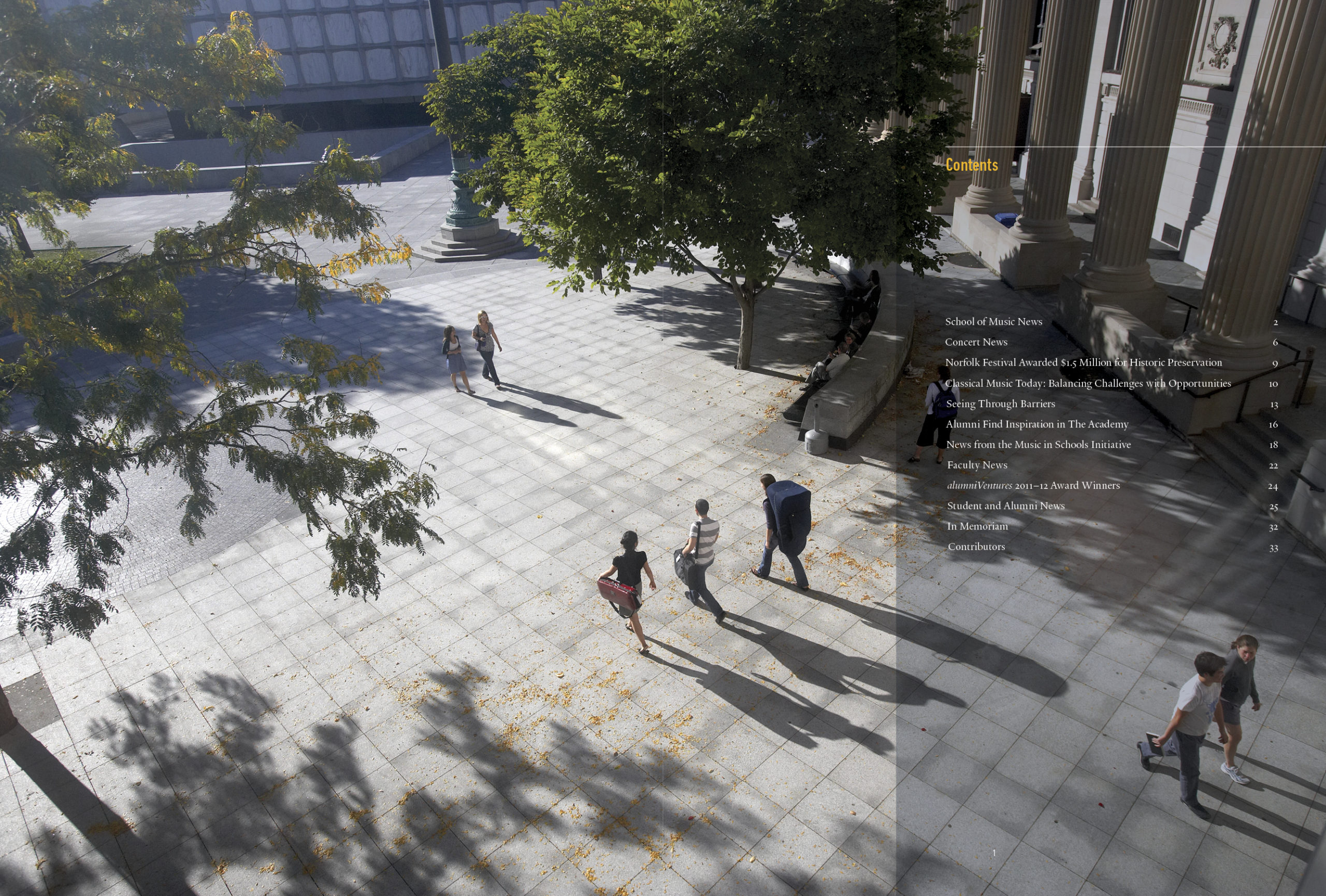
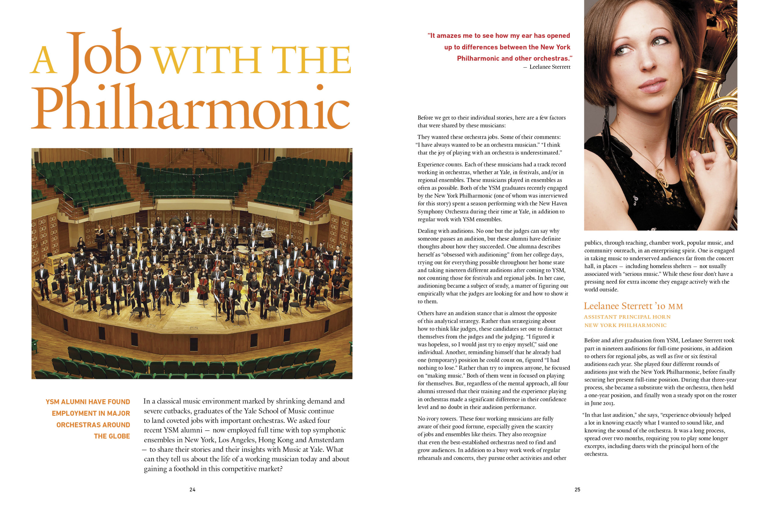
Clear Typographic Hierarchy
Readers skim before they dive in. A strong layout relies on a clear visual structure:
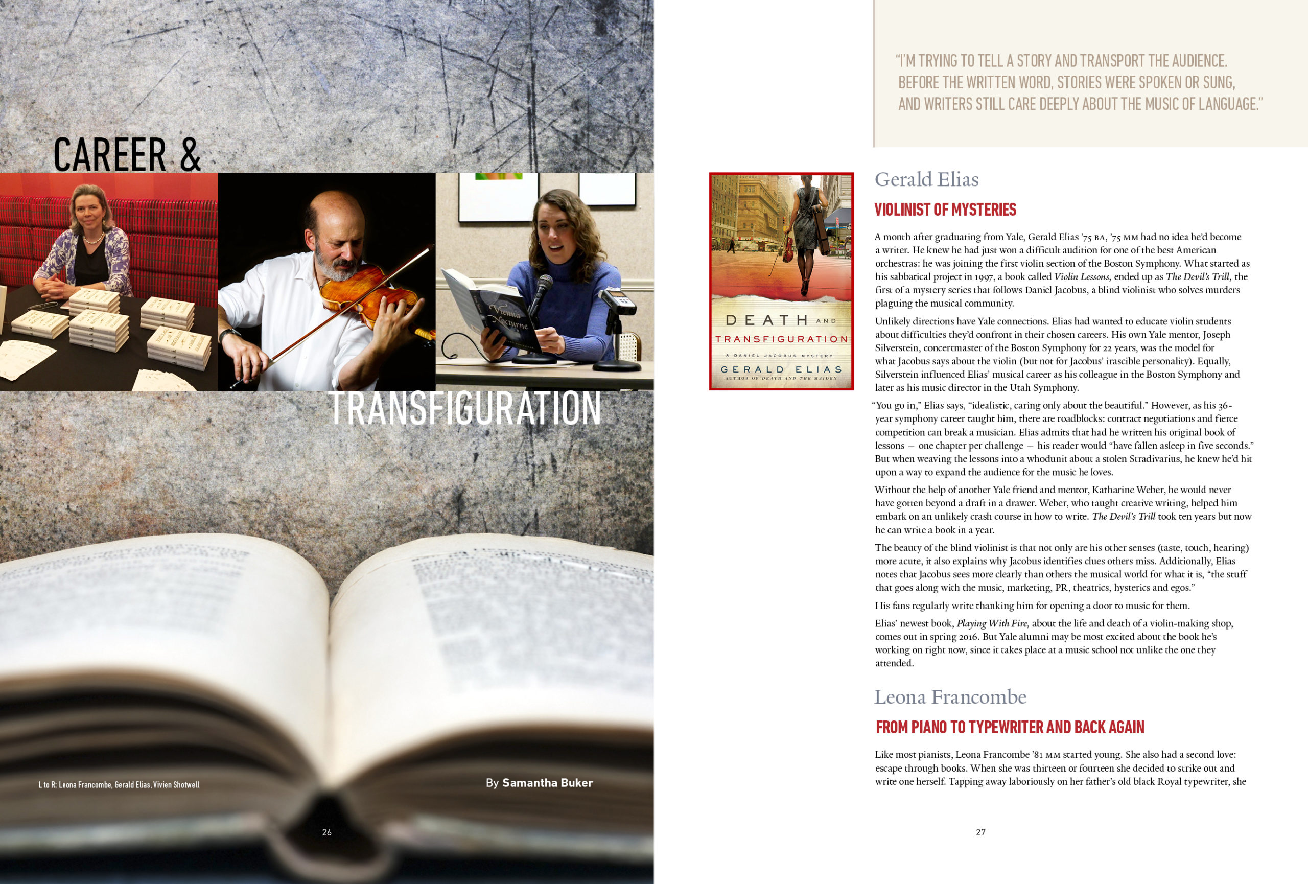
Headlines & Subheads: Commands attention instantly using bold display fonts.
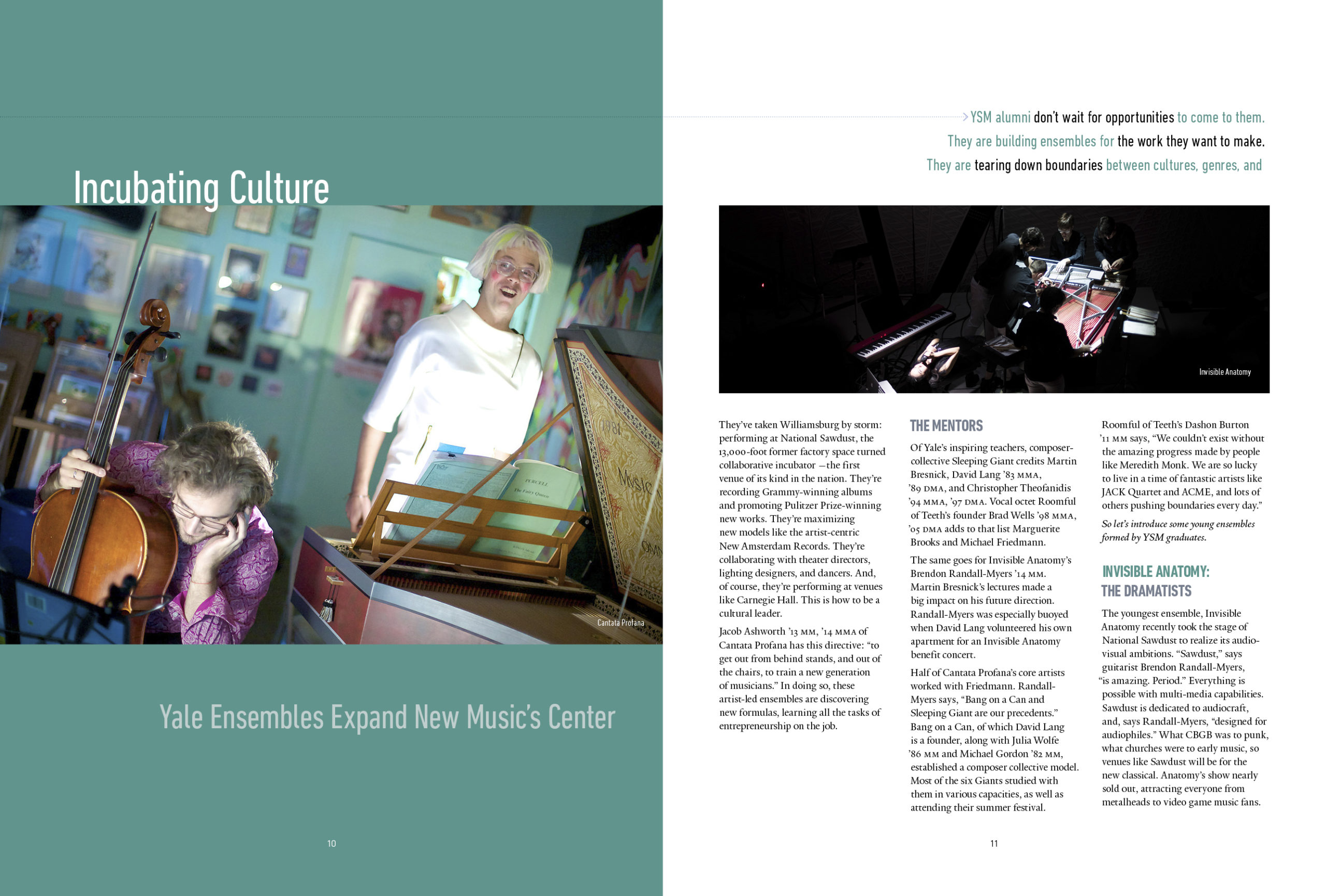
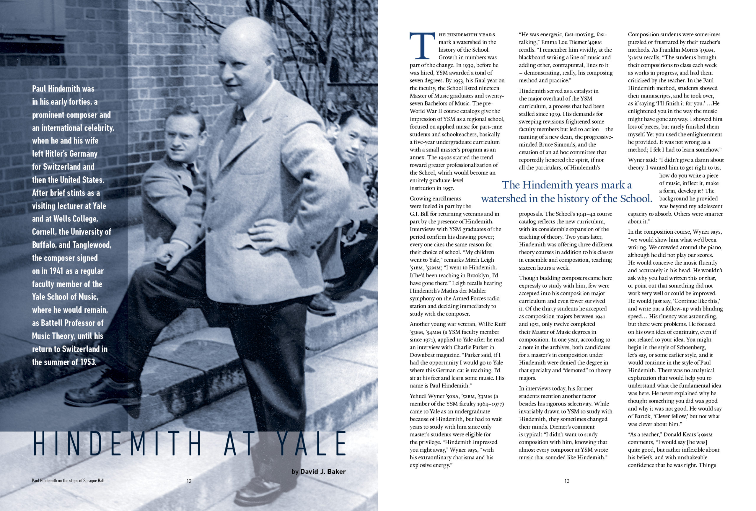
Pull Quotes: Highlight key quotes or statistics in larger text to break up dense body paragraphs and draw casual readers into the story.
Body Copy:Set in clean, highly legible type (typically 9–11pt) with generous leading (line spacing) for effortless reading.
See Music at Yale’s calendar pamphlet
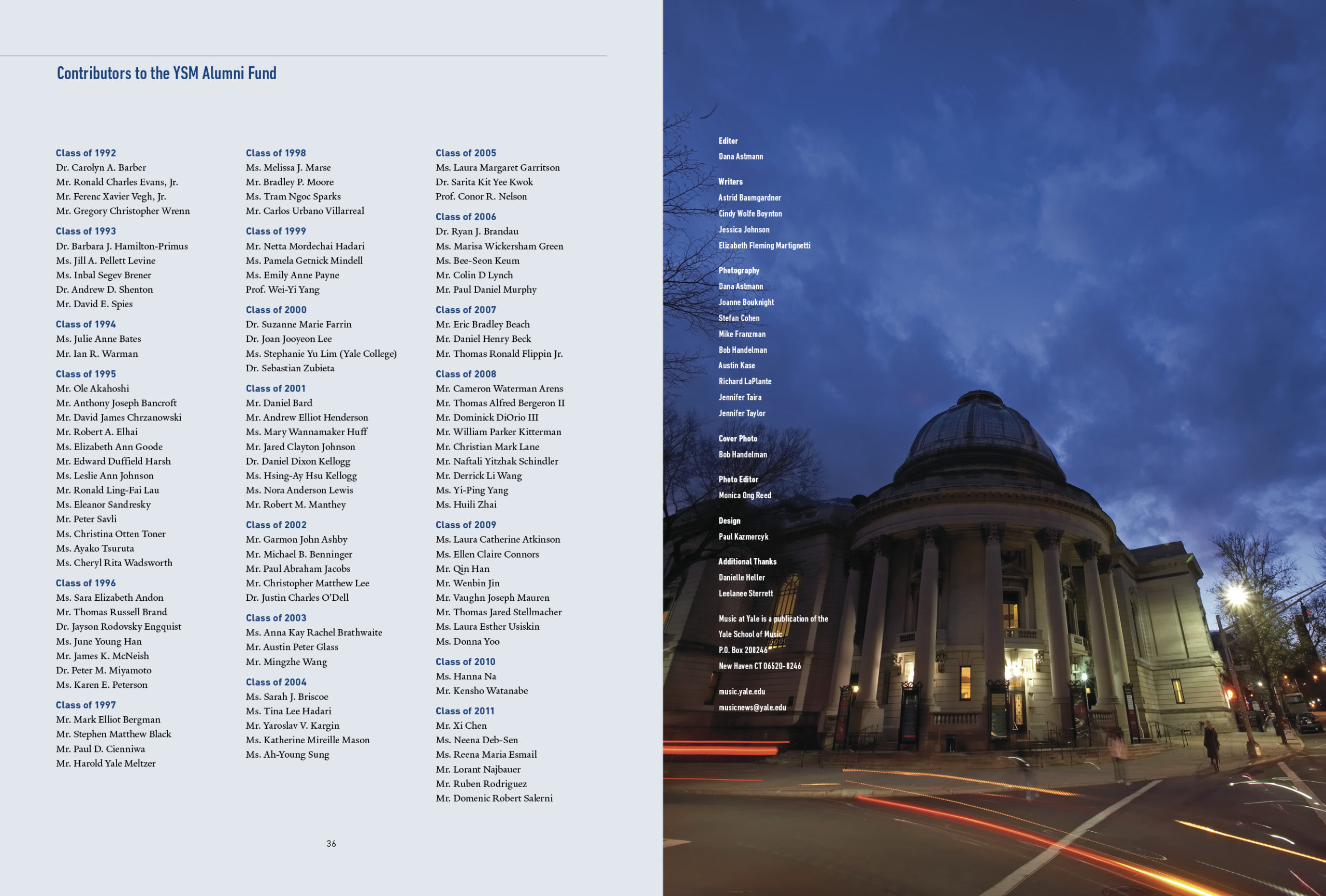
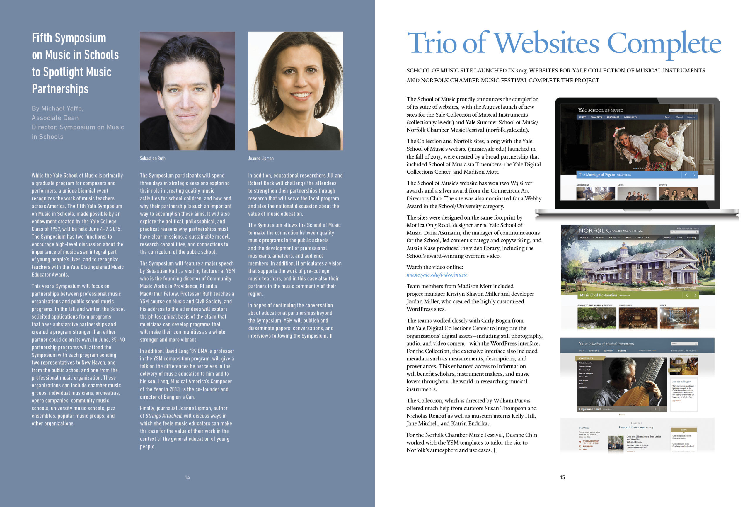
Grid Systems & White Space
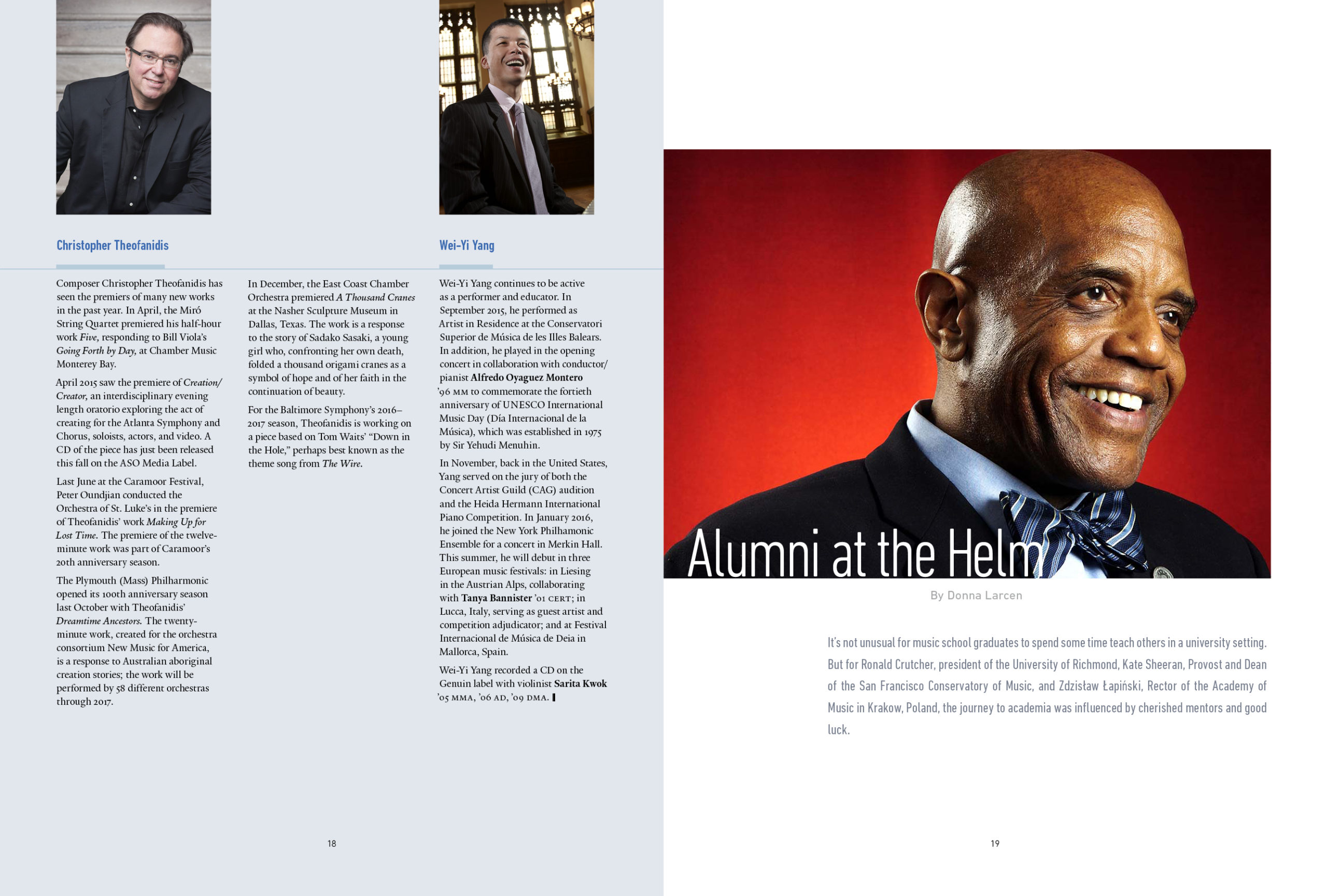
Underneath every polished magazine spread is a structured grid—usually 3 to 12 columns.
Structure: Grids align text blocks, images, and captions so multi-page articles feel cohesive rather than cluttered.
Negative Space (White Space): Strategic empty space around elements prevents cognitive overload, giving the reader’s eyes a place to rest and directing focus to high-priority visuals.
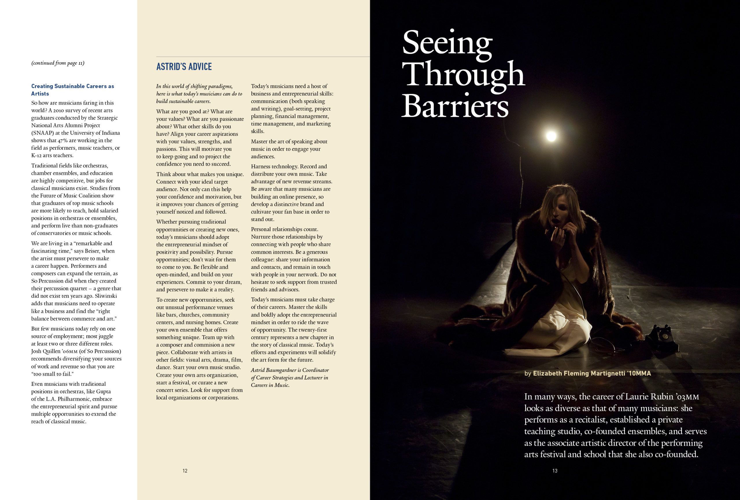
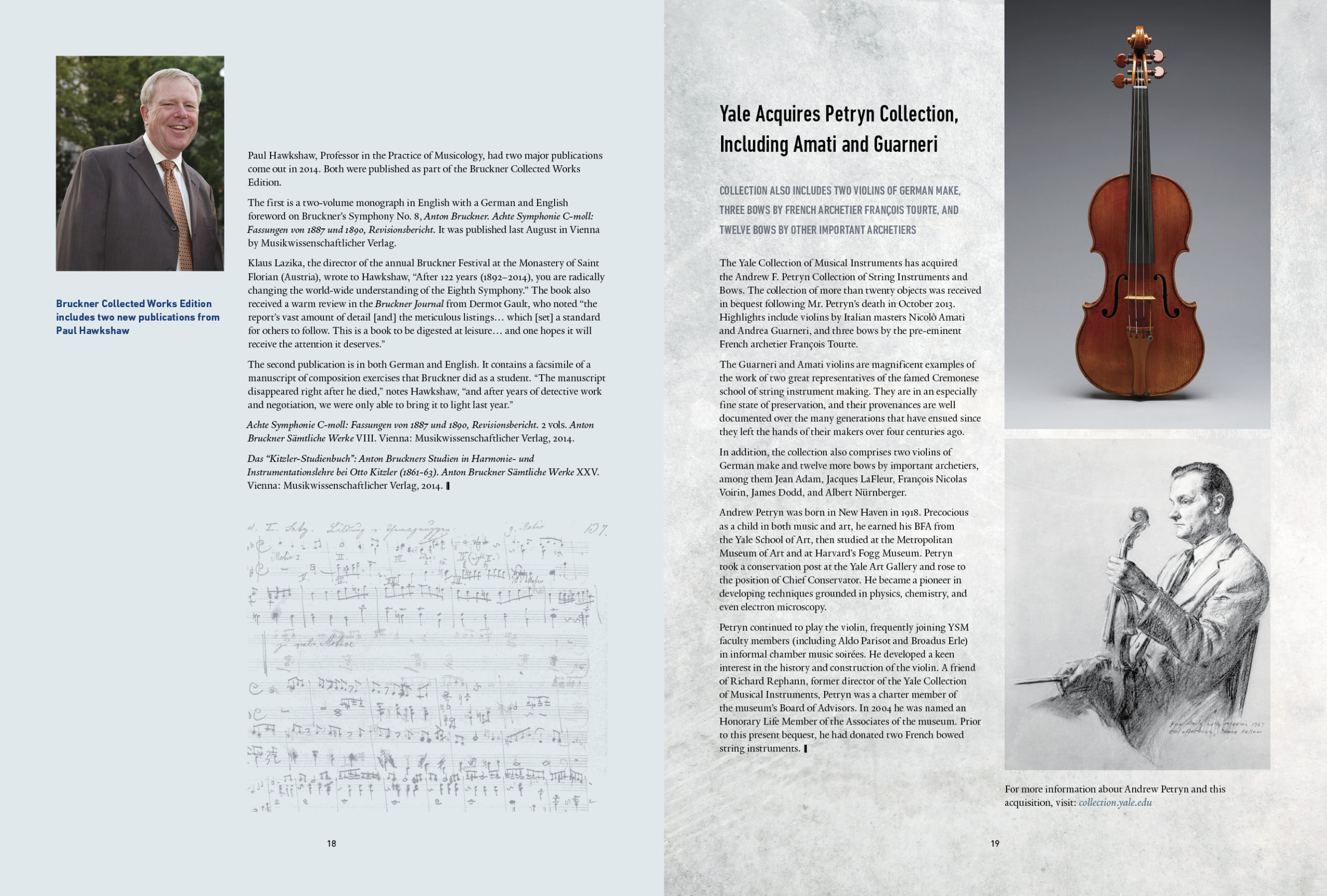
High-Impact Imagery & Focal Points
Visuals set the tone of a magazine. Effective layouts use:
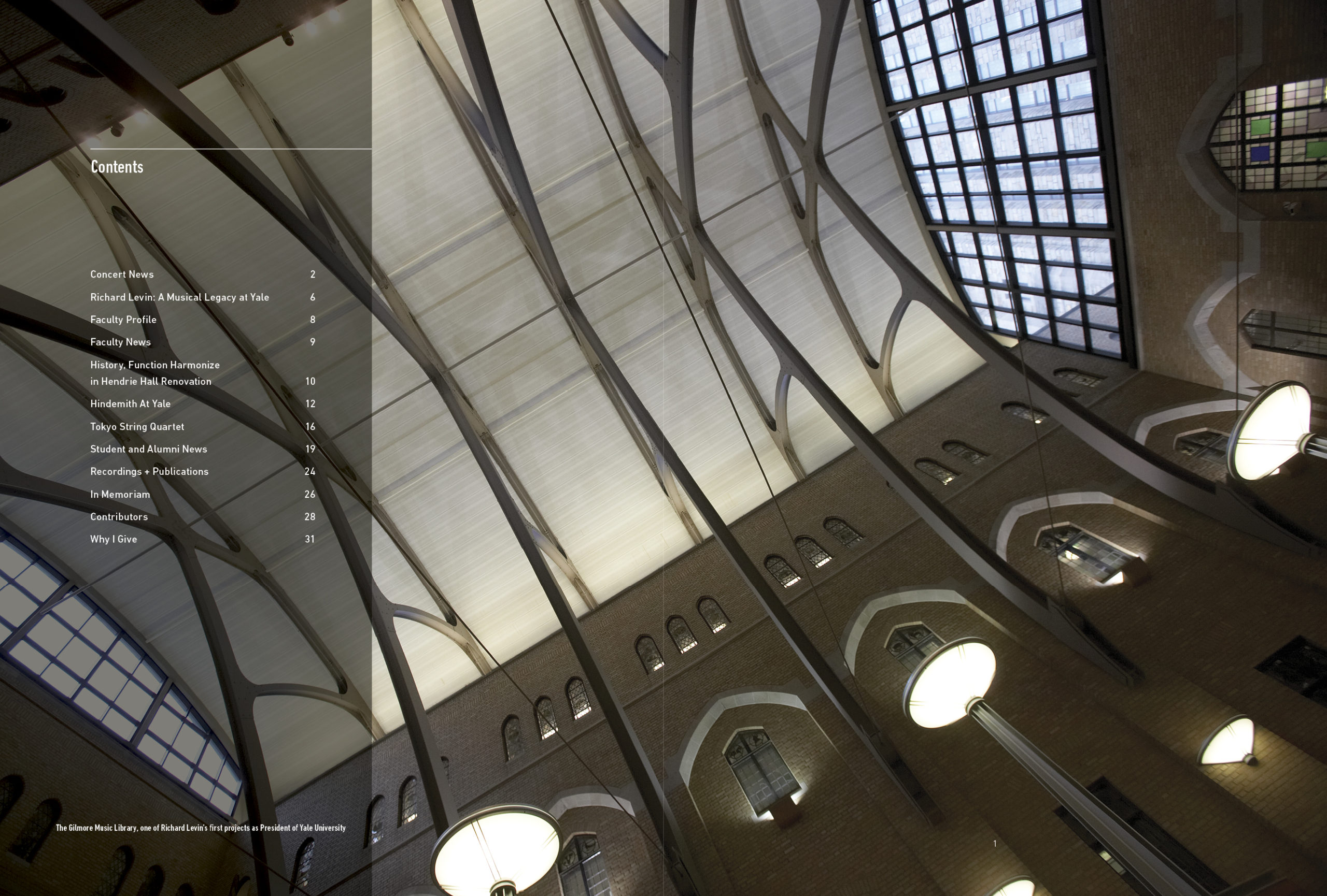
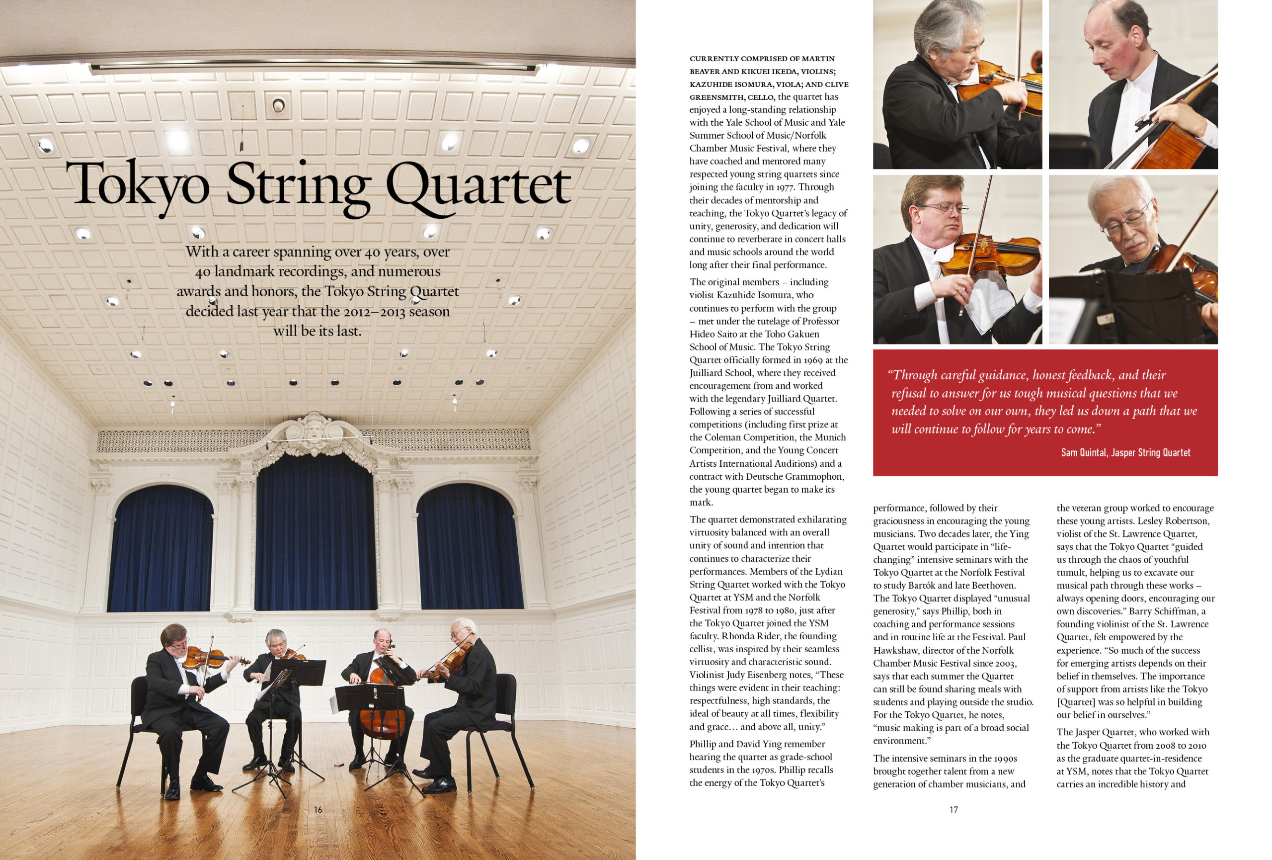
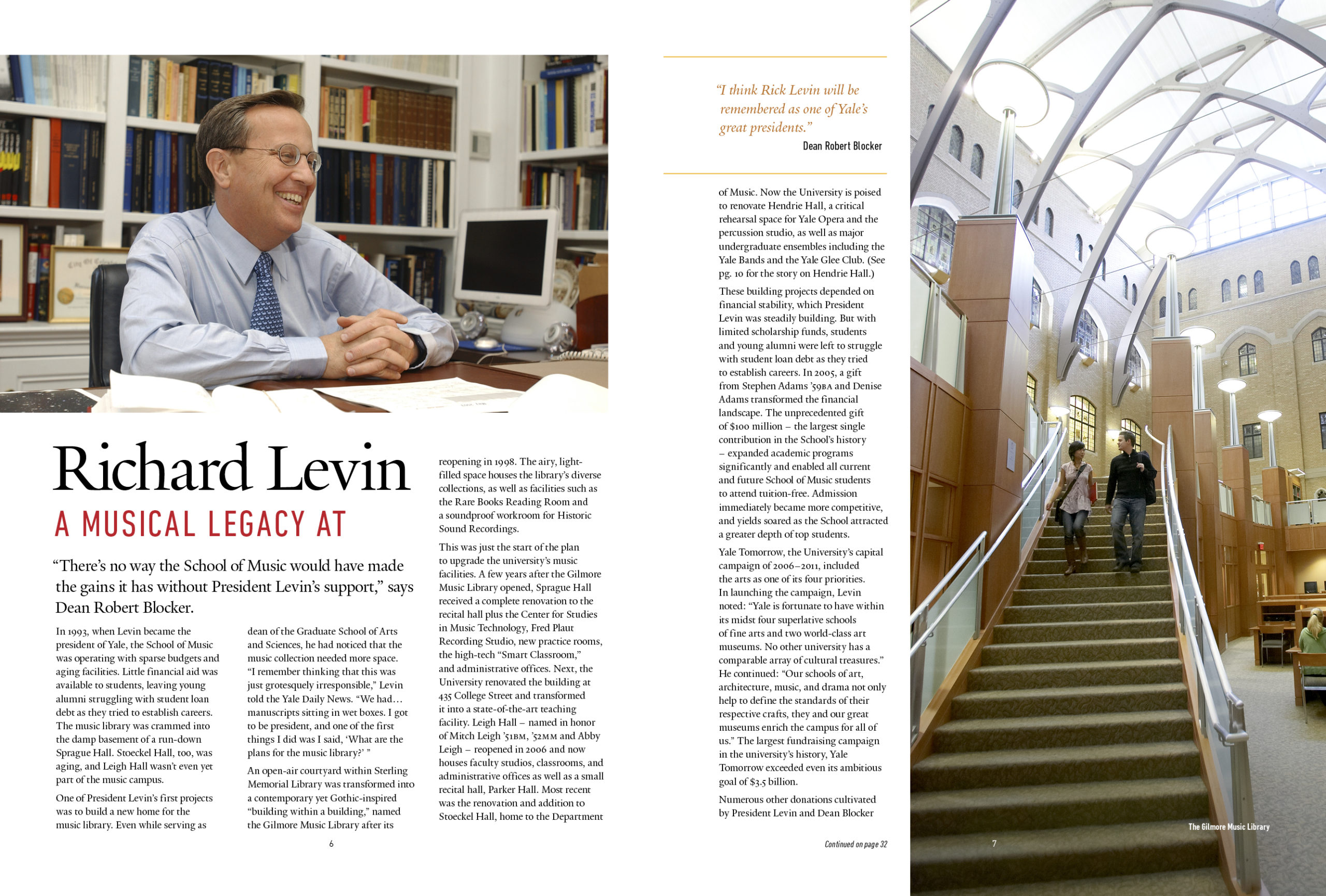
Hero Images: One dominant photographic or illustrative focal point per spread rather than several competing images of equal size.
Asymmetry: Off-center imagery and varied photo aspect ratios create dynamic energy across facing pages.
See Music at Yale’s Alumni Ventures brochure
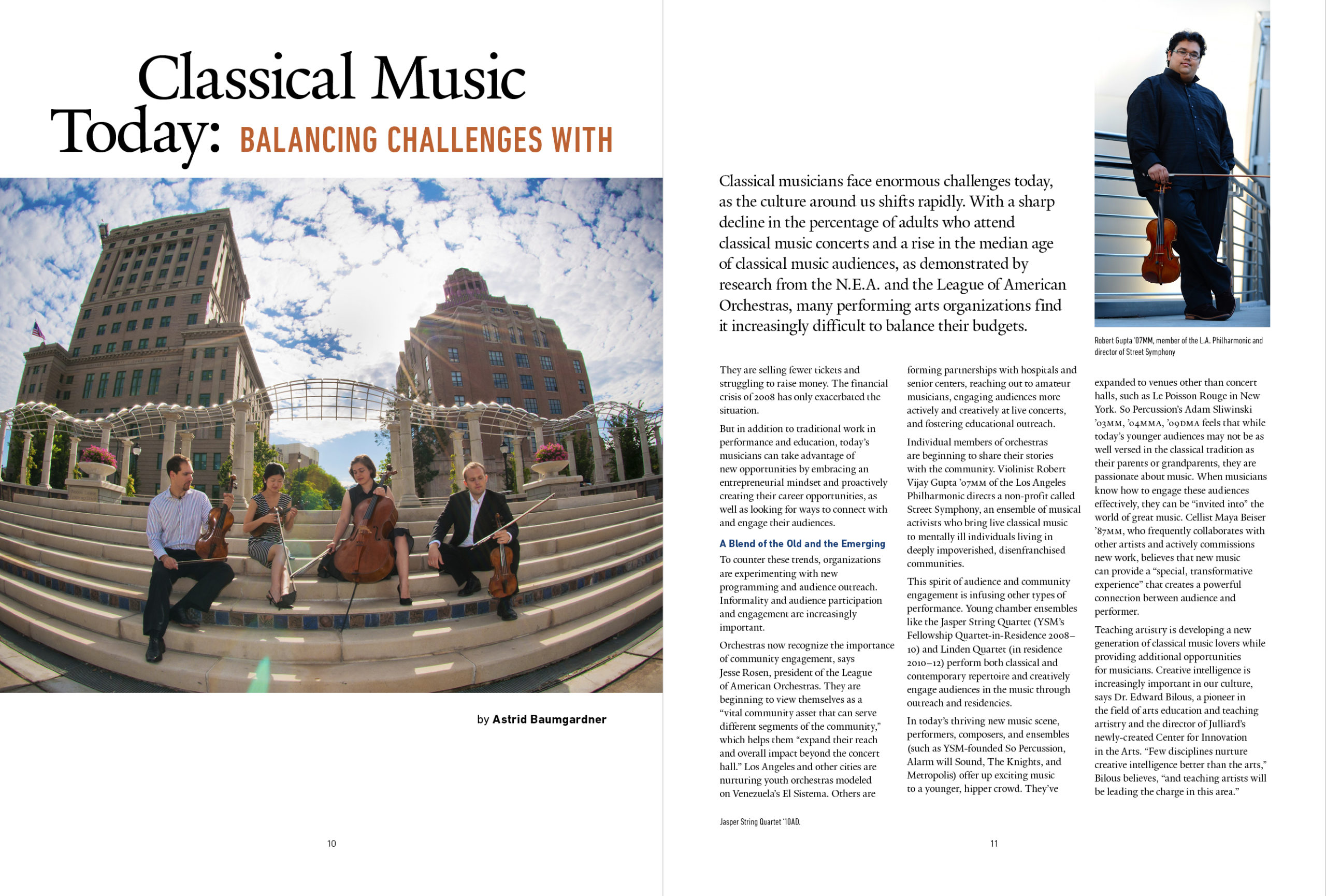
Consistent Branding & Pacing
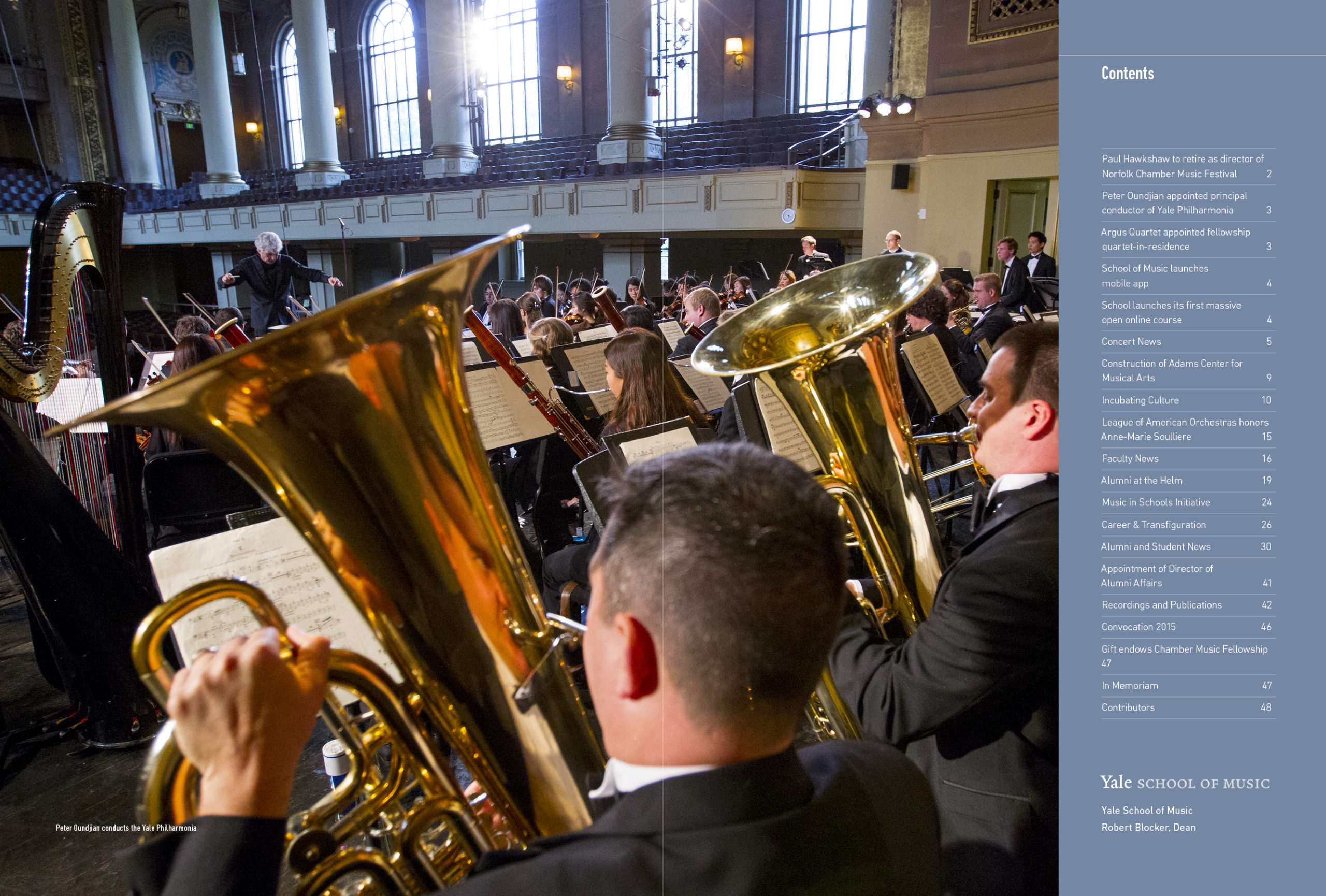
A magazine is an extended experience. Designers maintain unity across the entire publication using a distinct color palette, consistent running headers/footers, and intentional visual pacing—alternating text-heavy articles with image-driven photo essays to keep the reader refreshed.