
Theo Bertz: Sketchbook 03








Theo Bertz: “Graphite on Paper—Strokes on Canvas” Book Design 3/3
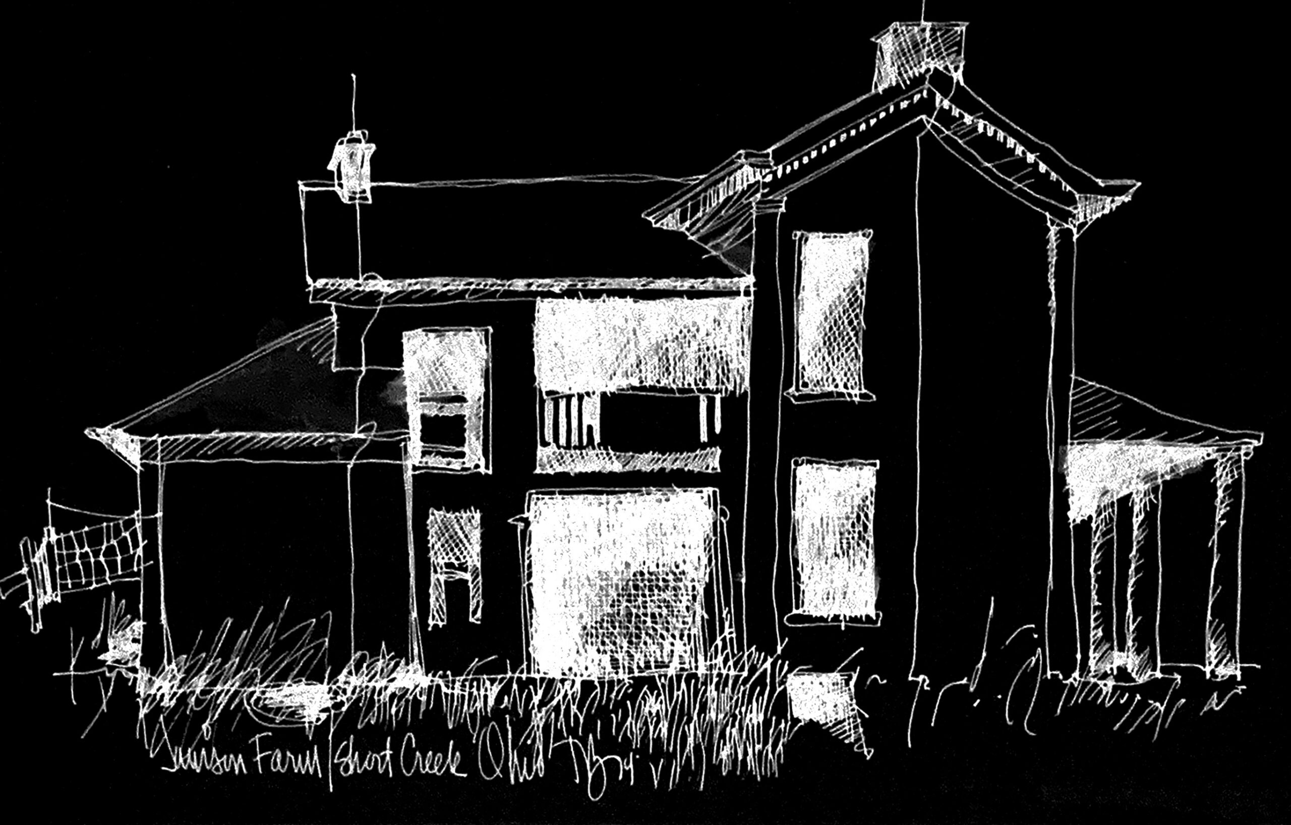
“Design is as much a matter of finding problems as it is solving them.”
Bryan Lawson

Scroll down to flip through Theo’s complete book
In print and graphic design, the 1-bit bitmap TIFF remains one of the most remarkably flexible utility formats available. Containing strictly pure black and pure white pixels without gray tones, a bitmap TIFF automatically treats its white background as transparent, allowing line art, custom textures, or hand-drawn illustrations to layer cleanly over backgrounds without requiring complex vector paths or clipping masks. Furthermore, major page-layout applications like Adobe InDesign let designers instantly colorize the black artwork—and even color the transparent frame background—using standard swatches. Because 1-bit files lack heavy multi-channel color data, they can be saved at crisp, high print resolutions (such as 1,200 to 2,400 DPI) while maintaining a surprisingly small file size. This unique combination of ultra-sharp line reproduction, effortless colorization, transparent layering, and light memory footprint makes bitmap TIFFs an enduring favorite for prepress workflows, comics, and screen printing.
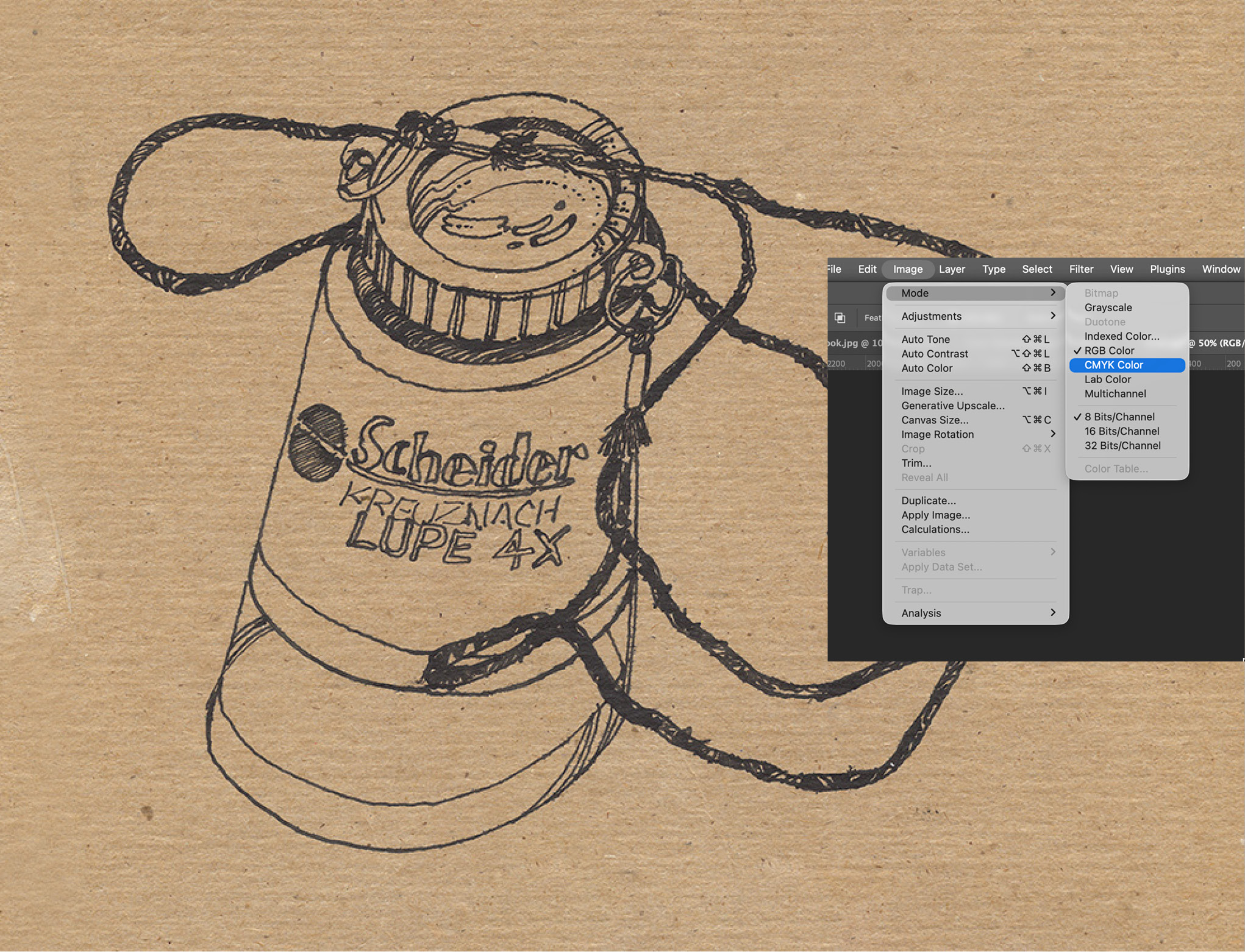
 Theo’s original loupe sketch. Most scans arrive in RGB mode. I almost always convert to CMYL because I’m used to that mode. In CMYK mode, I can see each (CMYK) channel individually. When sharpening an image, I often apply it to each channel individual, especially the black plate where I add contrast and sometimes extra sharpening to help images pop.
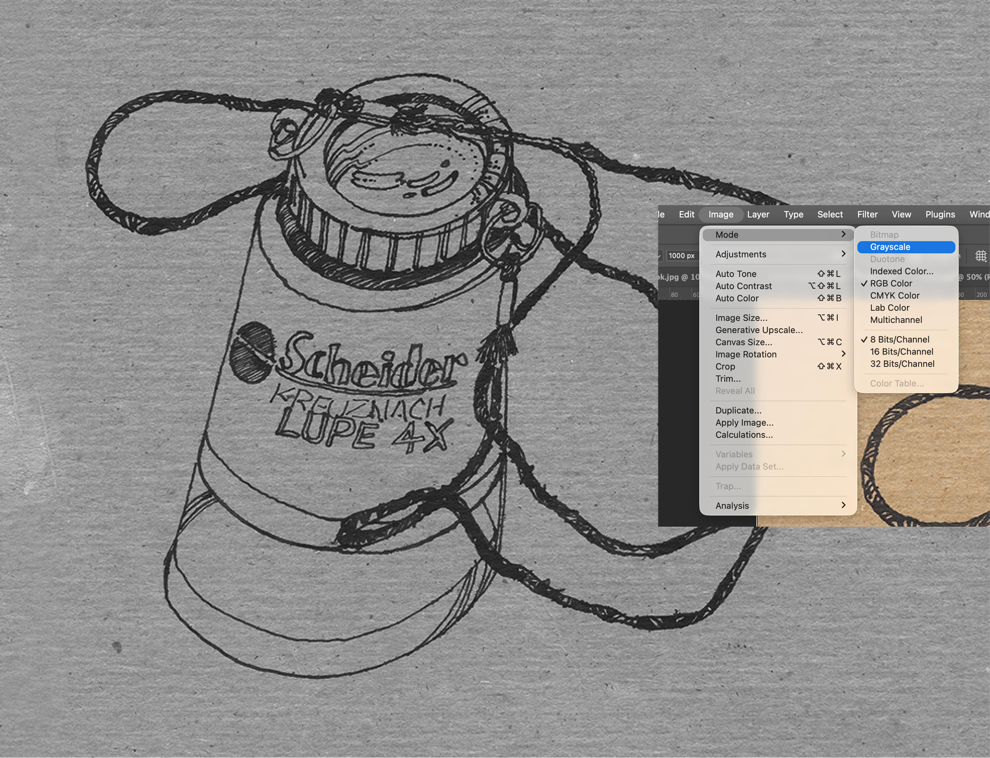
 When I’m making a bitmap image, I convert the image to greyscale. Sometimes, before I make that conversion, I look at the individual channels and find that one channel may work best. Of so, I view that channel and then covert it to greyscale.
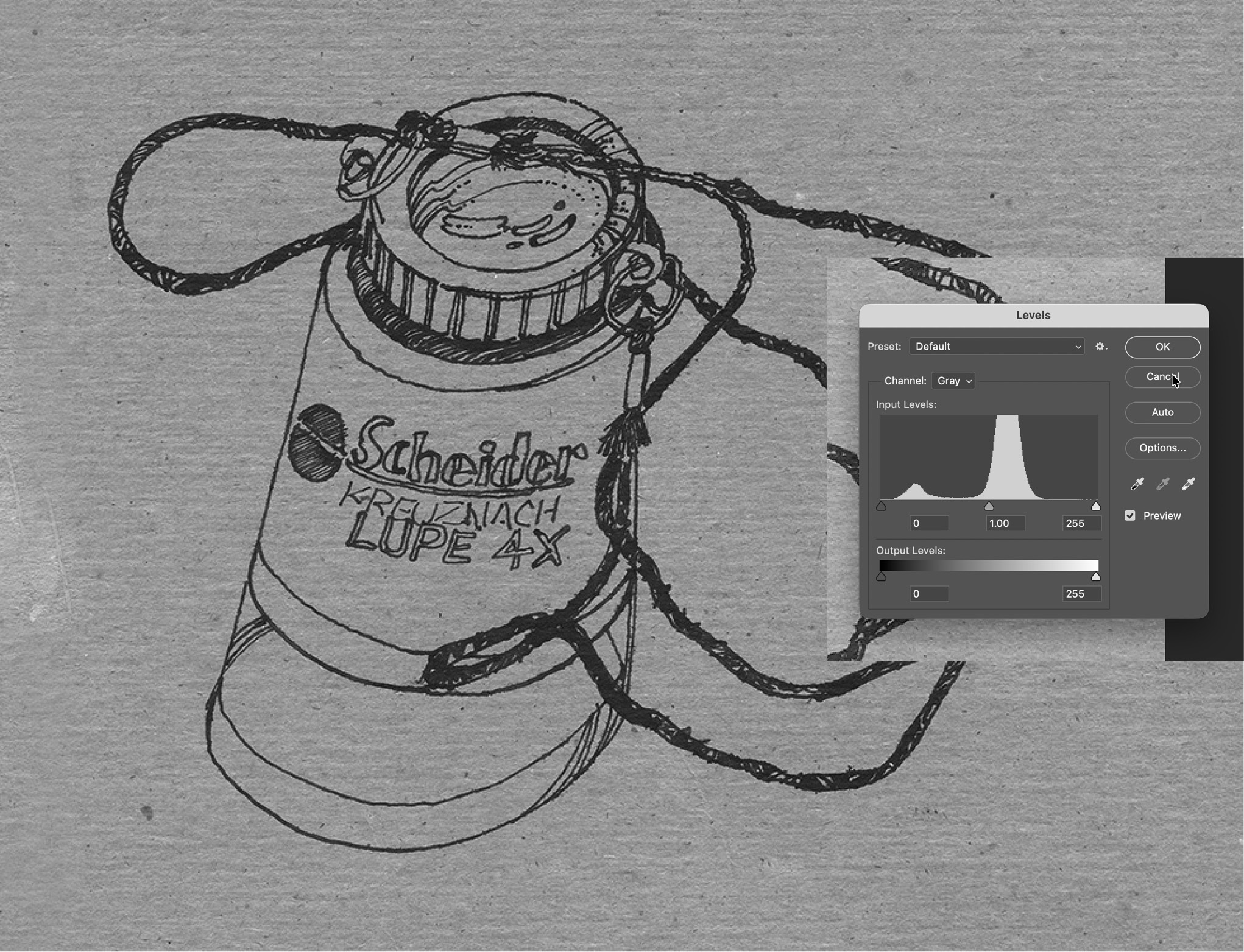
 Here are the default levels for that image.
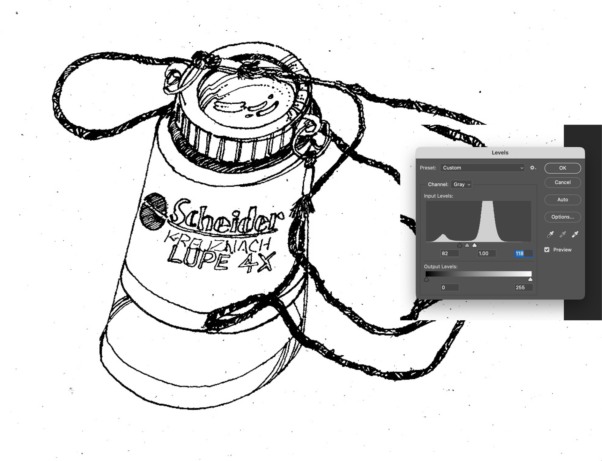
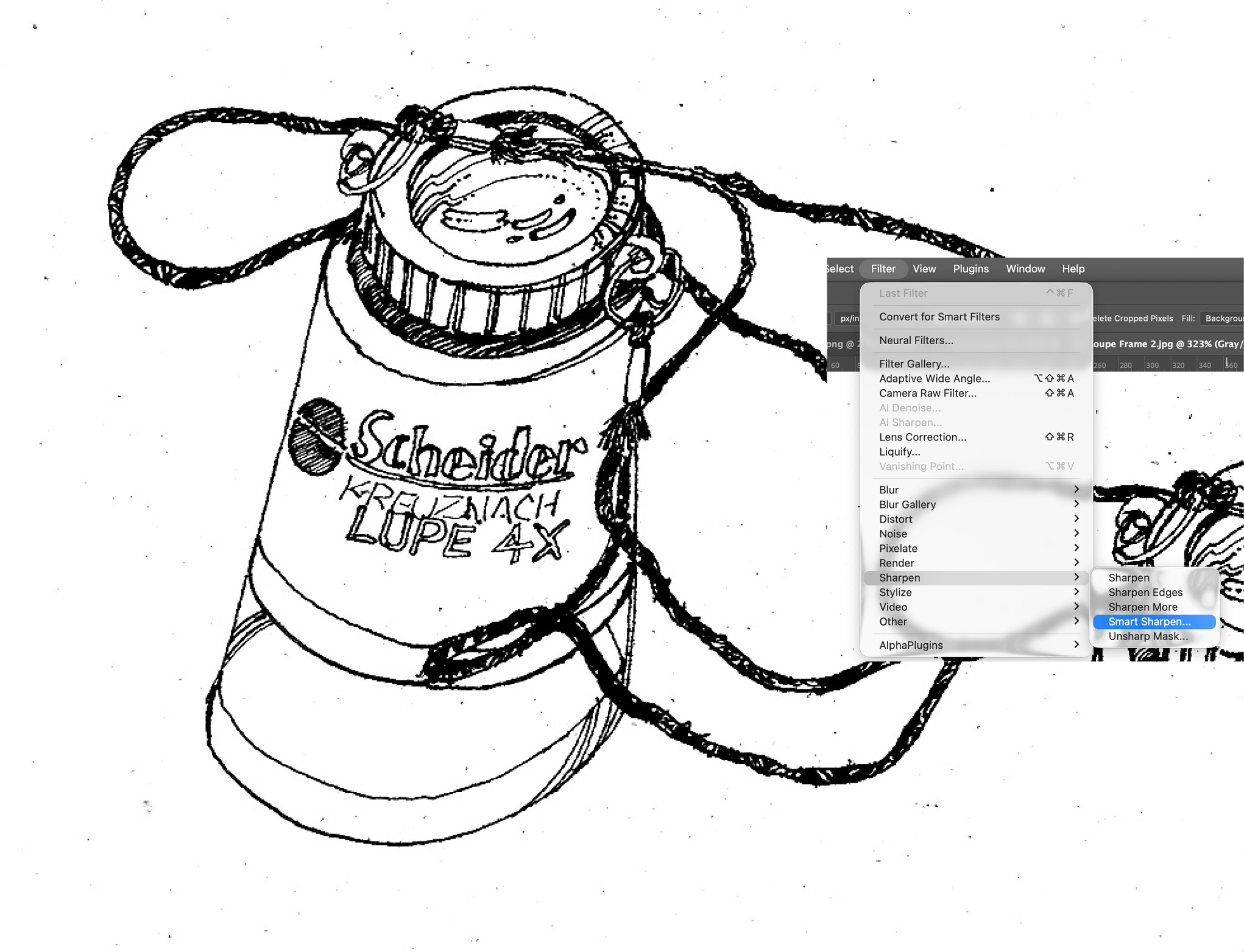
 I then change those levels to make the background as white as possible, and the black as clean as possible. This doesn’t always work so I sometimes use Photoshop’s dodge and burn tools to lighten or darken parts of the image.
 I almost always sharpen the greyscale image before converting it to a bitmap. I usually use Smart Sharpening, but the are other methods: Unsharp Mask, Sharpen More, Sharpen Edges.
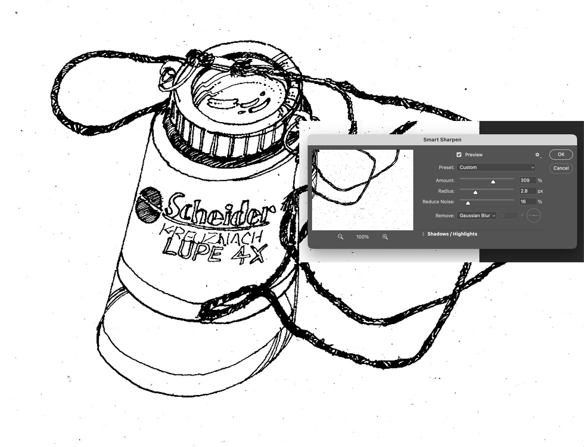
 Here are general settings for the Smart Sharpen filter. I often try different settings until the image looks just right.
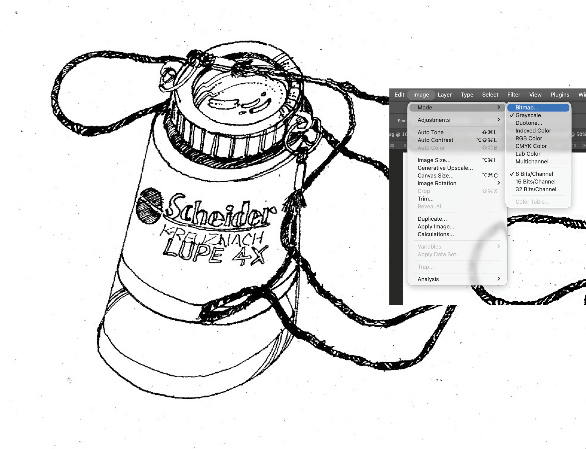
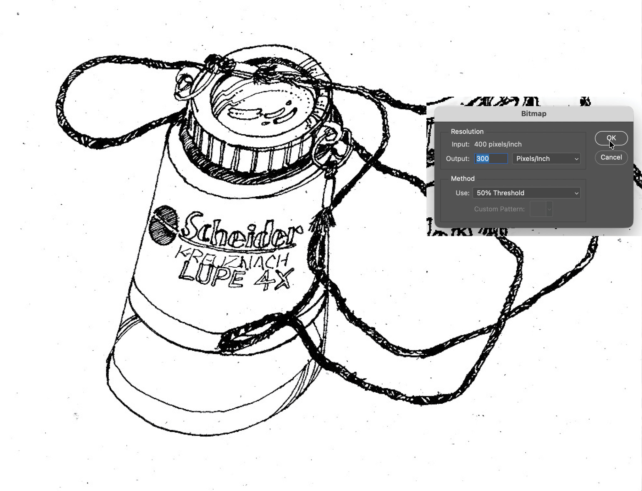
 I then change the mode to bitmap.
 There are several ways to change to a bitmap. Whenever possible, I use the 50% Threshold which does the best with sharp image. But sometimes I use Difussion Dither if the image still has greyscale sections in it. This creates a bitmap with difussed dots. Some images are either too low-resolution or lack enough contrast to be converted cleanly to a bitmap. I almost always go back and try again with mixed results.
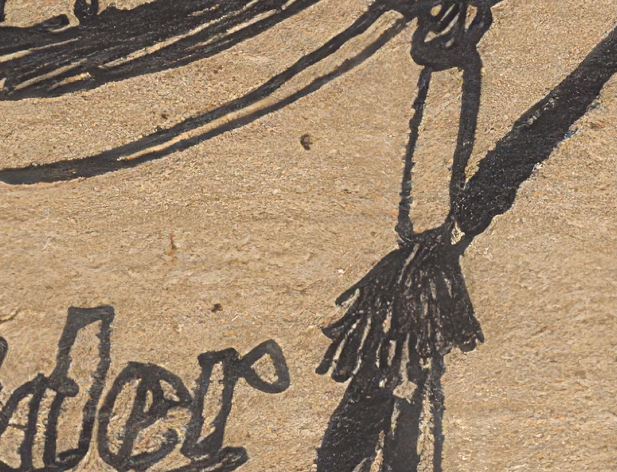
 Here’s a closeup of Theo’s original sketch.
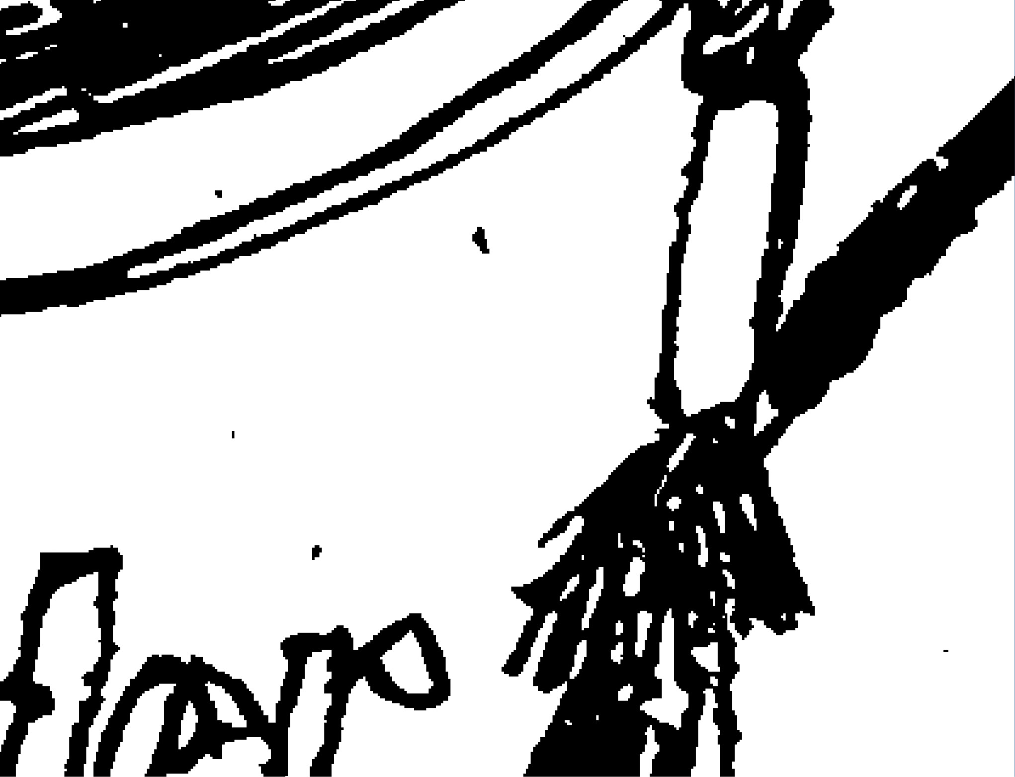
 Here’s a closeup of that same section as a bitmap.
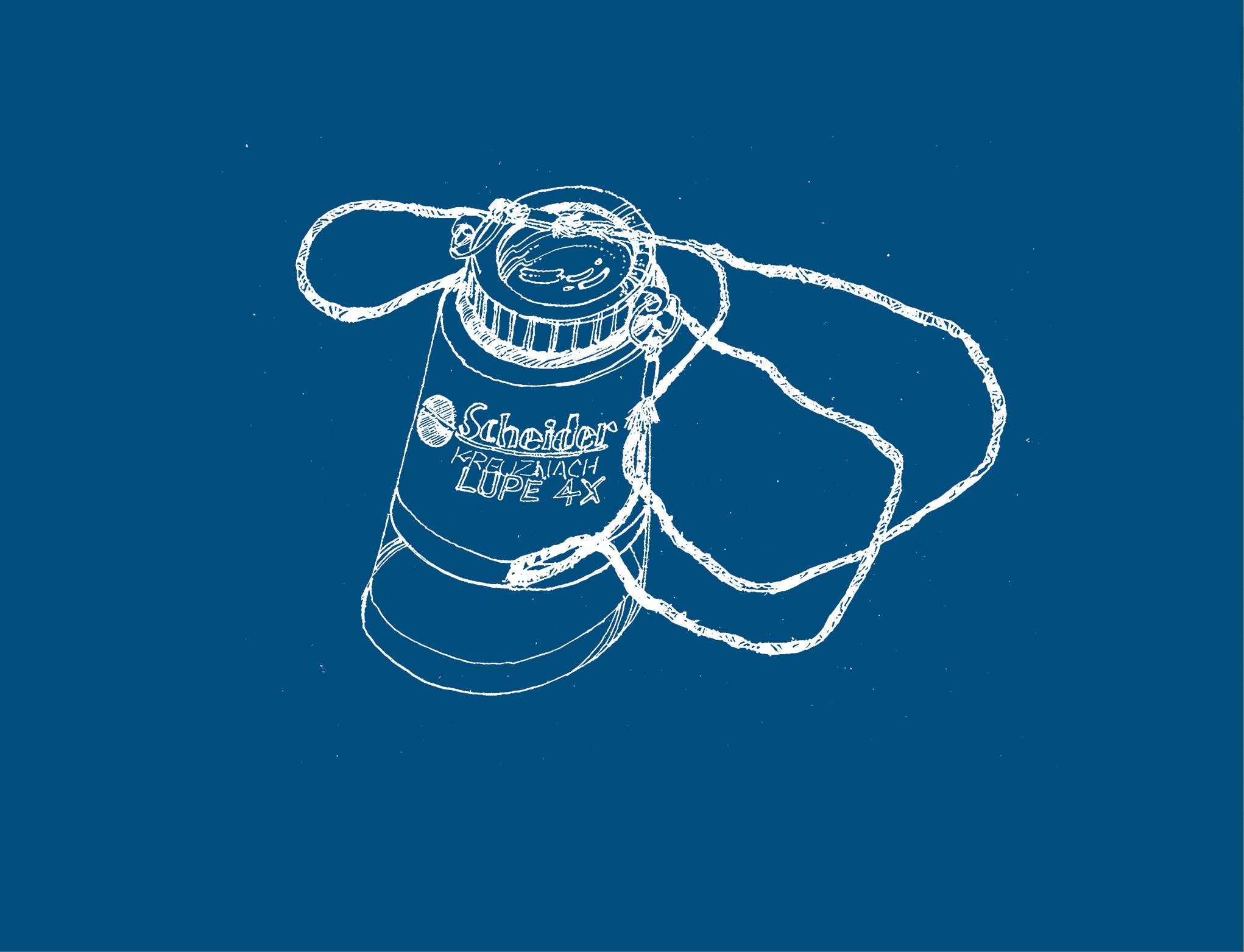
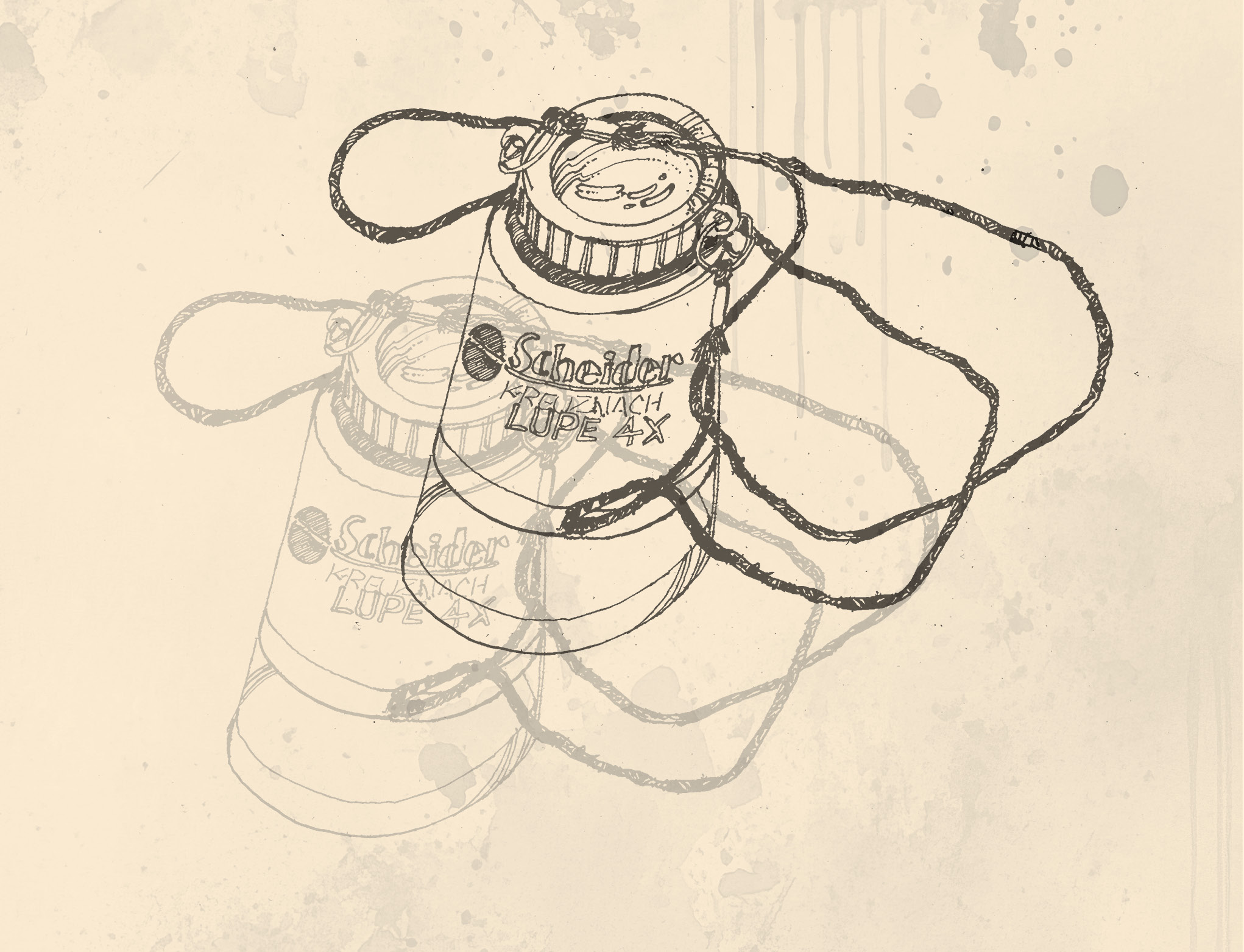
 Once I finish and save the bitmap as a TIFF file, I can place it in Adobe InDesign Once placed I have an endless number of ways to use it. Above: Once placed I added a blue background and set the image color to white.
 By using layers in InDesign I can place the image on top of a background. All of the white areas of the TIFF are completely transparent. I then duplicated th image, moved it and changed the opacity of the image using InDesign’s layer. On some pages in Theo’s book I duplicated three or more image layers with each layer rotated and changed the opacity.
