





Graphic Design Building Blocks 
Graphic Design Building Blocks: Printing Spot Colors

John F. Kennedy
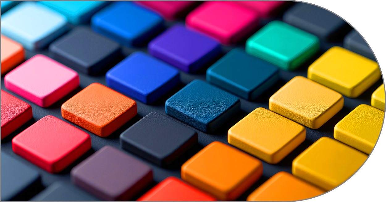
Solid ink printing, also known as spot color printing, uses premixed inks for each specific color. These inks are often referred to by their Pantone number and provide consistent color accuracy across different print runs. Solid inks are ideal for projects with a limited color palette, such as logos, illustrations, or when precise color matching is crucial. While solid inks offer greater color accuracy, they can be more expensive for smaller print runs due to the need for additional printing plates for each color. In contrast, CMYK printing, also known as process color printing, uses four base colors: cyan, magenta, yellow, and black (K). These colors are layered and blended to create a full spectrum of colors. CMYK is commonly used for full-color images and photographs, as it offers a wide range of colors and is cost-effective for large print runs. However, CMYK may not always achieve exact color matches, especially for specific or vibrant colors.
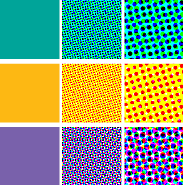
Below: Each of the squares below show (1) a solid color, (2) closeup of traditional CMYK halftone dots and (3) the same dots enlarged at 200%. In the enlargements, note in the gold swatch that the “background” appears to be solid yellow and the magenta (red) dots are seen at about 40% coverage. When I “mixed” the gold color in Photoshop, I selected 100% yellow, 40% magenta and no cyan or black. In the purple enlargement, notice how the cyan (blue) dots and the magenta dots overlap each other to form purple.
Other Printing Methods
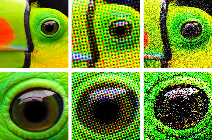
Below: On the left is a continuous tone, bitmap photograph, then a conventional halftone still used for most printing. Finally at the far right is a stochastic halftone. Although stochastic printing still mostly uses CMYK inks, the dots are scattered and therefore less obvious. Each of these is shown enlarged in the bottom row.

Learn More About the Building Blocks of Graphic Design
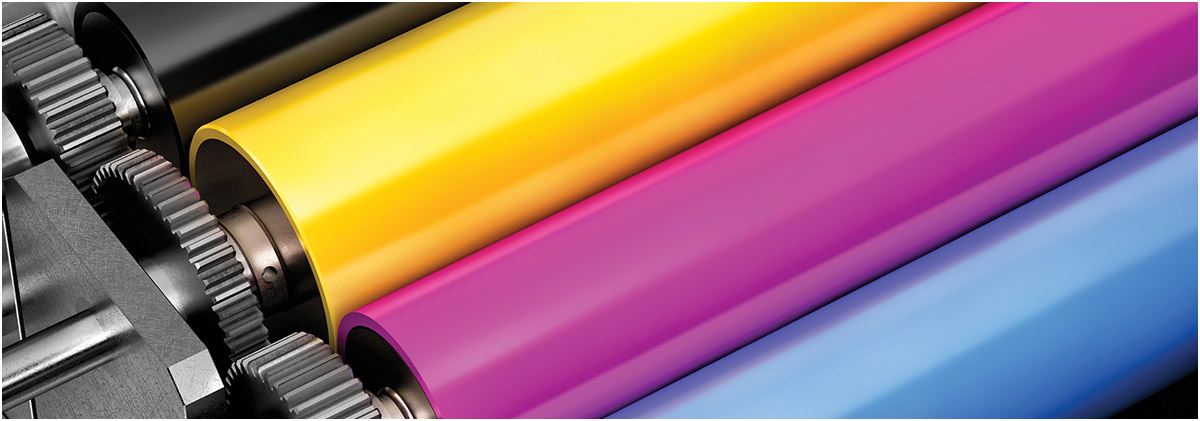

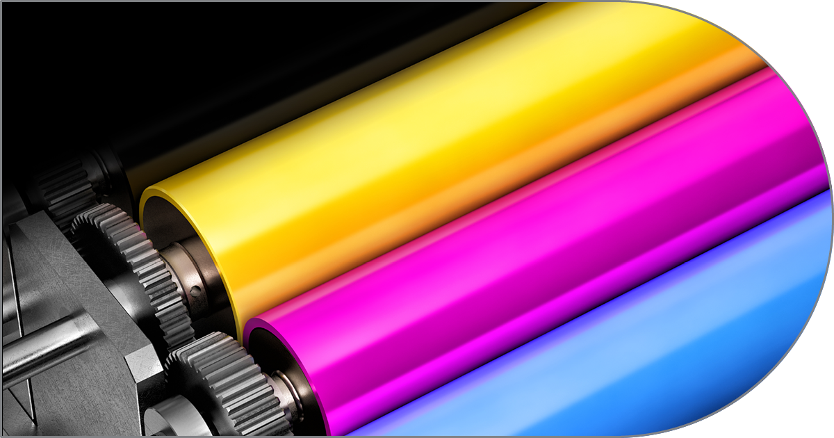
CMYK color printing bridges digital graphic design and tangible print by using overlapping subtractive dots of cyan, magenta, yellow, and black inks to faithfully reproduce complex, full-color imagery on paper.
Graphic design shapes a brand’s visual identity through cohesive color palettes, intentional typography, and memorable logos, translating a company’s core values into a distinct, recognizable personality that builds trust and recognition with its audience.
Bridging physical space and visual communication, wayfinding graphic design relies on intuitive visual cues—ranging from clear signage systems and spatial maps to color-coded pathways—to guide people effortlessly through complex environments.
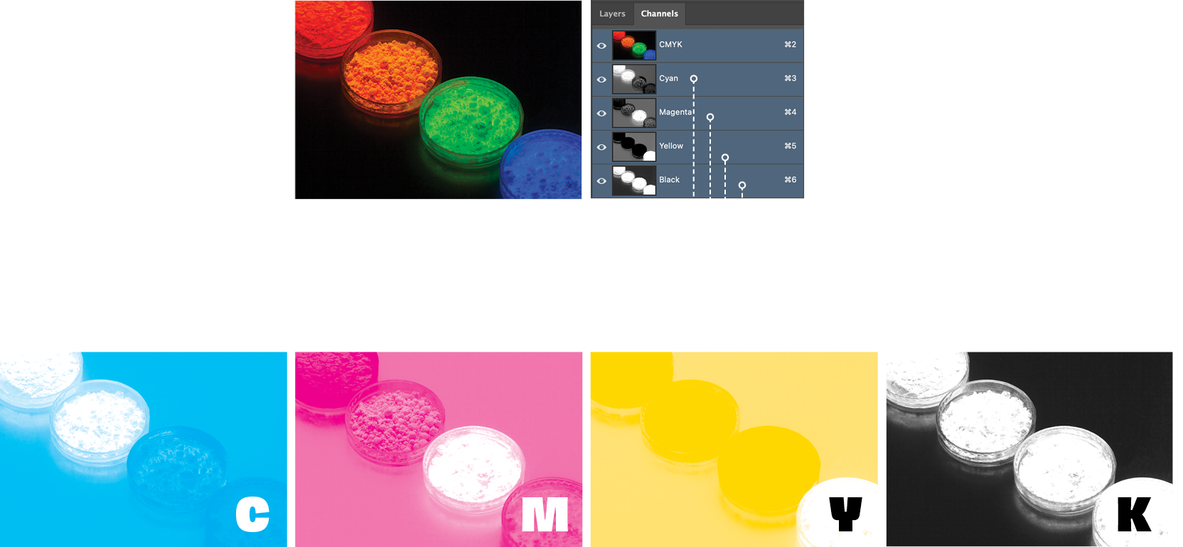
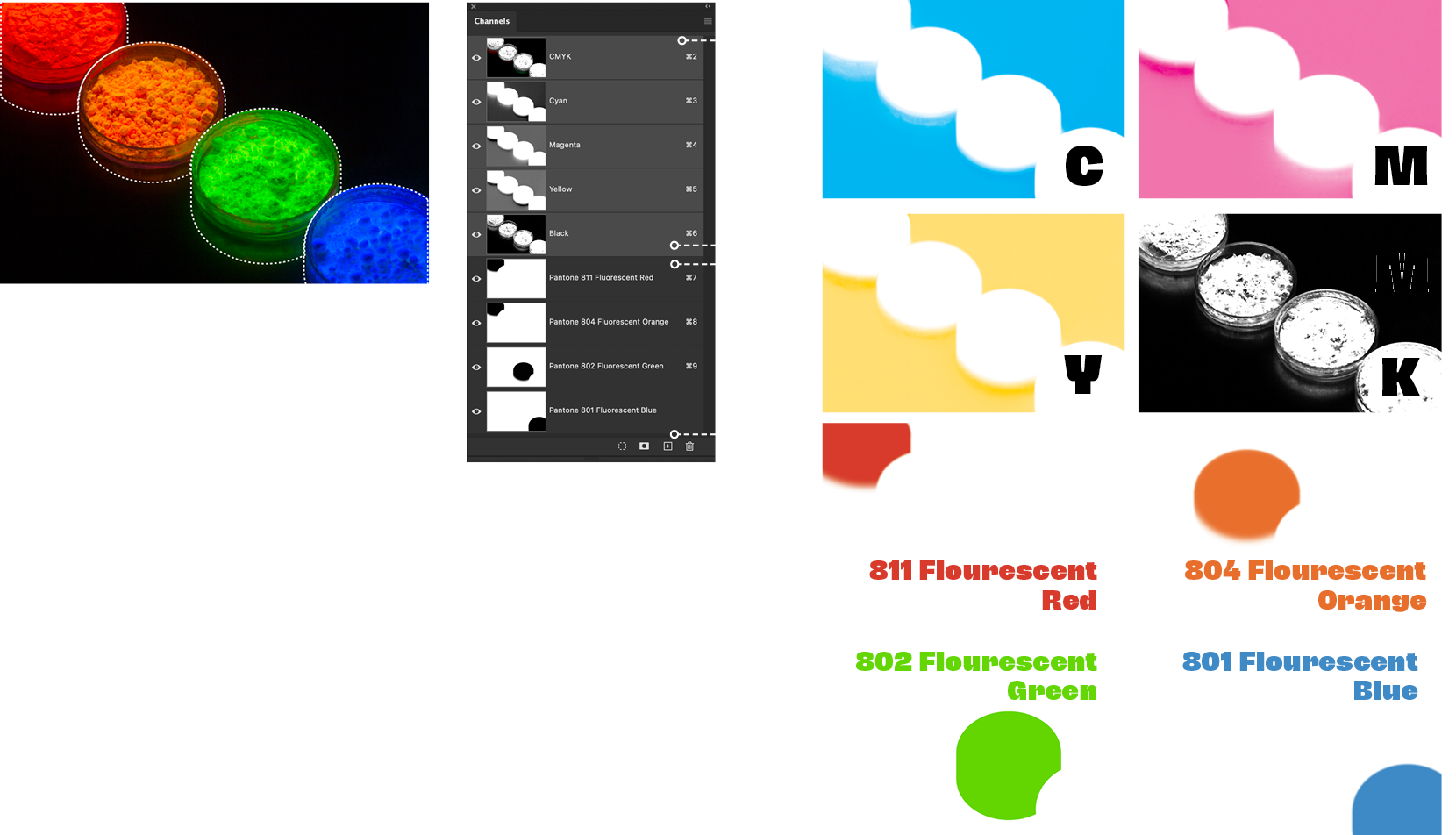
This step-by-step will walk you through the basics of adding new channels (plates) to an image in Photoshop and using several spot fluorescent inks on press to really bring an image to life. Here we see the original photograph viewed in Photoshop and its cyan, magenta, yellow and black inks. But, rather than limit ourselves to the color spectrums available with just CMYK, we’ll add four additional channels, each made up of a single Pantone ink isolated using Photoshop’s selection and feathering tools. At the printer, instead of just producing the basic CMYK color plates, four additional plates will be created. In this case, we’ll use four Pantone fluorescent inks to really give the image some kick.
Below: the original CMYK image with four plates before we added spot colors.
Below: To begin, our designer creates a hard-edged shape indicating where the fluorescent Pantone 802 green ink will print. The dotted line shows that shape. We then make a new “layer mask” to “knock out” the area around that shape (center). To make sure the green plate will print with soft edges (close to the original image), we then use one of Photoshop’s many blur tools (here we use “Gaussian” blur on the whole channel) Finally, we want the green to blend seamlessly into the black background below the dish, so we use other Photoshop tools to make a smooth transition from the green channel into the black background of the original image.
Below: We use the layer mask for the green channel to knock out the green area in the cyan, magenta and yellow plates so only green and black will print there. We leave the black plate as is, since it will define the detail in the green dish.
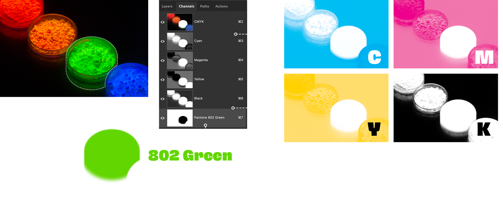
Below, left to right: We repeat the step above for each of the other three Pantone fluorescent inks, isolating each from the other plates. When the Photoshop file is saved, the four additional fluorescent ink plates are saved along with the original CMYK channels. When the printer gets the file he/she will output each channel separately and create a plate for each of the eight channels. The result will be an eye-popping color-intense photo. Note: this method is only available with conventional offset printing. In digital printing, most printers are limited to CMYK inks, although (depending on the digital printer) the digital version with only CMYK inks will probably be a bit more intense than the conventional offset printed version.
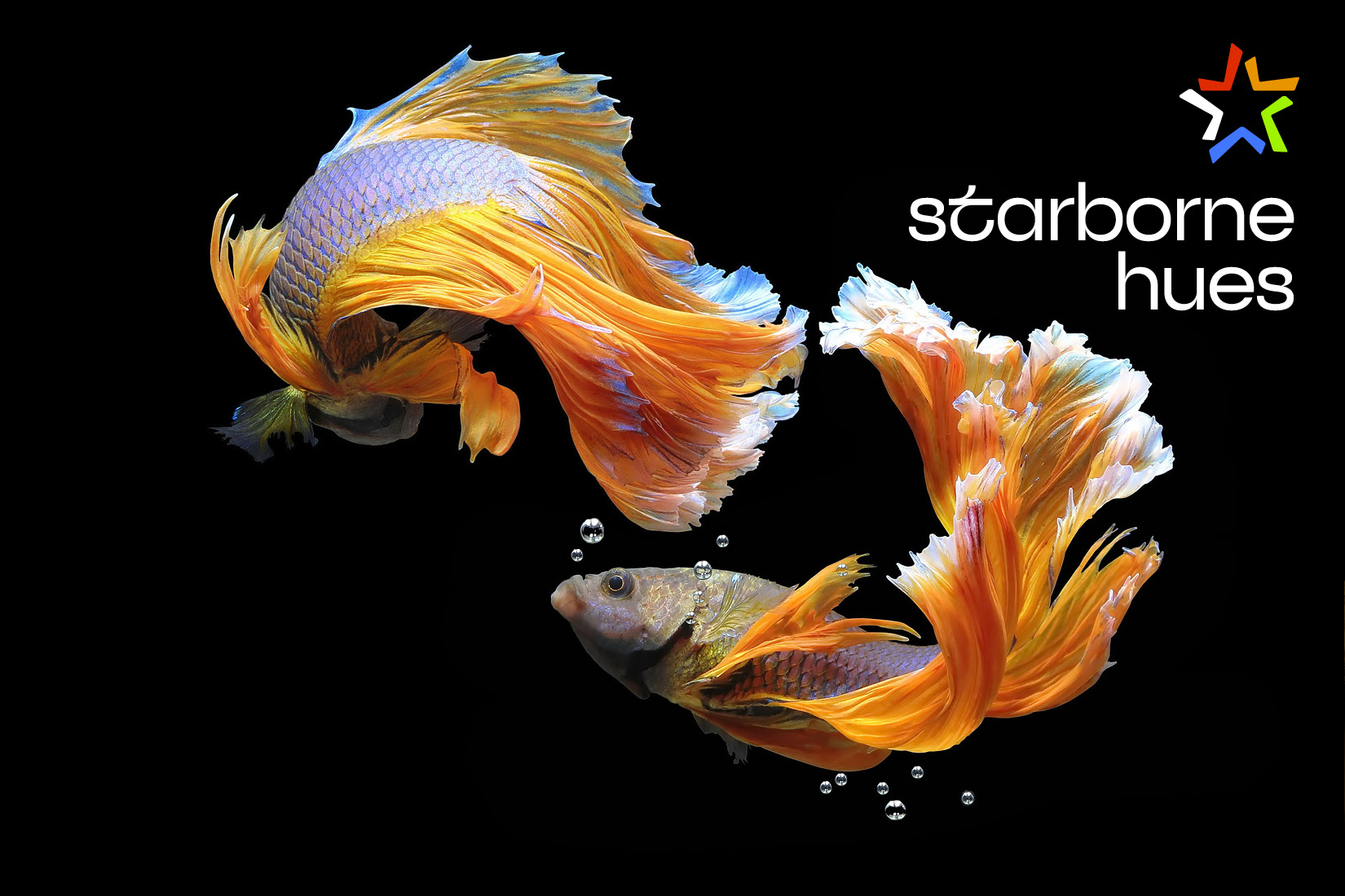
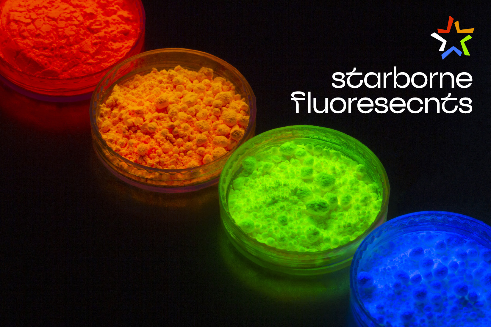
Below: sample pages from the printed piece. Starborne Color Systems is a highly specialized ink supplier and printer. For this piece, each of the pages shown utilizes a set of custom CMYK inks in addition to another set of custom made inks. These range from the fluorescent Pantones in the upper right, to specially formulated hues, earth and metallics. Because of the limits of PDF display and web graphics, the spot colors can only be rendered as standard CMYK and RGB. So we can’t show you the effect of the spot colors in the images above and on the previous pages.