





Graphic Design Building Blocks 
Graphic Design Building Blocks: Typography
Robert Bringhurst
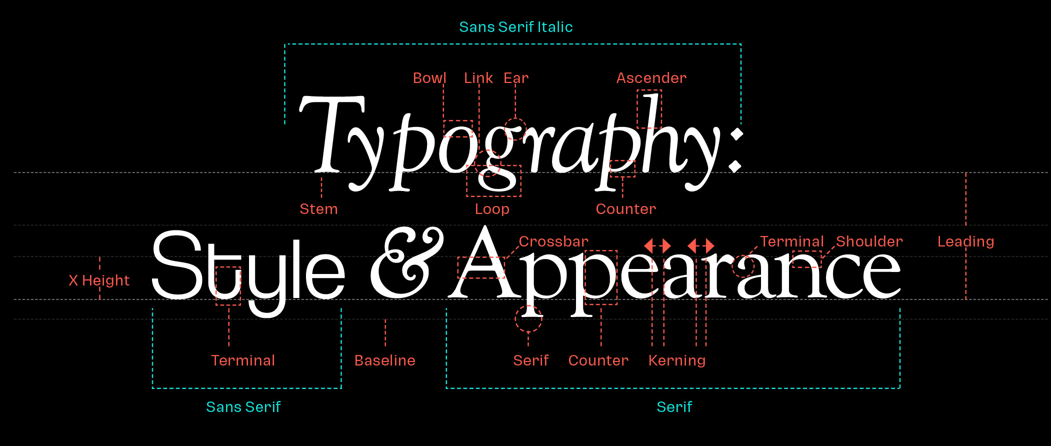
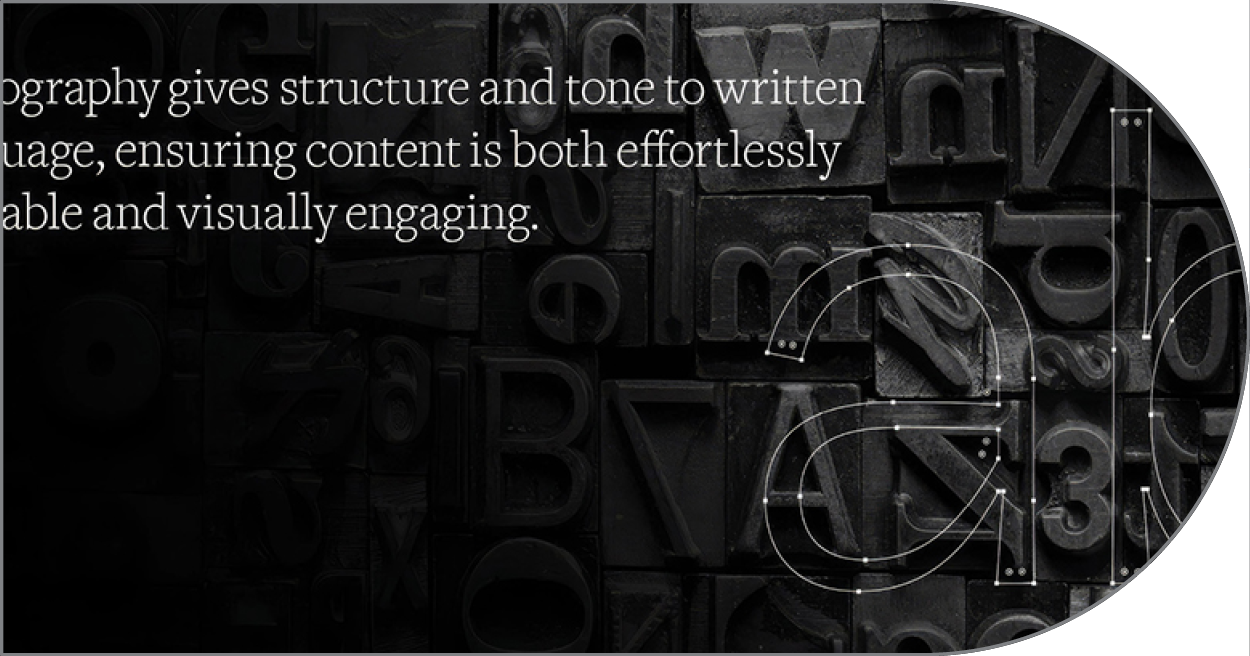
Typography is the backbone of graphic design, transforming mere text into a visual language that communicates far beyond the literal meaning of words. Far from being a passive vehicle for messaging, typography shapes the tone, emotion, and accessibility of a piece. Every typeface carries its own distinct personality and historical context, whether it is the authoritative structure of a classic serif or the clean, modern efficiency of a geometric sans-serif. By carefully selecting and arranging type, graphic designers set the stage for how a message is perceived, framing the user’s initial impression before a single sentence is read.
At the heart of successful typographic design lies visual hierarchy, which guides the viewer’s eye seamlessly through a page or screen. Through strategic variations in scale, weight, tracking, leading, and contrast, a designer creates an intuitive map for the reader. Headlines command immediate attention, subheadings break complex ideas into digestible sections, and body text is optimized for effortless legibility. Without this structured discipline, even the most captivating copy risks becoming an overwhelming wall of text, leaving the reader disoriented and unengaged.

Learn More About the Building Blocks of Graphic Design
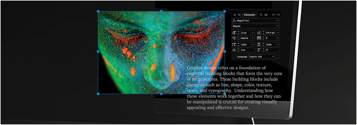
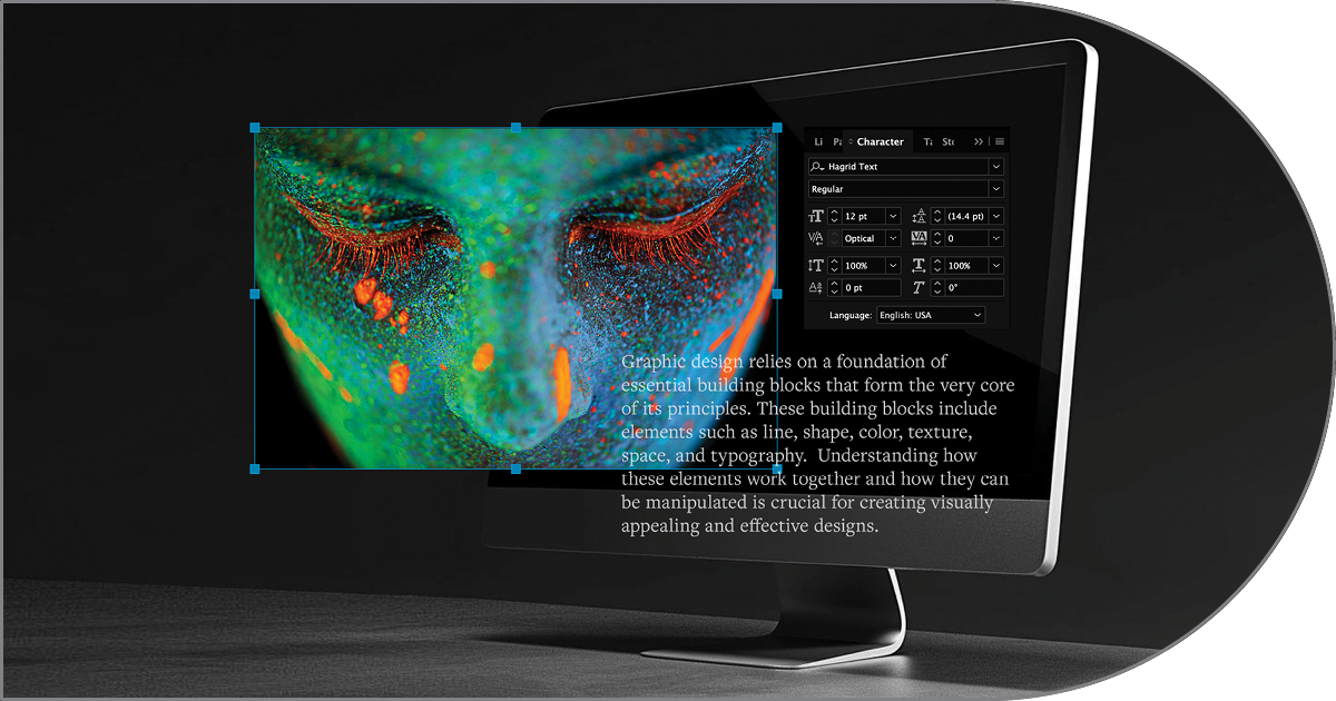
Graphic design establishes the creative vision, typography hierarchy, and visual branding for print and digital media, while Adobe InDesign serves as the industry-standard layout power tool that precision-engineers those elements.
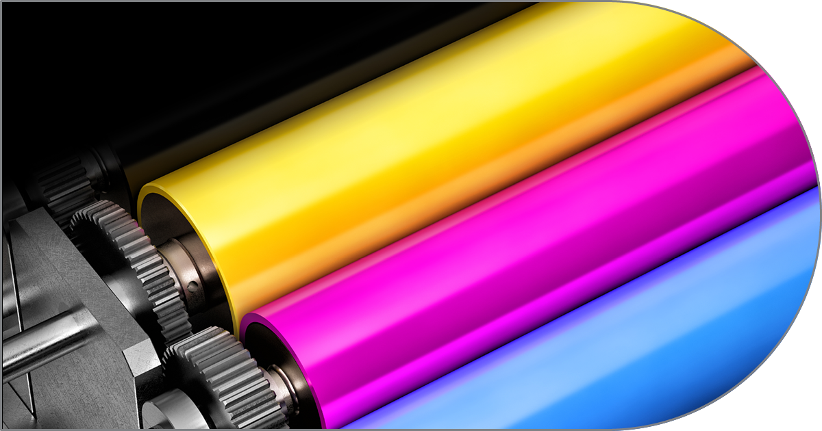
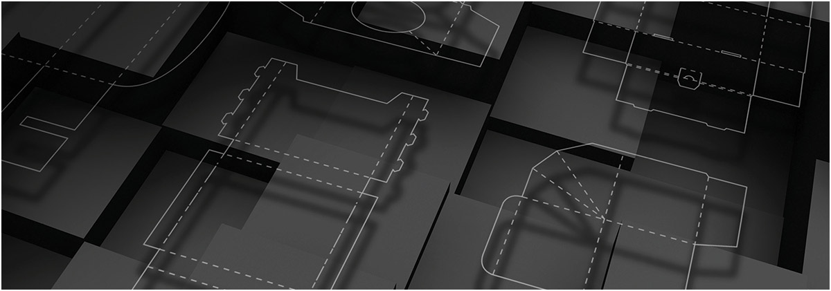
Graphic design transforms functional product packaging into an engaging tactile experience by fusing structural layout, brand typography, and persuasive visual hierarchy to instantly capture attention on crowded retail shelves.
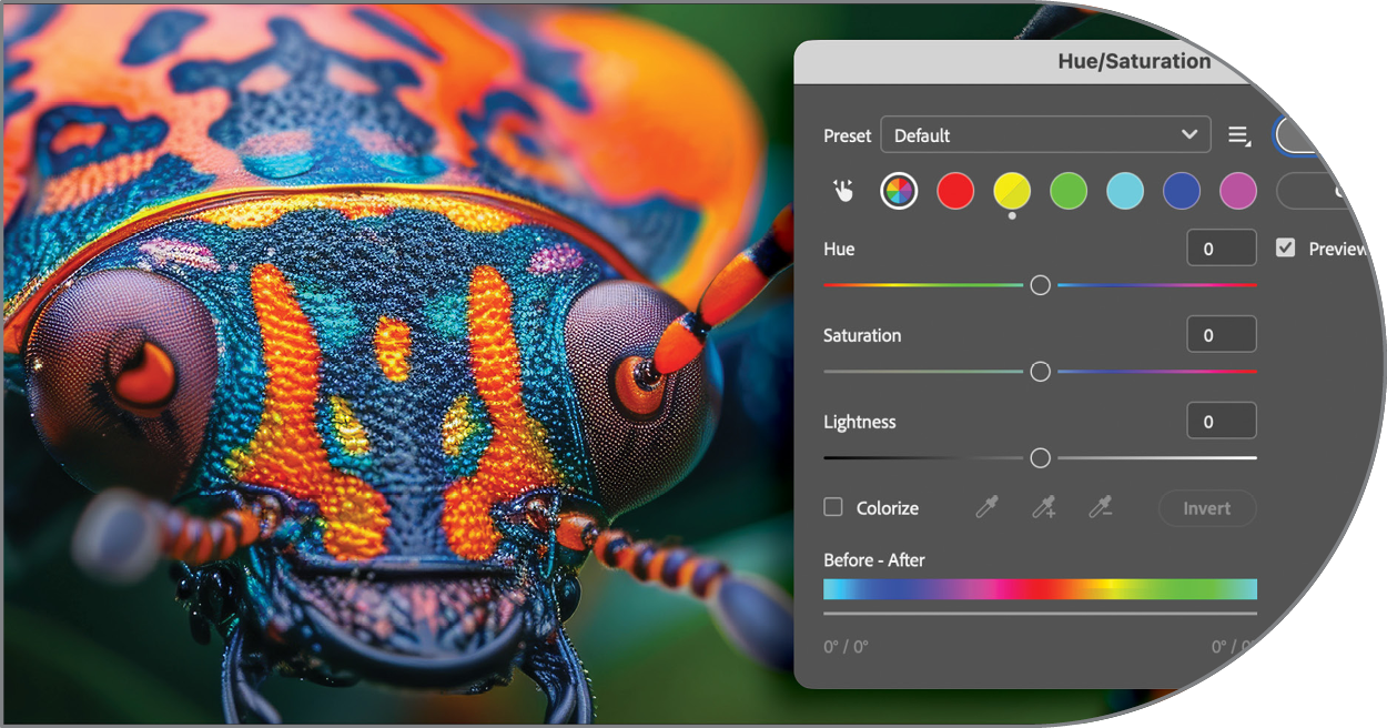
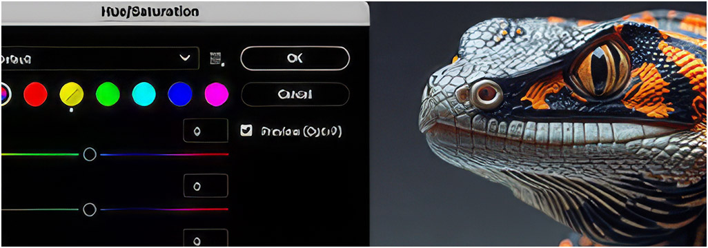
Adobe Photoshop serves as an essential digital canvas for graphic designers, enabling them to manipulate images, blend complex visual layers, and refine intricate raster graphics with extraordinary precision.
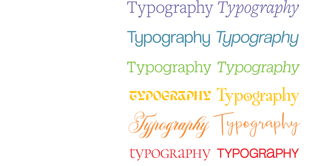
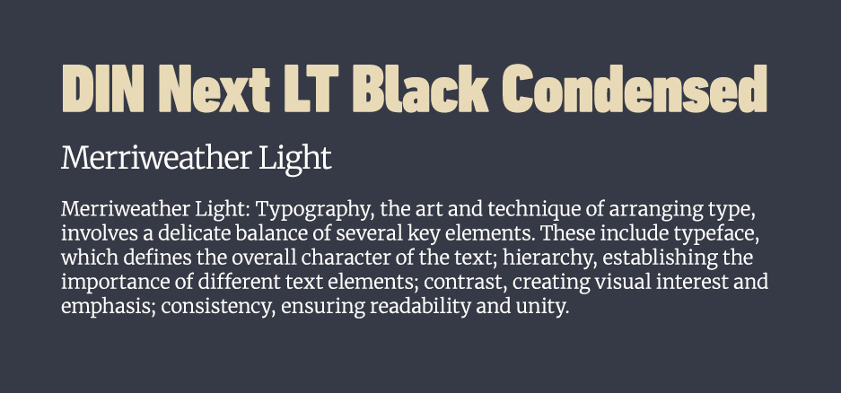
In graphic design, font pairing is the art of combining distinct typefaces to establish clear visual hierarchy, enhance readability, and evoke a specific brand voice. Effective font pairings rely on deliberate contrast rather than conflict—typically balancing a high-personality display or serif headline font with a clean, highly legible sans-serif for body copy. To maintain cohesion, designers often match typefaces that share similar structural proportions, x-heights, or historical eras, or they limit selection to a single super-family that offers a wide range of weights and styles. By limiting a layout to two or three harmonizing typefaces, you guide the reader’s eye effortlessly through the page while creating a polished, intentional aesthetic.
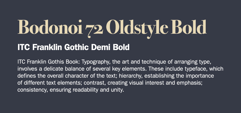
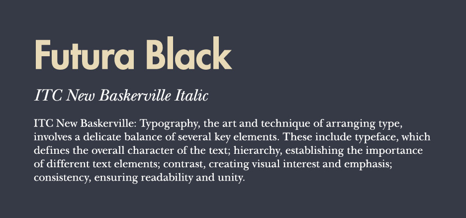
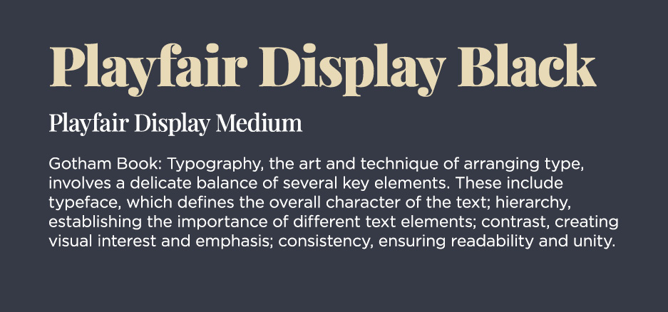
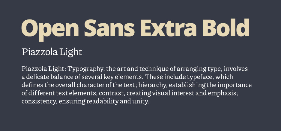
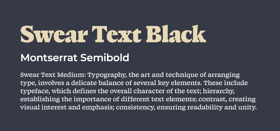
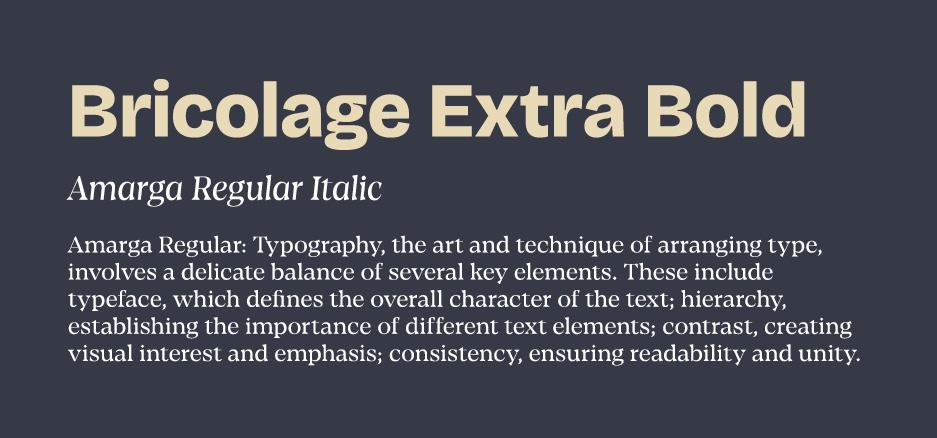
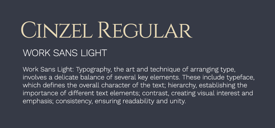
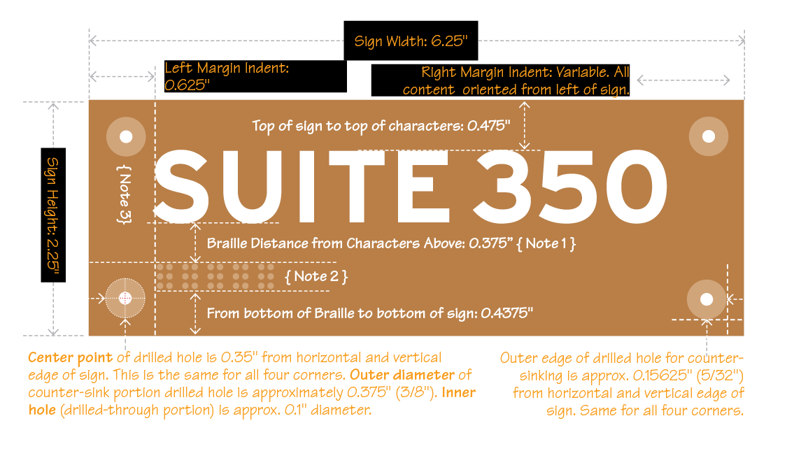
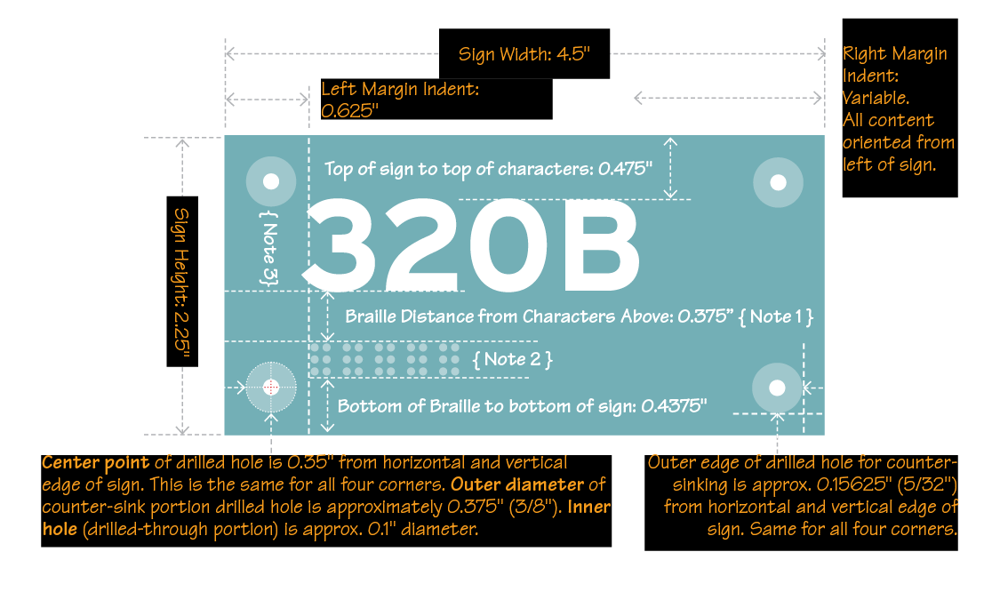
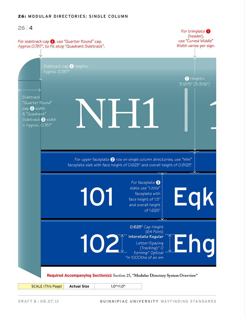
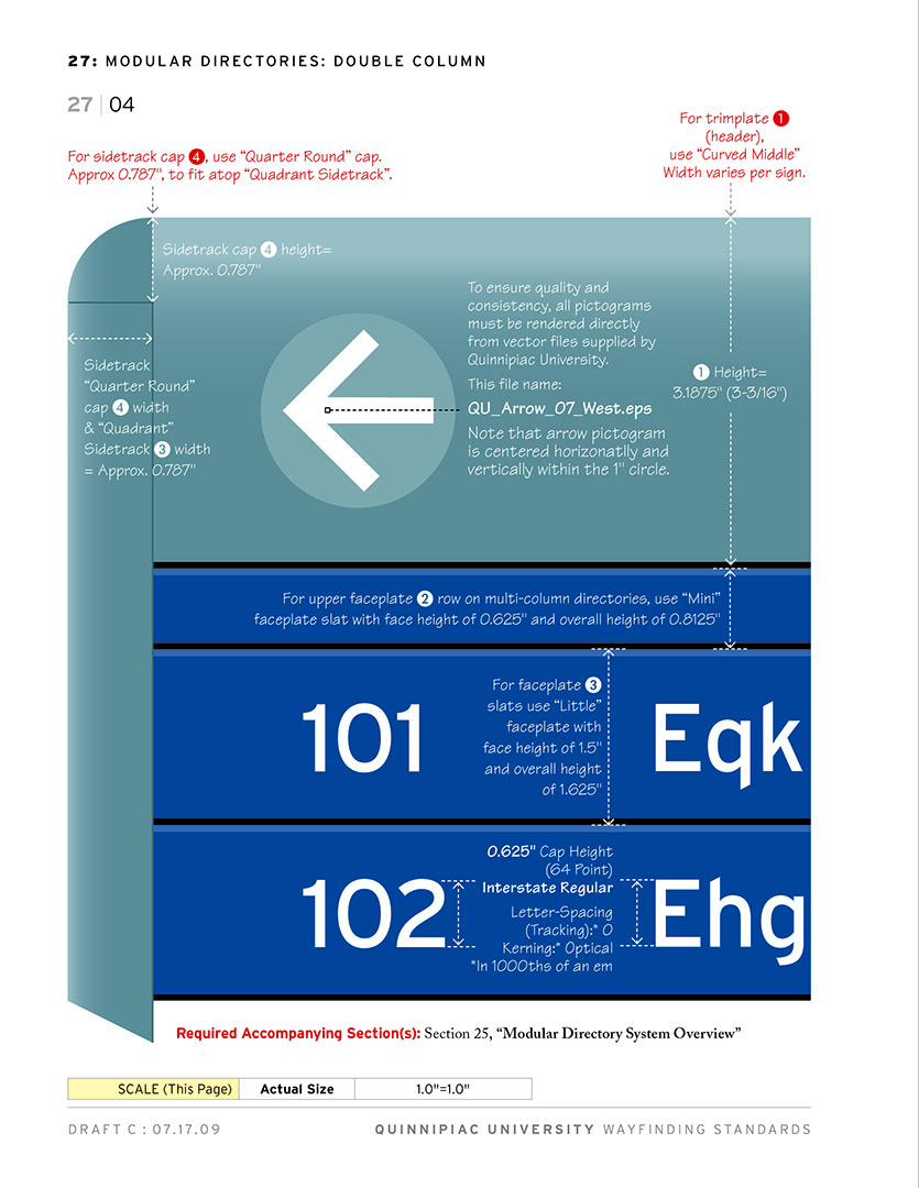
In wayfinding and environmental graphic design, typography serves as a critical spatial tool, transforming physical environments into intuitive, navigable experiences. Unlike static print media, wayfinding type must deliver instant, effortless legibility from varying viewing distances, angles, lighting conditions, and speeds of movement. Designers prioritize clean, highly recognizable typefaces—typically sans-serifs with open counters, distinct letterforms, high x-heights, and generous kerning—to prevent characters from blurring together when viewed from afar or under harsh glare. Beyond pure legibility, typography in wayfinding works in tandem with directional arrows, color coding, and material surfaces to establish a clear spatial hierarchy, guiding diverse audiences safely and seamlessly through complex spaces like transit hubs, hospitals, and urban landscapes.
Beyond legibility and structure, typography serves as a powerful medium for creative visual expression. In branding, editorial design, and poster design, letterforms can be stretched, cropped, layered, or combined with imagery to tell a compelling narrative. Display typography often steps into the foreground as the primary visual element, using contrast, texture, and custom lettering to evoke mood and identity. When executed thoughtfully, expressive typography blurs the line between text and artwork, capturing imagination while reinforcing the core message.

Learn More About the Building Blocks of Graphic Design