





Graphic Design Building Blocks 
Graphic Design Building Blocks: Photography

Eadweard Muybridge
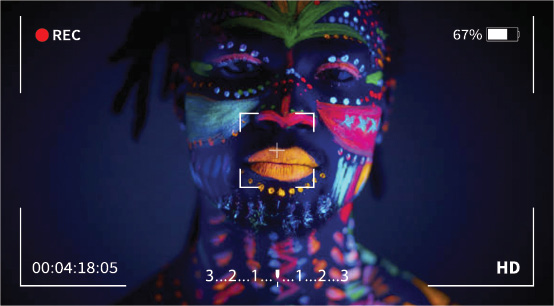

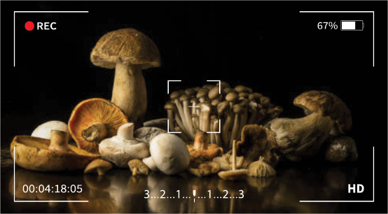
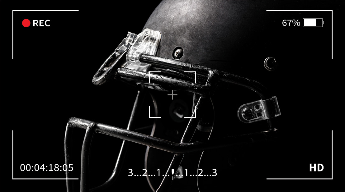
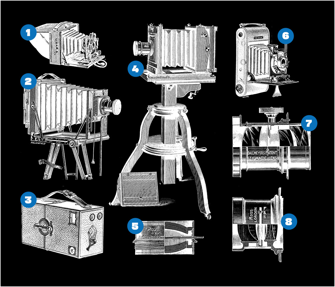
Above:  Folding Hand Camera
  Tripod Camera
  Hand Camera: Box Pattern (“Frena”).
  Studio Portrait Camera.
  Ross Wide-Angle Lens
  Folding Hand Camera (for Roll Films).
  Dallmeyer Stigmatic Portrait Lens.
  Ross-Zeiss Anastigmat Lens
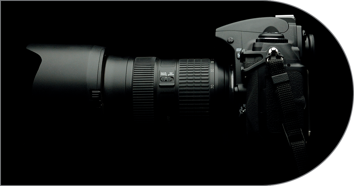
Graphic designers wield photography like a powerful tool to craft visuals that grab attention and leave a lasting impression. They have a keen eye for photos that possess strong composition, where elements are arranged to guide the viewer’s gaze and tell a story. This might involve using the rule of thirds, placing key subjects at specific points within the frame to create a sense of balance and interest. Lighting is another crucial aspect. Designers understand how light can set the mood, highlight details, or create dramatic shadows, all influencing the overall impact of the image.
By manipulating these photographic elements and skillfully combining them with other design tools like typography and color theory, graphic designers elevate photographs from simple visuals to integral parts of a cohesive and impactful design. This can be anything from a captivating advertisement layout to a beautifully designed magazine spread. The photo becomes not just a pretty picture, but a strategic element that breathes life into the designer’s creative vision.

Learn More About the Building Blocks of Graphic Design



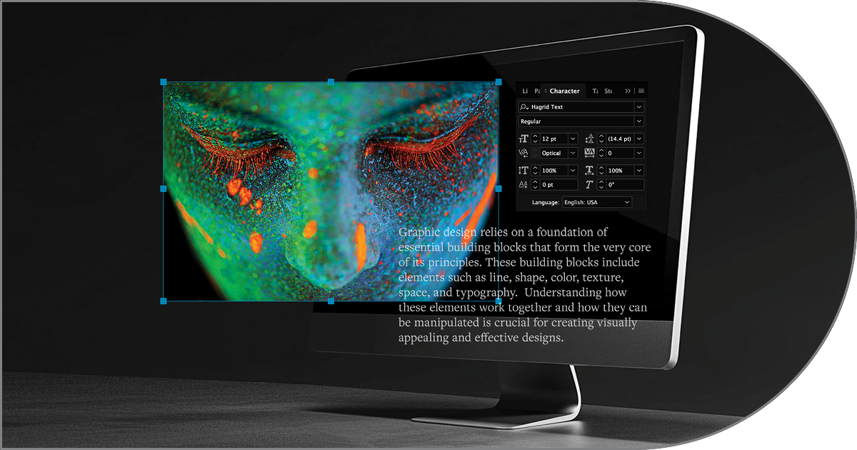
White space, far from being mere empty area, acts as an active structural element in graphic design that gives visual components room to breathe, guides the viewer’s eye through a clear hierarchy, and elevates overall legibility and sophistication.
An infographics graphic designer translates complex data and information into clear, visually engaging illustrations and charts that make narrative insights effortlessly readable for any audience.
A skilled graphic designer seamlessly bridges the digital and print worlds by designing in the RGB color model to maximize color vibrancy on screens, while masterfully translating those assets into the CMYK color space to guarantee exact hue fidelity and sharp contrast for physical printing.
(Captions Below)
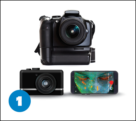
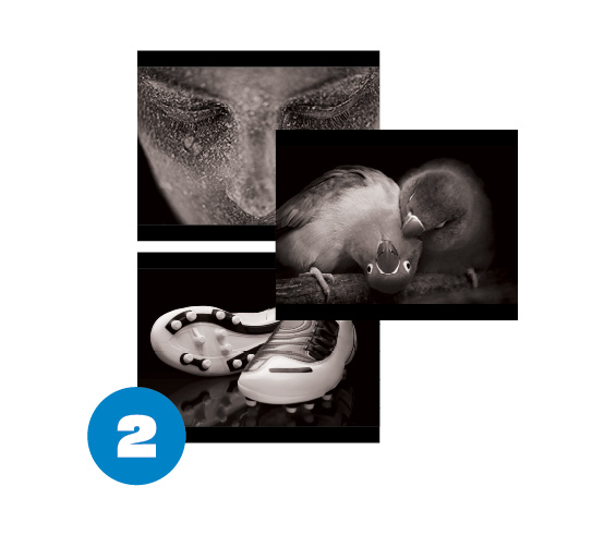
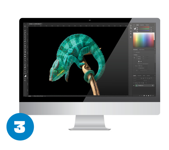
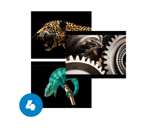
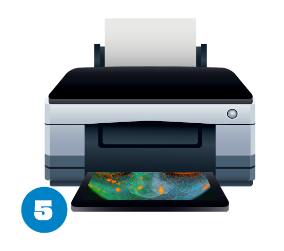
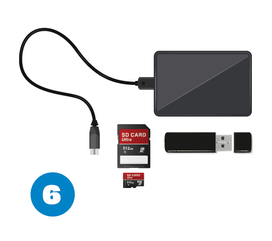
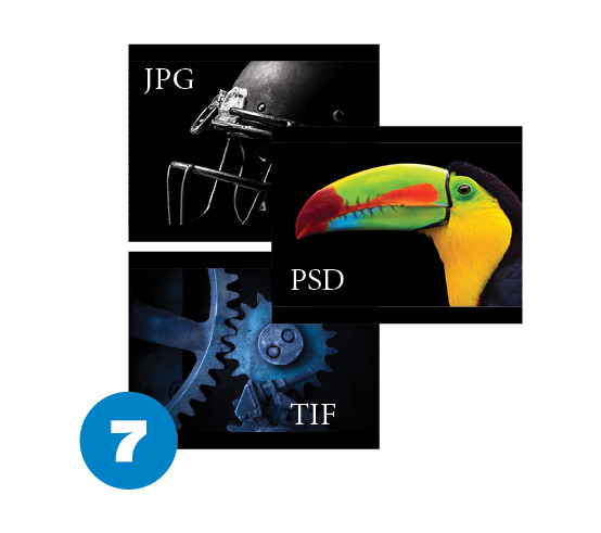
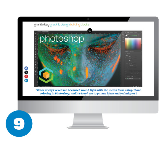
Image Capture: Leaps in technology have made our ubiqitous smart phones and compact cameras useful for some photography. Professional photographers still use Digital Single Lens Reference (DSLR) cameras—although especialy in the field, they may make use of their smart phones especially for candids. Photography may take placein the studio or in the field and photographers will choose the best camera, lighting and other accessories for each type of shoot including a well-calibrated computer monitor.
 After a photo shoot, the photographer will review the images. He or she may use proprietary software for his or her camera or Adobe Lightroom for initial sorting,
deleting shots that are out of focus, have poor lighting or composition. These are generally flagged using stars or color labels. The photographer can also add tags, categories and other options.
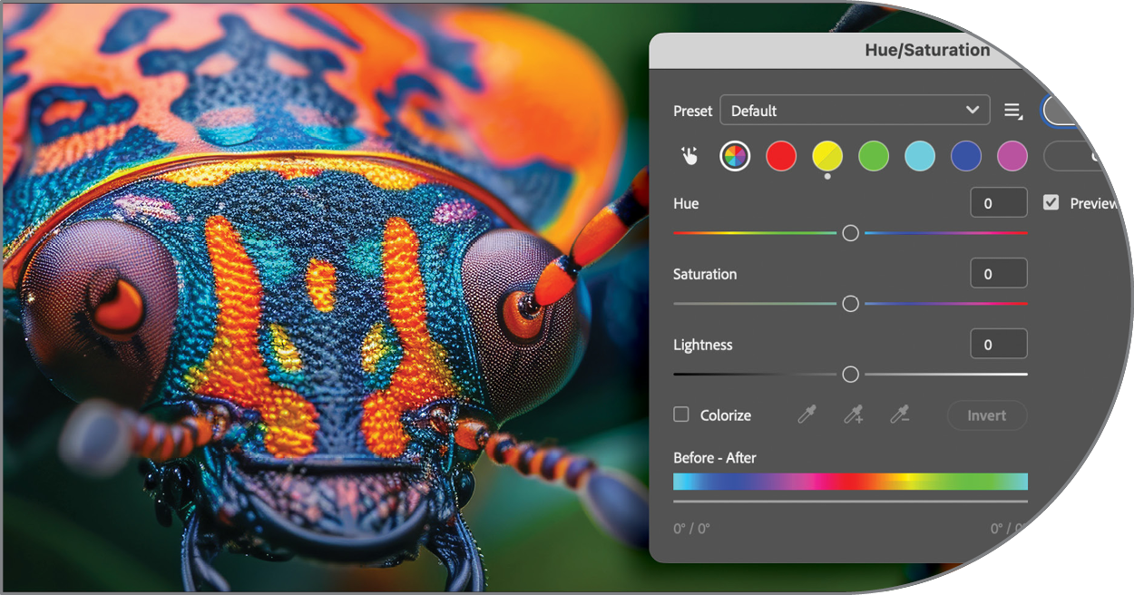
 The best images are generally then bought into Adobe Photoshop where a near-limiless number of great or subtle adjustments are possible.
 Once the images have been initially modified in Photoshop,
they are ready for presentation to the client. This process can take several paths. The photographer may print each image separately  or group them smaller on a page. The other option that is used more often today, is to supply the client with digital files to view on his or her computer. There are currently many different hardware, software and web-based solutions for clients to review a photgrapher’s work and make notes on individual photos. Images can be transferred to hard drives, usb thumb drives or even SD cards—all of these have increased their capacity dramatically over the last few
years and even a tiny 512gb SD card can hold hundreds or thousands of high-resolution images. But more and more, photographers are supplying clients with online links to sites with which to review the photographer’s work.
 Once images are chosen and the photographer makes Photoshop adjustments. Depending on the images final use (print or digital) these adjustments may including sharpening, highlighting or darkening masked areas and color adjustments. Again, depending on the final use, the file must be saved in a particular format. The three main
formats in a digital photography workflow are PSD (this is a native Adobe Photshop file and it will often contain multiple layers, filters and other adjustments), JPG (or JPEG) files are generally “flattened” versions of the origianl PSD files. When saving a file as a JPG, the file size is reduced.. JPG files can be saved in a range of quality settings. A setting of 12 will yield the largest file (but still smaller than the original PSD file) and also the best quality. Even at a setting of 8 or 9, image quality remains pretty darn good. Laslty, for our purposes, is the TIF file. While the average printed piece of web
graphic can use a high-quality JPG, for high-end printed pieces, designers prefer TIF files. Unlike JPGs, TIFs are not compressed. They are basically flattened replicas of the original PSD files and they print at very high quality.  The factors above come into play if, for instance, we’re printing a brochure. Here we would most likely use TIF images at 300dpi (dots per inch) or higher.
  If we’re using an image in a web page, we might use a JPG at a level between 6 and 10, depending on the size and detail. Web images are generally rendered at 72dpi to match the default resolution of most computer screens.
Learn More About the Building Blocks of Graphic Design
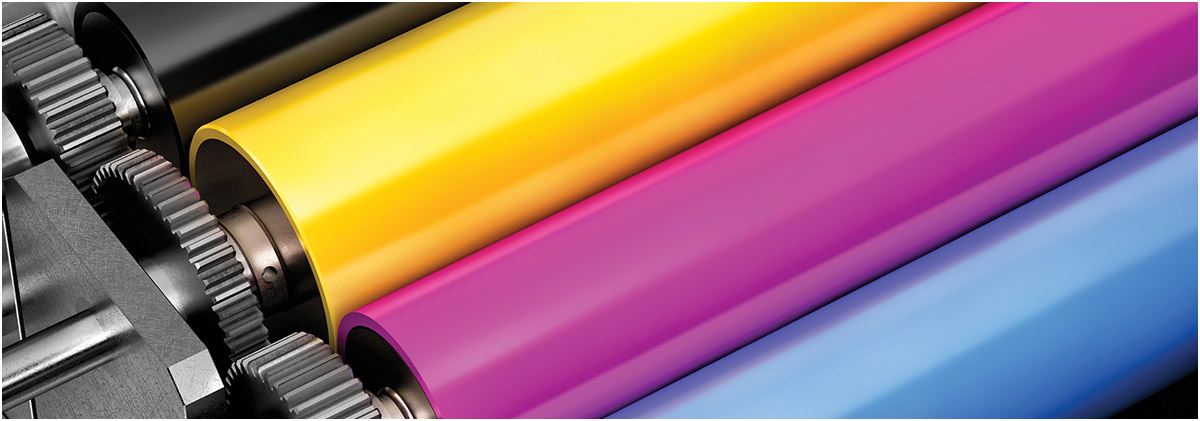

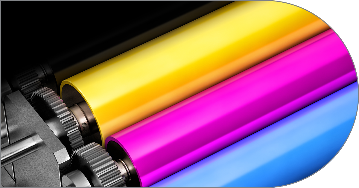
CMYK color printing bridges digital graphic design and tangible print by using overlapping subtractive dots of cyan, magenta, yellow, and black inks to faithfully reproduce complex, full-color imagery on paper.
Graphic design shapes a brand’s visual identity through cohesive color palettes, intentional typography, and memorable logos, translating a company’s core values into a distinct, recognizable personality that builds trust and recognition with its audience.
Bridging physical space and visual communication, wayfinding graphic design relies on intuitive visual cues—ranging from clear signage systems and spatial maps to color-coded pathways—to guide people effortlessly through complex environments.

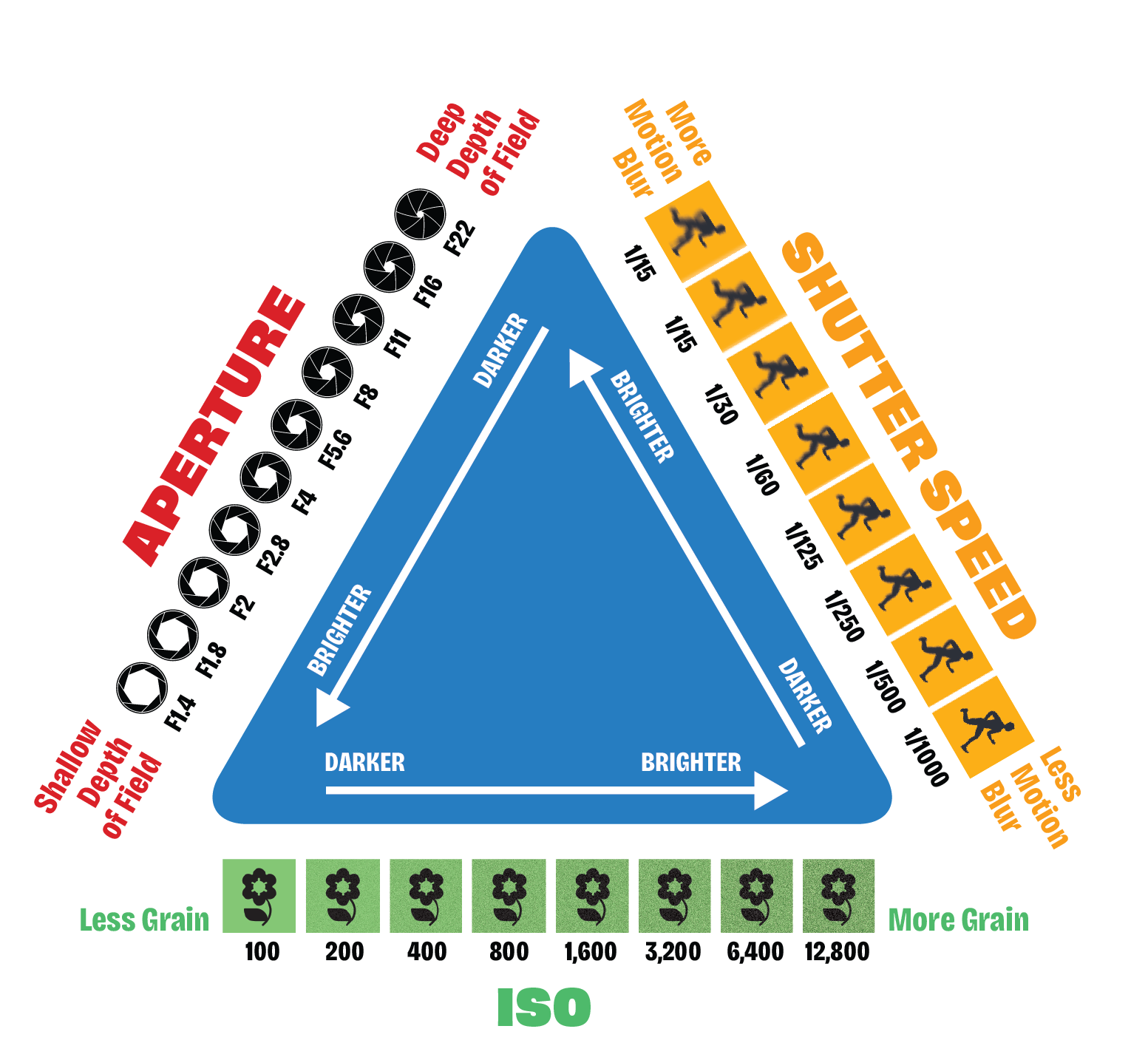
Above: In photography, the exposure triangle is the foundation of capturing a well-lit image. It refers to three key settings that work together to control the amount of light reaching the camera sensor: aperture, shutter speed, and ISO. Aperture acts like the size of the pupil in your eye, letting in more light when wider. Shutter speed determines how long the sensor is exposed to light, similar to the duration a curtain is open. ISO controls the sensor’s sensitivity to light, akin to cranking up the gain on a microphone. By understanding how these settings interact, you can achieve a perfect balance between light and shadow, capture motion blur or freeze action, and produce clear or grainy photos.
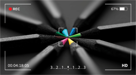
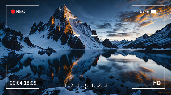
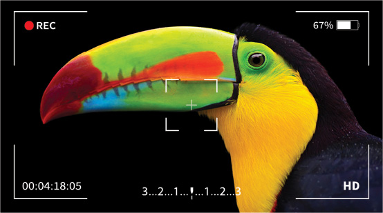
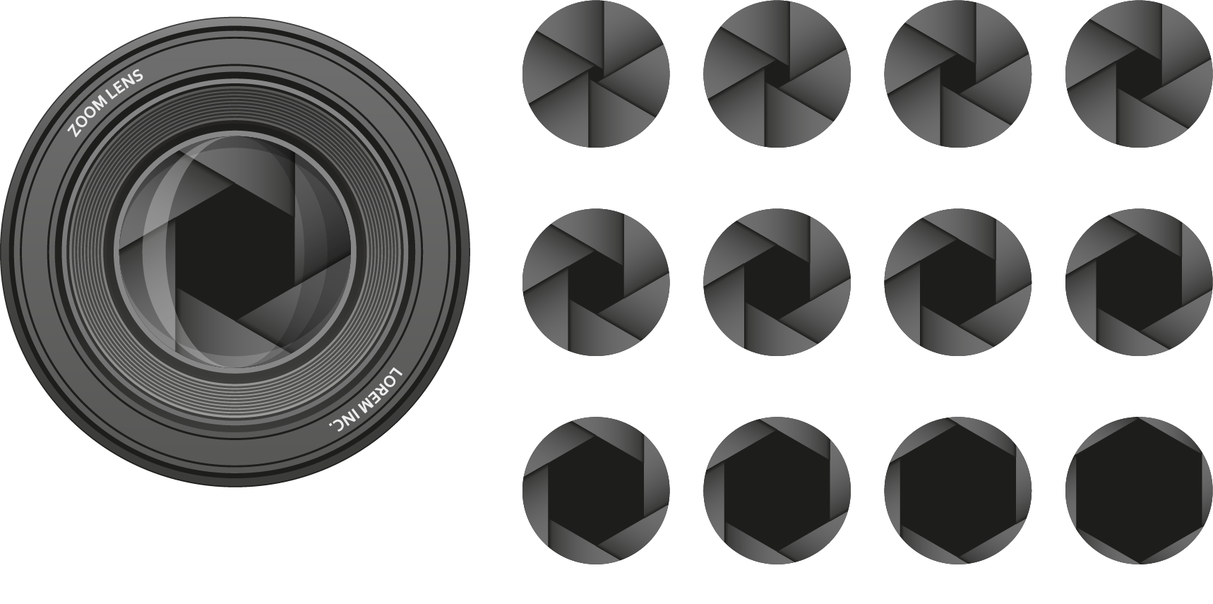
Above: Aperture, the adjustable opening within a camera lens, acts like the iris of a human eye. It controls the amount of light reaching the sensor, impacting your photo in two key ways. Larger apertures, indicated by lower f-stops like f/1.4, allow more light in, blurring the background and creating a shallow depth of field – perfect for isolating your subject. Conversely, smaller apertures (higher f-stops, like f/16) let in less light but bring more of the scene into focus, ideal for landscapes or group photos where sharpness throughout the image is desired. By understanding aperture, you can achieve creative effects and control the overall look and feel of your photographs.