Graphic Design Building Blocks: Quinnipiac University Campus-Wide Wayfinding 2/3







Graphic Design Building Blocks 
Graphic Design Building Blocks: Wayfinding Part 2 of 3
Below: One of Hundreds of Pages by Granite Bay Design for Quinnipiac University
Granite Bay Design has had a long working relationship with Quinnipac University. The asked us to work with them on completely overhauling their campus wayfinding. The project would include wayfinding for the “Crescent” dormitory. Wayfinding design transforms physical spaces into legible, intuitive environments by translating complex visual architecture into clear human paths. At its core, wayfinding goes far beyond simple directional arrows or exit signs; it is a holistic discipline that sits at the intersection of graphic design, environmental architecture, and cognitive psychology. Designers analyze how people process information while moving through high-friction spaces—such as international airports, sprawling hospitals, and multi-level transit hubs—to create seamless visual navigation systems that reduce anxiety and foster immediate orientation.
Below: Flip Through a Chapter
Below: A Few of the Hundreds of Highly Detailed Specification Diagrams
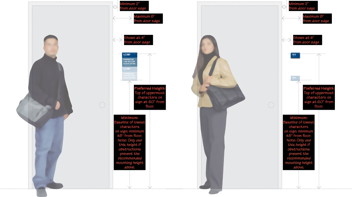
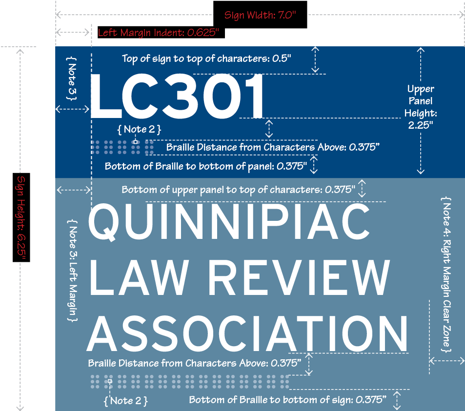
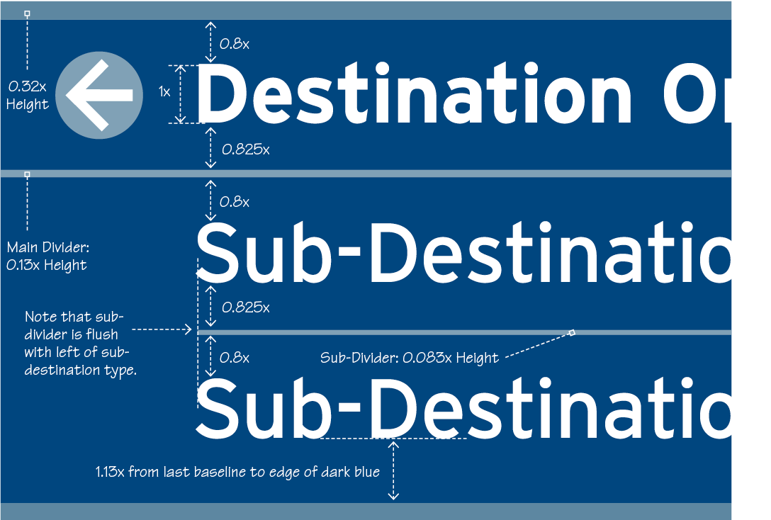
Below: Details of a room name and number and a close-up of a hanging sign. A successful visual navigation system relies heavily on a structured information hierarchy built through typography, iconography, and color theory. Typography must prioritize legibility at scale, utilizing clean sans-serif typefaces with generous x-heights and open counters to remain readable under varying lighting conditions and distances. Universal iconography acts as a cross-cultural visual bridge, distilling complex actions or destinations into instantly recognizable symbols. Meanwhile, color coding serves as a powerful spatial anchor, visually segmenting large environments into manageable visual zones long before a pedestrian is close enough to read the text.
Details of Room Number and Name Specifications
Below: Details of a Hanging Sign with Arrow

Below: An Example of a Modular Directory


Learn More About the Building Blocks of Graphic Design

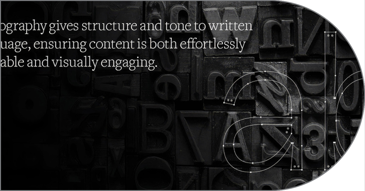
As the strategic backbone of graphic design, typography seamlessly weaves structural hierarchy, psychological tone, and expressive visual form into written text, empowering designers to deliver clear, legible information.
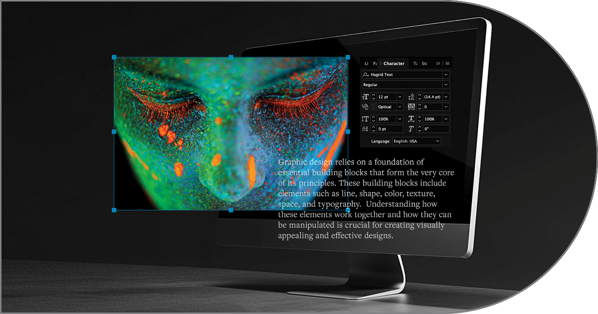
Graphic design provides the structured framework of layout, typography, and color strategy, while photography feeds that structure with compelling real-world imagery, together forming a seamless visual medium.
Serving as the structural foundation and visual skin of the digital web, HTML and CSS transform raw digital information into dynamic, accessible layouts by pairing clean document architecture with precise stylistic control over layout, color, responsiveness, and interaction design.
Modular Directories
Modular directories are used across campus and use the “Slatz” modular system. Beyond individual signboards, modern wayfinding incorporates environmental graphics and spatial branding to construct a memorable narrative within the physical landscape. Integrated visual elements—such as floor decals, large-scale typography painted directly onto concrete walls, and strategic lighting—guide foot traffic organically through spatial flow without cluttering the visual field. By embedding visual cues directly into the building’s structural identity, designers create an immersive brand touchpoint that feels like an organic extension of the physical architecture rather than a series of visual interruptions.
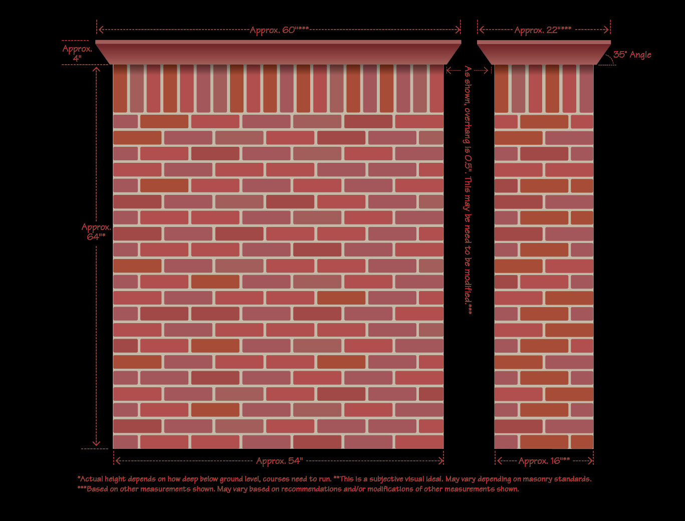
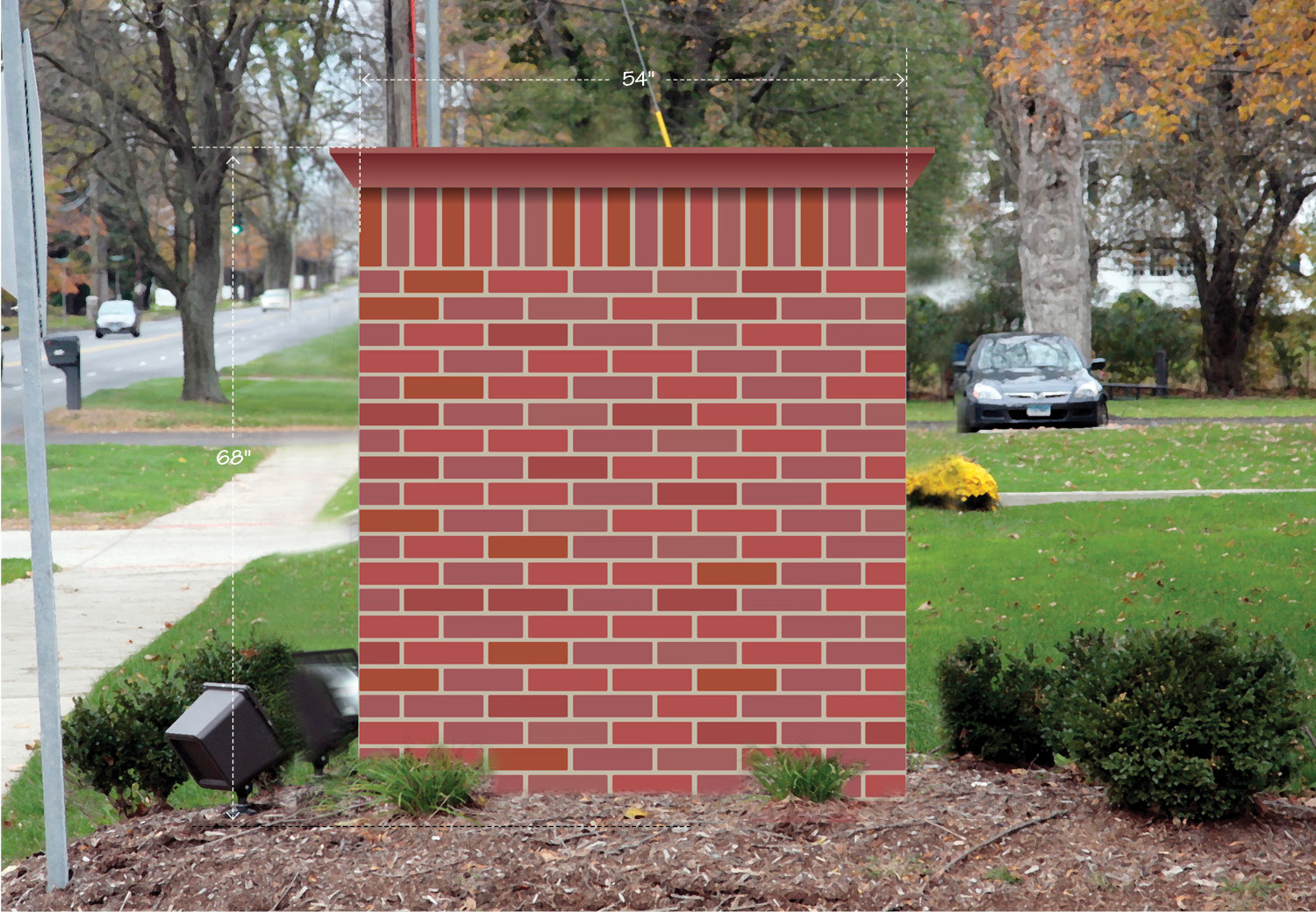
Granite Bay Design Also Designed These Brick-Based Signs for Off-Campus Buildings
As physical and digital spaces increasingly merge, graphic designers must also account for accessibility, inclusivity, and responsive environmental shifts. ADA compliance, tactile braille placement, high-contrast visual ratios, and sightline adjustments for wheelchair users are essential baseline requirements for any public visual system. Furthermore, contemporary wayfinding design now integrates dynamic digital signage and augmented reality, creating flexible spatial systems that adapt to real-time events, changing foot traffic patterns, and personal mobile navigation, ensuring every visitor navigates the physical world with confidence.