Graphic Design Building Blocks: Quinnipiac University “The Crescent” Wayfinding 1/3







Graphic Design Building Blocks 
Graphic Design Building Blocks: Wayfinding Part 1 of 3

Bill Burnett
QUINNIPAC UNIVERSITY EXTENSIVE STANDARDS MANUAL FOR THE CRESCENT DORMITORY
Overview of Crescent Navigation
Granite Bay Design has a long history with Quinnipiac University. We were asked to work with them on a complete overhaul of all of their wayfinding. One of the biggest challenges what developing “extreme wayfinding” for the university’s newest dormitories, “The Crescent”. It was very important to make getting to a student’s room as easily as possible. The primary focus on visitors. We developed a letter, color-coded and numerical system. Every elevator has a sign pointing out where a visitor was standing along with a map of the whole dormitory and arrows pointing to room numbers. Below: Long before the dormitory was completed, we were working on the navigation system
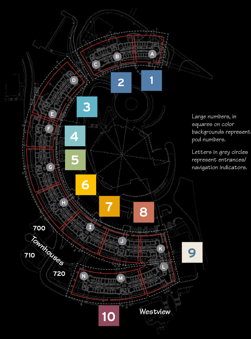
Below: Please flip through one of 42 chapters
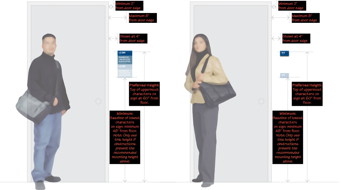
Below: One of 42 “chapters” in the Quinnipiac University wayfinding manual. Each chapter was developed separately and placed in binder at the university. A main goal was to be very specific so university staff could refer to any chapter without our involvement both currently and in the future. Our specifications covered everything: color, size, fonts, placement, right down to the type of screws used. Click below to see the whole chapter.
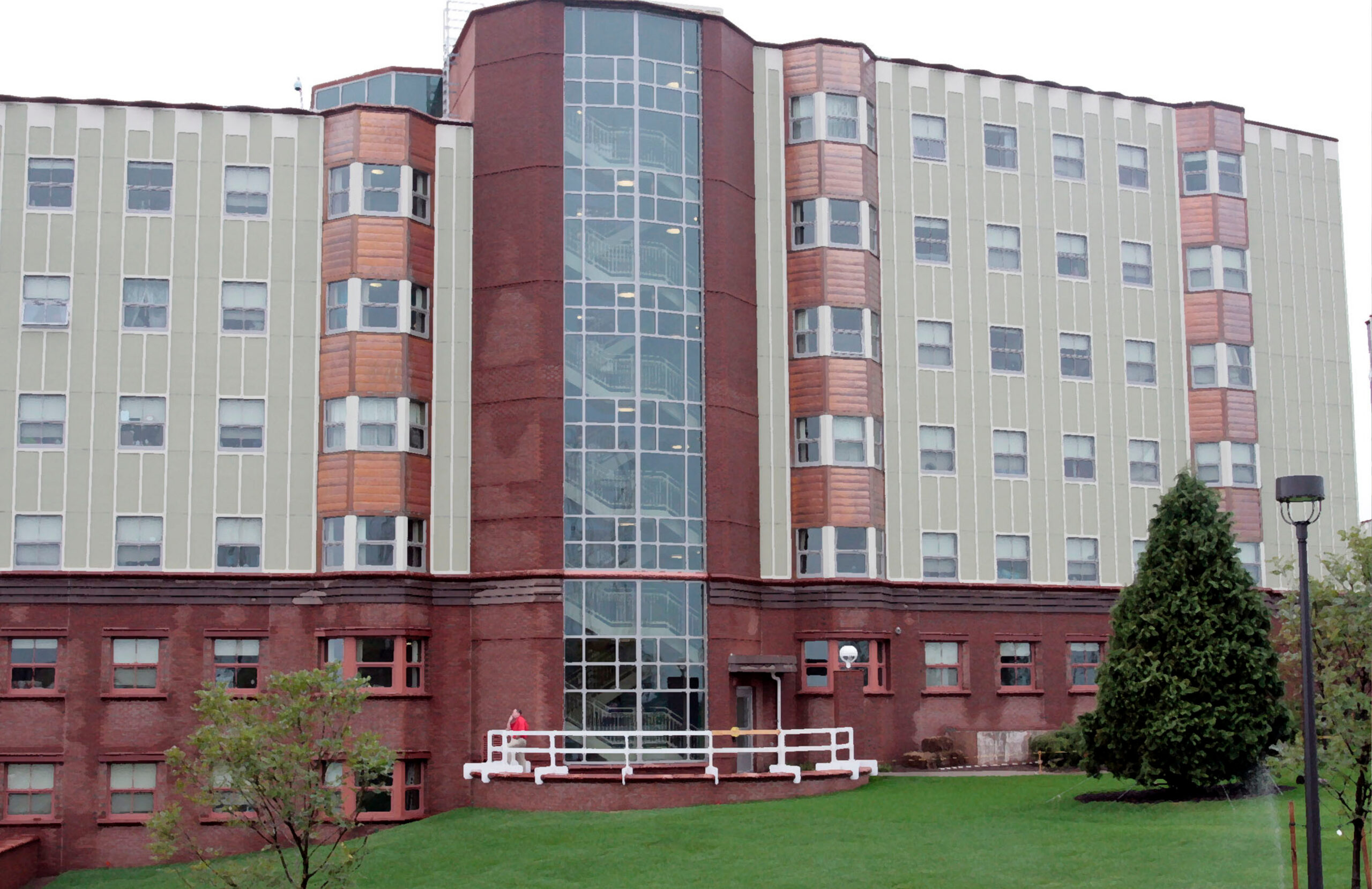
The Exterior of The Crescent Before and After Adding Exterior Column Navigation




Below: Navigation System Located at Every Elevator
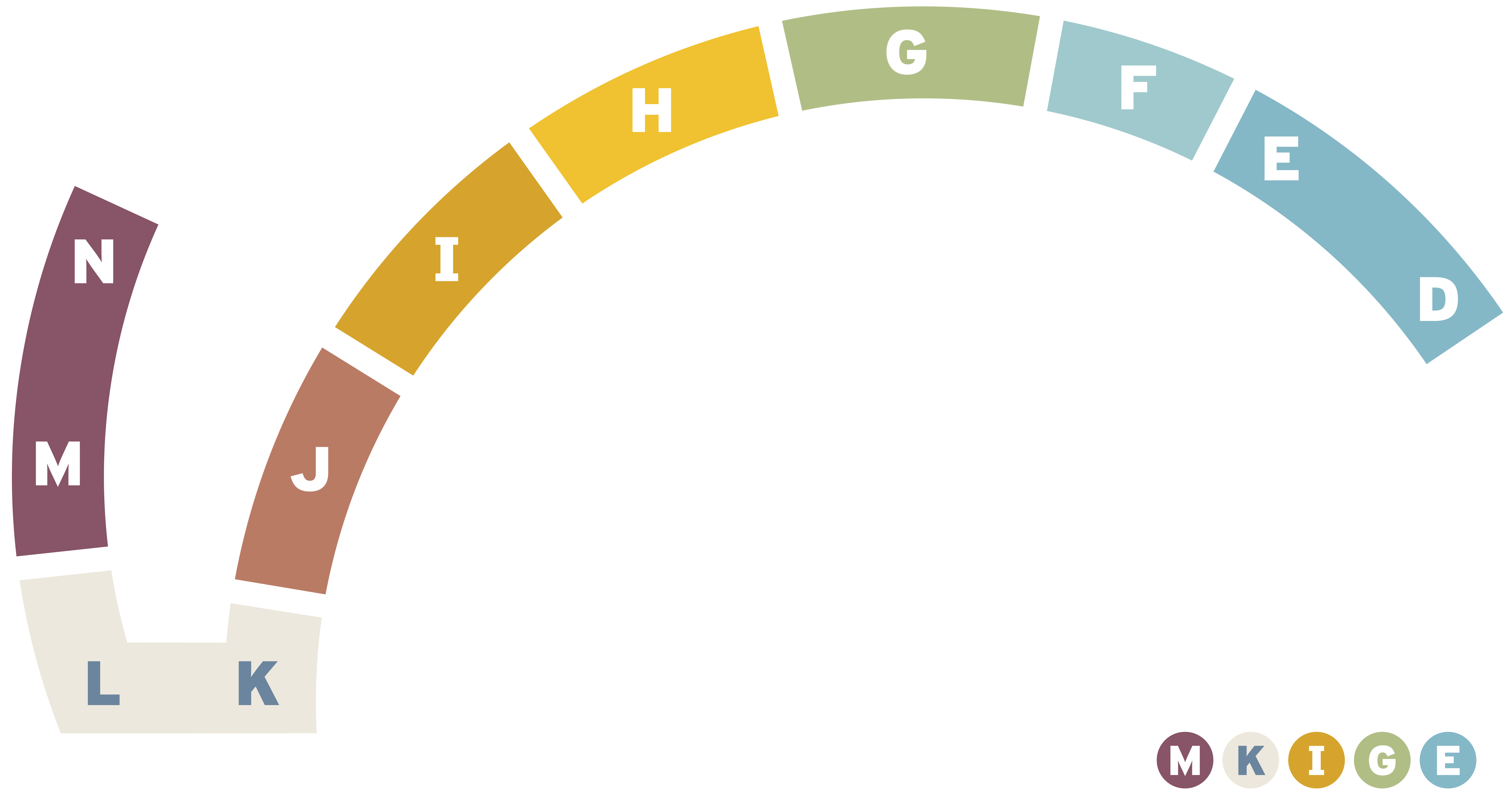
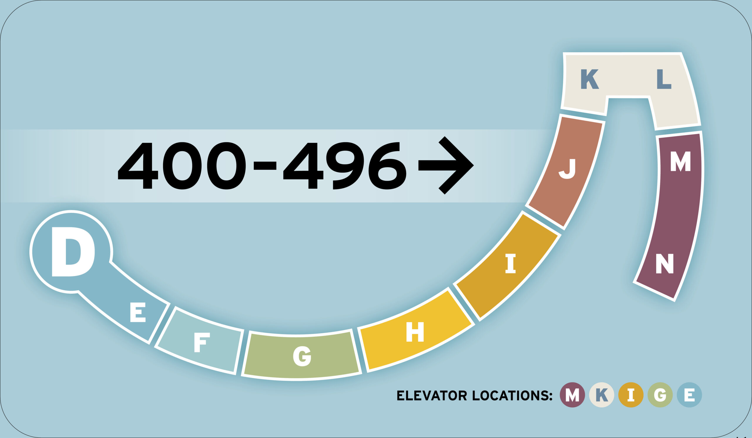
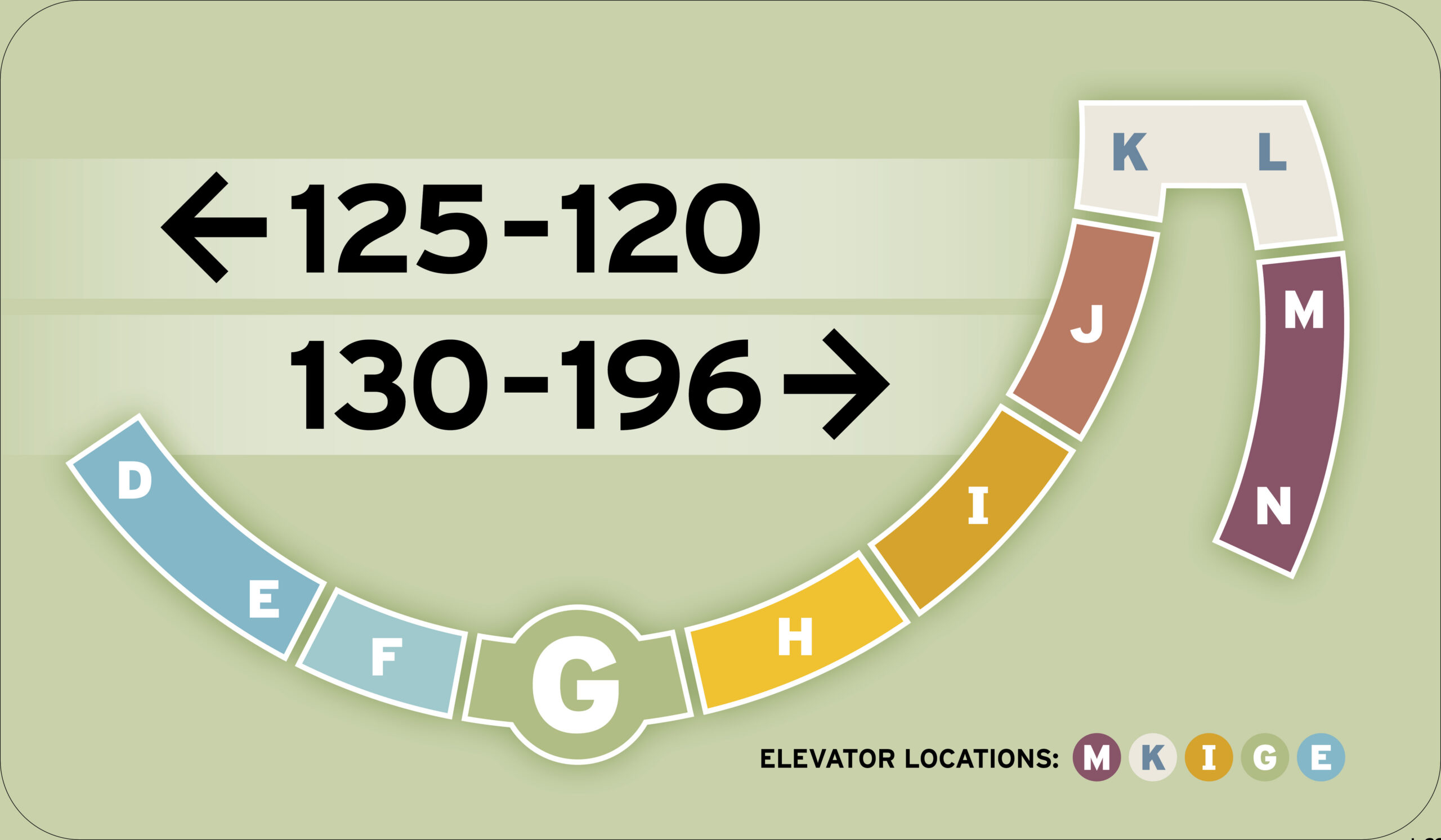
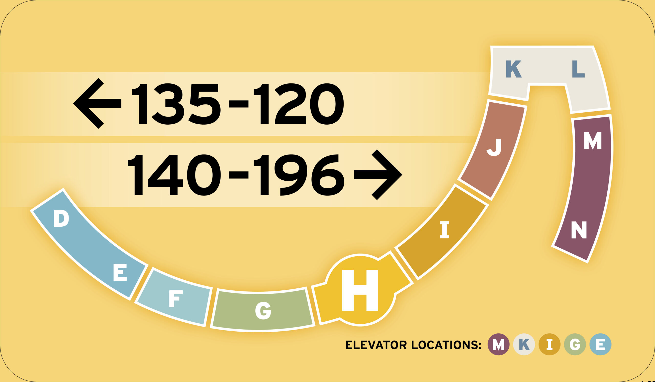
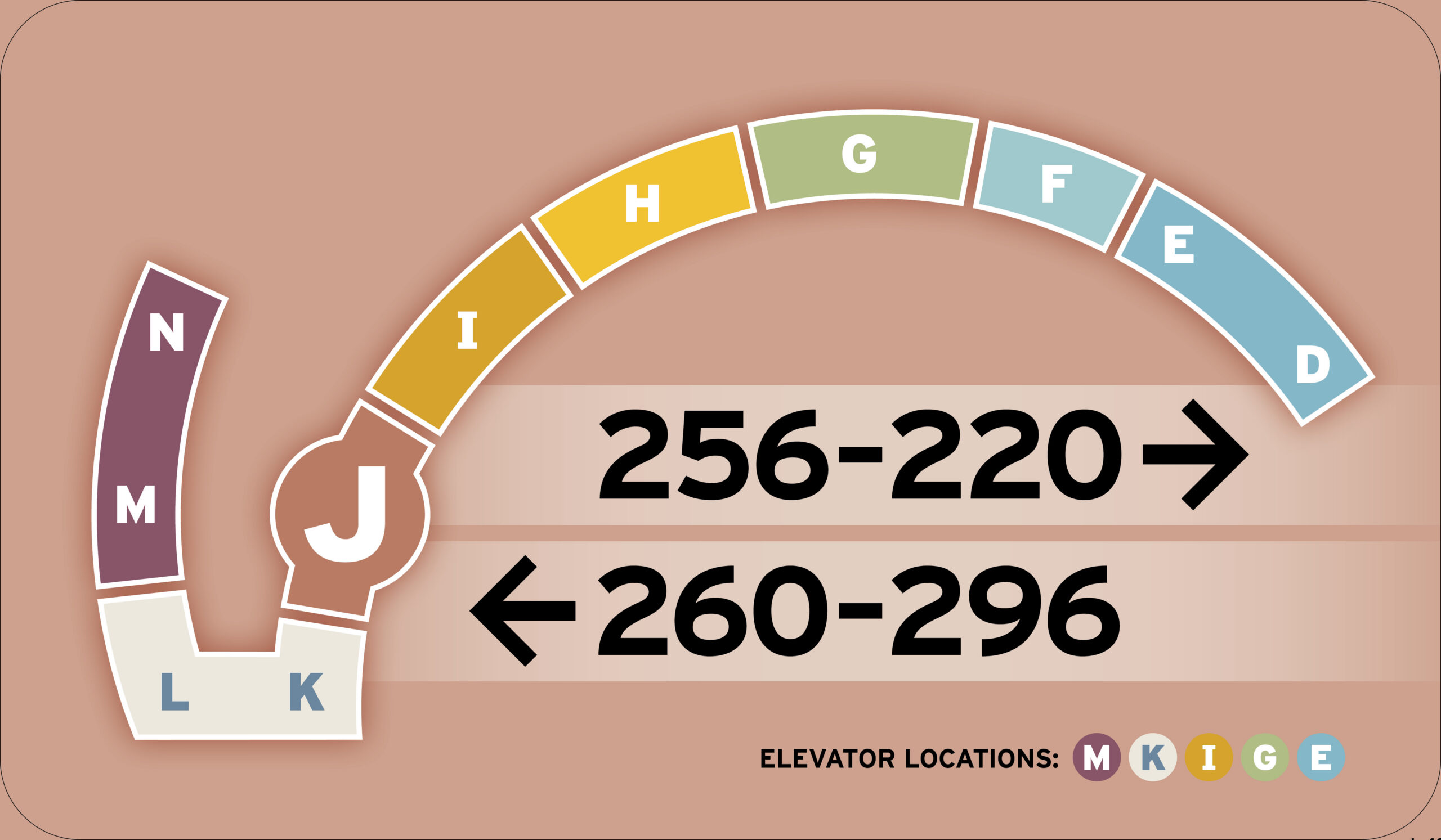
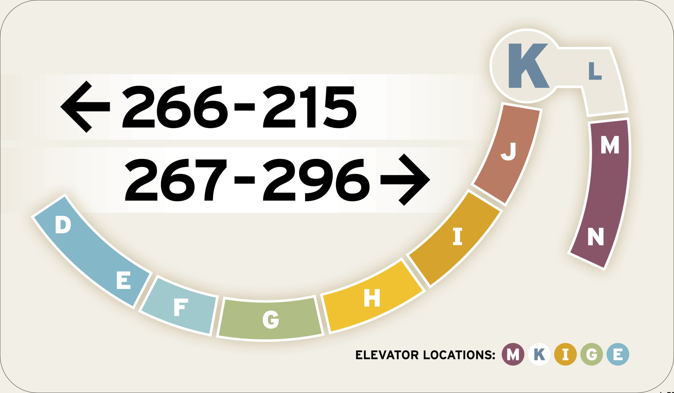
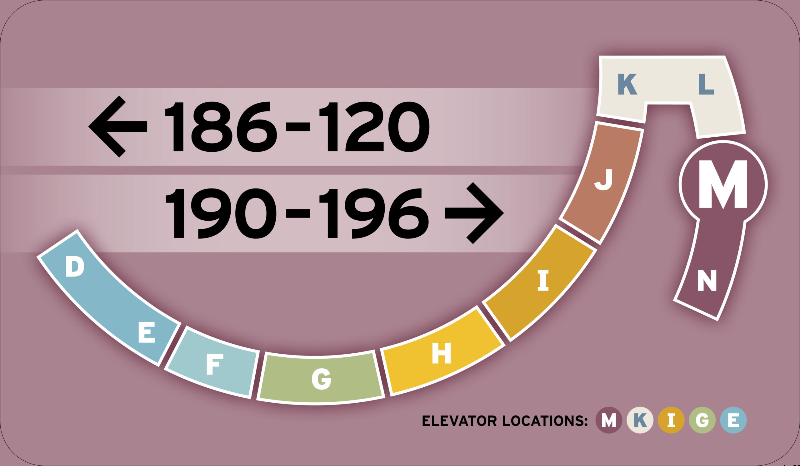
Below: Details of the Crescent Color Selections


Learn More About the Building Blocks of Graphic Design

At the heart of graphic design lies creativity, an imaginative problem-solving process that transforms raw ideas into captivating visual concepts by harmonizing color, composition, and metaphor to communicate complex stories, break through digital noise, and inspire action.
Graphic design relies on vector graphics for logos, typography, and illustration because their mathematical, point-and-path construction allows visuals to scale infinitely.
hen using spot colors, printers use premixed custom inks—such as Pantone shades—to ensure exact color accuracy and consistency across different printed materials.

Effective wayfinding seamlessly guides people through complex physical or digital environments by relying on spatial logic, visual hierarchy, and intuitive design rather than overwhelming users with excessive signage. When implemented thoughtfully, it eliminates cognitive friction and navigation anxiety by answering four essential questions at every decision point: Where am I?, Where is my destination?, How do I get there?, and How do I return?. By combining high-contrast typography, universally recognized iconography, strategic lighting, and clear visual sightlines, effective wayfinding builds an inclusive, accessible ecosystem that empowers individuals to navigate unfamiliar spaces effortlessly and independently.
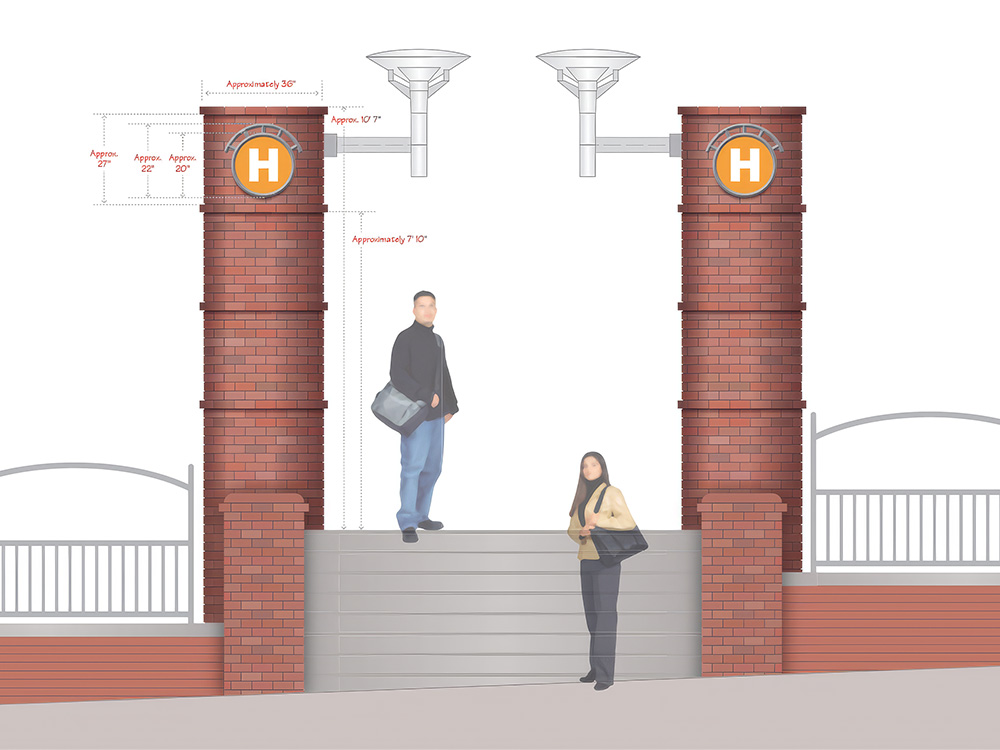
Below: Several Details from Three of the Chapters
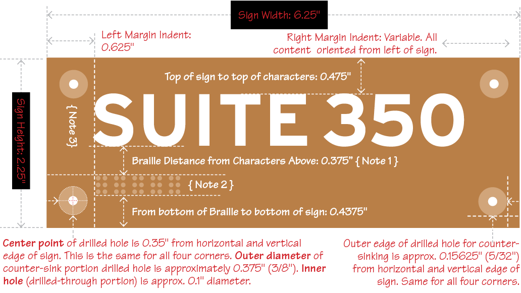
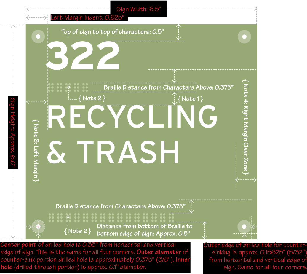
Below: Details Include Measurements in Relation to Students